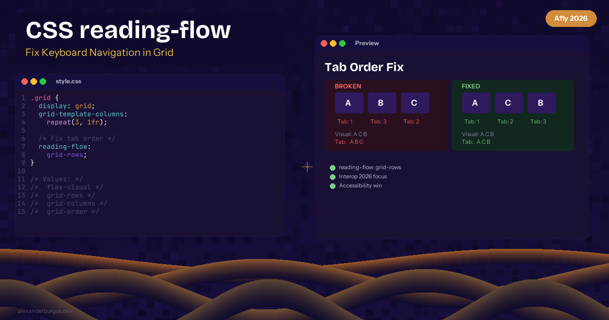
CSS reading-flow -- Fix Keyboard Navigation in Grid and Flex Layouts
Here's a dirty secret about CSS Grid and Flexbox -- they can break keyboard navigation. When you reorder elements visually with order, grid-row, or flex-direction: row-reverse, the tab order still follows the DOM. Your keyboard users are navigating in a completely different order than what they see on screen.
The Problem
/* Visual order: A, C, B */
.grid {
  display: grid;
}
.item-b { order: 3; }
.item-c { order: 2; }

/* Tab order: A, B, C (follows DOM, not visual) */
The Fix: reading-flow
The reading-flow property tells the browser to use the visual layout order for keyboard navigation:
.grid {
  display: grid;
  grid-template-columns: repeat(3, 1fr);
  reading-flow: grid-rows;
}

/* Now tab order matches visual grid layout */
Available Values
normal-- default DOM orderflex-visual-- follow flex visual orderflex-flow-- follow flex-flow directiongrid-rows-- follow grid row ordergrid-columns-- follow grid column ordergrid-order-- follow CSS order property
Browser Support
Experimental -- Chrome behind flag. Part of Interop 2026 focus areas, which means all major browsers are committed to implementing it.
This is an accessibility win that's long overdue. If you use CSS ordering, you need this property.
Happy coding!
If you want to go deeper and learn how to build real, production-ready CSS design systems step by step, check out my full course here: CSS Design Systems Course If you found this helpful, I'd love to connect! Follow me on Twitter/X @alexandersstudi or LinkedIn for more CSS and design system tips.