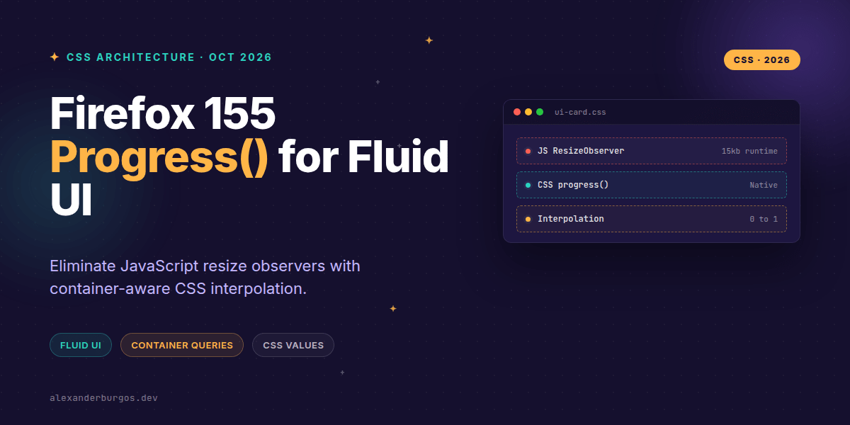
Right, let's talk about the death of the Resize Observer. For years, we've been tethered to JavaScript whenever we wanted a component to truly 'feel' its surroundings—scaling font sizes, adjusting opacities, or shifting layouts based on how much room it actually has on the screen.
With the release of Firefox 155 in September 2026, we've hit a massive milestone. The progress() function is now broadly available, joining Safari 27 to give us a native way to calculate interpolation directly in our stylesheets. It's a game-changer for design system engineers who want to build fluid components without the performance overhead of imperative script logic.
The Math Behind the Magic
At its core, progress() is a mathematical function defined in the CSS Values and Units Level 5 spec. It takes a value and maps it against a start and end point to return a number between 0 and 1. Think of it as a way to ask CSS: 'How far along are we?'
/* The basic syntax */
progress(<progress-value>, <start>, <end>)
If your container is 500px wide, and you've set a range from 300px to 700px, progress() returns 0.5. It’s simple, elegant, and incredibly powerful when combined with calc().
Example: The Truly Fluid Card
I've found that the best use case for this is a card component that lives in a dynamic grid. Instead of jumping between rigid breakpoints, the card can smoothly transition its internal styles as it grows. By using 100cqw (100% of the container query width), the component responds to its own size, not the whole viewport.
.card {
  /* Calculate progress between 320px and 720px width */
  --fluid: progress(100cqw, 320px, 720px);

  /* Use that 0-1 value to drive properties */
  opacity: calc(0.65 + var(--fluid) * 0.35);
  transform: scale(calc(0.96 + var(--fluid) * 0.04));
  padding-inline: calc(1rem + var(--fluid) * 1rem);
}
In this setup, as the card expands, the opacity drifts from 0.65 to 1.0, and the padding grows from 1rem to 2rem. It’s completely fluid, buttery smooth, and requires exactly zero lines of JavaScript.
Architecting Safe Fallbacks
We can't just throw this into production and hope for the best. Browsers that don't recognize progress() will invalidate the entire declaration. I always recommend a 'mobile-first' static fallback, wrapped in a feature query.
.card {
  padding: 1rem;
  opacity: 1;
}

@supports (opacity: progress(50%, 0%, 100%)) {
  .card {
    --fluid: progress(100cqw, 320px, 720px);
    padding-inline: calc(1rem + var(--fluid) * 1rem);
    opacity: calc(0.65 + var(--fluid) * 0.35);
  }
}
This ensures that users on older browsers still get a functional, well-designed card, while modern users get the enhanced, fluid experience.
Design System APIs: Exposing the Right Knobs
If you're building a design system, don't force your consumers to write math. Instead, expose semantic variables. This keeps your internal logic encapsulated while giving designers control over the 'inflection points' of the component.
@layer component {
  .ui-card {
    /* Default boundaries */
    --ui-progress-start: 320px;
    --ui-progress-end: 720px;

    --ui-fluid: progress(100cqw, var(--ui-progress-start), var(--ui-progress-end));

    gap: calc(0.75rem + var(--ui-fluid) * 0.75rem);
    border-radius: calc(0.5rem + var(--ui-fluid) * 0.5rem);
  }
}
Things to Watch Out For
- Type Compatibility: You cannot mix units. If your start is in
px, your end and progress-value must also resolve to a length. - Container Context:
100cqwonly works if the parent (or an ancestor) hascontainer-type: inline-sizedefined. - Clamping: By default,
progress()is clamped between 0 and 1. If you need it to go beyond those bounds, you'll need theno-clampkeyword (check specific browser support for this variation). - It's a Number: The function returns a unitless number. You must use
calc()to multiply it by a unit (like 1rem) to use it for lengths.
The long version with support labels and runnable demos is in Modern CSS 2026 on Amazon Kindle.
Wrapping Up
- Use
progress()to replace heavy ResizeObserver scripts for visual-only interpolations. - Always pair it with Container Query units (
cqw) for truly modular components. - Implement robust fallbacks using
@supportsto ensure cross-browser stability.
I'd encourage you to start experimenting with this in your local dev environments. It's one of those features that, once you start using it, makes you wonder how we ever survived without it.
If you want to go deeper and learn how to build real, production-ready CSS design systems step by step, check out my full course here: CSS Design Systems Course
Got questions about fluid typography or container-based logic? Let's chat over on Twitter or connect with me on LinkedIn.