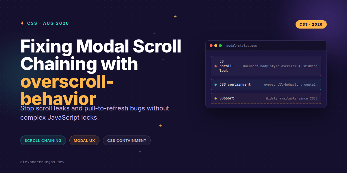
We've all been there: you open a beautiful modal on your mobile browser, scroll to the bottom of the content, and suddenly the background page starts moving instead. It's jarring, it feels broken, and for years, our only solution was a messy dance of JavaScript event listeners and body-locking hacks.
But things have changed. As of 2026, we've fully moved into an era where overscroll-behavior is a design system staple. If you're still toggling overflow: hidden on the body element every time a drawer opens, I've got some good news for you. We can do this much more elegantly now.
What is Scroll Chaining?
Scroll chaining is that default browser behaviour where, once a nested scrollable element reaches its boundary, the scroll action is passed up to the parent container. In a modal context, once you hit the end of the modal text, the browser helpfully (or unhelpfully) starts scrolling the main page content behind it.
According to MDN, the overscroll-behavior CSS property is our primary tool to tell the browser exactly what to do when reaching that boundary. It's a shorthand for overscroll-behavior-x and overscroll-behavior-y, giving us granular control over how our overlays interact with the rest of the viewport.
The contain vs none Dilemma
When I'm building out components for a design system, I usually reach for one of two values. The choice depends on just how much control you want to take away from the browser's native feel.
- contain: This stops scroll chaining. The scroll stays within the modal, but the browser preserves local effects like the 'rubber-band' bounce on iOS or pull-to-refresh affordances.
- none: This is the nuclear option. It stops scroll chaining and also kills the local overscroll effects. No bounce, no refresh, just a hard stop.
/* The standard way to handle a scrollable modal */
.modal__content {
  max-height: 80vh;
  overflow-y: auto;
  overscroll-behavior: contain;
}
Why this beats JavaScript locks
In the past, I've spent far too many hours debugging 'jumpy' layouts caused by document.body.style.overflow = 'hidden'. When the scrollbar disappears, the layout shifts, and then you're stuck writing logic to calculate scrollbar width and add artificial padding. It's a nightmare for performance and maintenance.
By using overscroll-behavior, we're letting the browser's compositor handle the logic. It's smoother, it's declarative, and it doesn't break when a user switches between touch and mouse input. Chrome's engineering team explicitly highlighted modals and drawers as the primary use case for this property because it solves the 'leakage' problem without side effects.
The 'Hidden' Gotcha
Here's a tip I've picked up: an element doesn't actually need to be scrolling for this to work. MDN notes that even if an element has overflow: hidden, it's still treated as being at its scroll boundary. This means you can apply overscroll-behavior: contain to a non-scrolling overlay to ensure no gestures ever bleed through to the page underneath.
A Note on iframes
Don't make the mistake of trying to set this on an iframe tag directly. It won't work. If you're dealing with embedded content, you've got to apply the property to both the html and body tags inside the iframe document itself.
Wrapping Up
- Use
overscroll-behavior: containto stop modals from scrolling the background while keeping native bounce effects. - Use
noneif you need to strictly disable pull-to-refresh or rubber-banding in a specific UI region. - Remember that this property only handles scroll logic—you still need to manage focus trapping and ARIA roles for a truly accessible modal.
I'd encourage you to go into your current project and replace one of your old JS scroll-locks with this. You'll be surprised at how much 'jank' just disappears when you let CSS handle the boundaries.
If you want to go deeper and learn how to build real, production-ready CSS design systems step by step, check out my full course here: CSS Design Systems Course
I cover this and the other twenty-seven CSS shifts of 2026 in Modern CSS 2026 on Amazon, my catch-up book for people who learned CSS five years ago.
If you found this useful, let's chat about it on Twitter or connect with me over on LinkedIn. I'm always keen to hear how others are implementing these native controls!