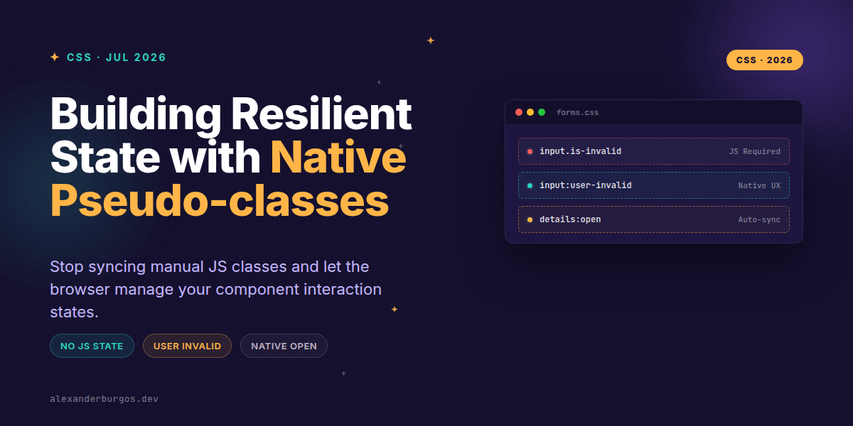
Ever wondered why we're still writing manual blur listeners just to toggle a red border on a text field? We've all been there: synchronising .is-invalid or .is-open classes across React components, fighting race conditions, and bloating our bundles with state management logic that the browser is actually perfectly capable of handling itself.
Right, let's talk about the shift toward CSS-only state. With the arrival of :user-invalid and :open, we can finally strip away the brittle JavaScript glue that holds our design system components together. It's time to let the browser own the interaction state.
The Problem with :invalid
For years, the :invalid pseudo-class was the 'promised land' that turned out to be a bit of a UX nightmare. If you applied styles to input:invalid, the field would turn red the second the page loaded because it was empty and marked as required. That's aggressive, and frankly, it's bad UX.
As Trevor Lasn points out, :user-invalid is the 'User Interaction Pseudo-class' we've actually been waiting for. It waits for meaningful interaction. According to MDN, it only matches after the user has attempted to submit or has blurred the field after a change. It's polite validation.
/* The modern, polite way */
input:user-invalid {
  border-color: var(--color-error-600);
  outline: 2px solid var(--color-error-100);
}

input:user-valid {
  border-color: var(--color-success-600);
}
Simplifying Disclosures with :open
We often build accordions or dropdowns by toggling a .is-open class. But if you're using semantic HTML like the <details> element or the new Popover API, the browser already knows the state. The :open pseudo-class allows us to hook into that native state directly.
In my experience, this is a game-changer for design system maintainers. You no longer need to worry about your React or Vue state getting out of sync with the actual DOM state. If the browser says it's open, CSS reacts.
/* No more .is-open class needed */
details:open {
  background-color: var(--color-surface-alt);
}

details:open summary::after {
  content: "\2212"; /* Minus sign */
}
The Gotchas: Accessibility and Fallbacks
I've found that senior engineers sometimes lean too hard into these new features without considering the 'silent fail.' Unlike standard properties, if a browser doesn't recognise :user-invalid, it discards the entire CSS rule block. It won't just ignore that one line; it kills the whole selector.
- Accessibility: CSS states don't replace ARIA. You still need
aria-describedbyto link error messages to inputs. - Fallbacks: If you support legacy browsers, you'll need a strategy (like
@supports) to ensure they get at least some validation feedback. - Scope:
:openonly works on elements with a native 'open' state, like<details>or elements using thepopoverattribute.
Wrapping Up
- Use
:user-invalidto provide immediate, polite feedback without writing custom JS blur listeners. - Leverage
:openwith native elements to reduce the state surface area in your component library. - Always pair CSS validation styles with proper ARIA attributes for a truly accessible experience.
I'd encourage you to open your favourite component library today and see how many 'state classes' you can delete by switching to these native selectors. It's incredibly satisfying to watch your JS bundle shrink while your UX stays just as robust.
If you want to go deeper and learn how to build real, production-ready CSS design systems step by step, check out my full course here: CSS Design Systems Course
The full story including the testing layers and governance lives in Ship Your Design System on Amazon.
For more thoughts on CSS architecture and UX engineering, let's connect on Twitter or LinkedIn.