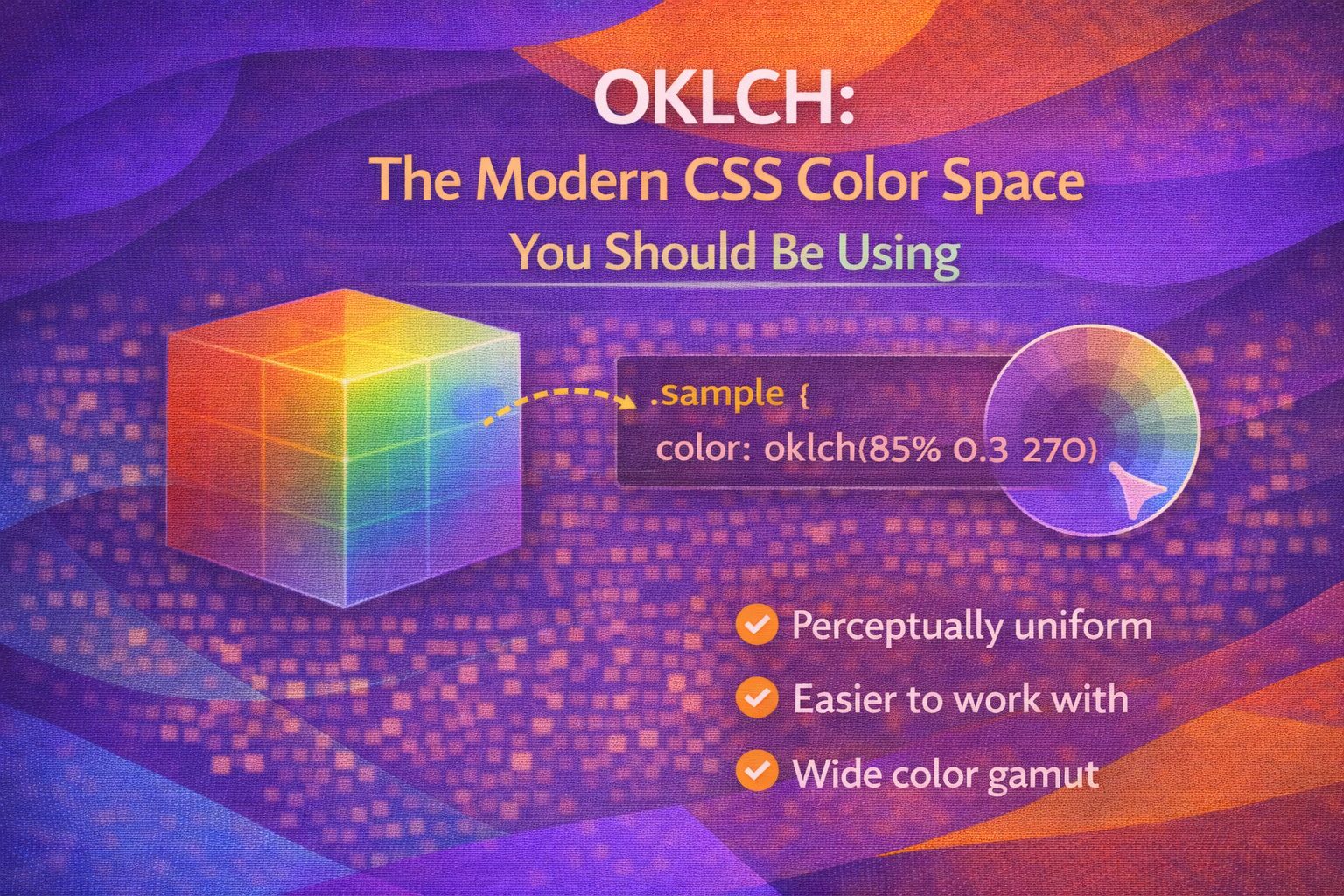
Let's be honest - HSL is broken. We've all tried to create a button hover state by tweaking lightness, only to find that 'yellow' at 50% lightness looks like neon sunbeams while 'blue' at 50% looks like a dark abyss. This happens because HSL isn't perceptually uniform, but thankfully, OKLCH is here to save our design systems.
The OKLCH Syntax
The syntax is refreshingly clean, using spaces instead of commas, and it consists of Lightness, Chroma, and Hue.
/* Basic OKLCH syntax */
.button-primary {
  background-color: oklch(60% 0.15 250);
  /* l: 60%, c: 0.15, h: 250 */
}

/* With transparency */
.card-overlay {
  background-color: oklch(40% 0.05 20 / 0.5);
}
What I love about this is that the Lightness (L) actually matches how our eyes perceive brightness, regardless of the Hue (H).
/* These two colors have the same perceived brightness */
.blue-box {
  background: oklch(70% 0.1 250);
}

.yellow-box {
  background: oklch(70% 0.1 80);
}Building Perceptually Uniform Scales
In a design system, you can create consistent palettes by keeping Chroma and Hue constant while only adjusting the Lightness.
:root {
  --brand-hue: 260;
  --brand-chroma: 0.18;

  --color-primary-100: oklch(95% var(--brand-chroma) var(--brand-hue));
  --color-primary-500: oklch(60% var(--brand-chroma) var(--brand-hue));
  --color-primary-900: oklch(20% var(--brand-chroma) var(--brand-hue));
}
This ensures your accessible contrast ratios remain predictable across different brand colors.
/* High contrast text example */
.text-on-dark {
  background: oklch(30% 0.1 260);
  color: oklch(95% 0.02 260);
}Relative Color Syntax (RCS)
The real game-changer is using OKLCH with the 'from' keyword to derive new colors from existing ones dynamically.
:root {
  --base-color: #3b82f6;
}

.button {
  background: var(--base-color);
}

.button:hover {
  /* Automatically darken any base color by 10% */
  background: oklch(from var(--base-color) calc(l - 0.1) c h);
}
You can even manipulate the saturation (Chroma) to create 'muted' versions of brand colors on the fly.
.card-disabled {
  /* Desaturate the color by half */
  border-color: oklch(from var(--base-color) l calc(c * 0.5) h);
}Handling Wide Gamut Colors
OKLCH isn't limited to the old sRGB gamut, meaning you can access those super-vibrant P3 colors that modern screens support.
/* A ridiculously vibrant pink that sRGB can't touch */
.vibrant-callout {
  background-color: oklch(65% 0.32 350);
}
Just be careful with the Chroma value; anything above 0.37 is usually outside the visible spectrum or display capabilities.
/* Safe middle-ground chroma for UI elements */
.ui-element {
  background-color: oklch(50% 0.12 150);
}Browser Support & Fallbacks
Support is excellent in modern browsers (Chrome 111+, Safari 15.4+, Firefox 113+), but we still need fallbacks for older environments.
/* Simple fallback approach */
.header {
  background-color: rgb(0, 100, 200);
  background-color: oklch(50% 0.15 240);
}

/* Feature query for complex overrides */
@supports (color: oklch(0% 0 0)) {
  .hero {
    background: linear-gradient(to right, oklch(60% 0.2 300), oklch(60% 0.2 200));
  }
}Wrapping Up
Switching to OKLCH has completely changed how I approach design systems. It's more intuitive, mathematically consistent, and ready for modern displays.
- Perceptual Uniformity: 50% lightness looks like 50% brightness regardless of hue.
- Wide Gamut: Access more vibrant colors than HSL or Hex can provide.
- Relative Syntax: Powerful color manipulation without needing a CSS preprocessor.
I highly recommend trying it out on your next project. Once you see the consistency it brings to your palettes, you won't want to go back to HSL!
If you want to go deeper and learn how to build real, production-ready CSS design systems step by step, check out my full course here: CSS Design Systems Course
Got questions or want to share how you're using this? Drop me a message on LinkedIn - I always enjoy chatting about this stuff!