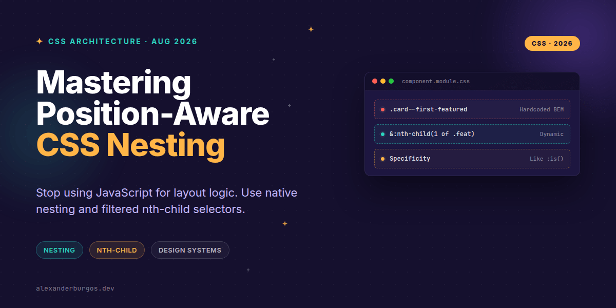
Right, let's talk about the death of the 'active-item' class. We've all been there: writing a React useEffect or a Vue computed property just to figure out which element is the third visible item in a filtered list so we can give it a specific border. It's brittle, it's noisy, and frankly, in 2026, it's unnecessary.
For years, we relied on BEM (Block Element Modifier) to keep our styles from leaking, but it resulted in massive class names and a lot of repetition. With the stability of CSS Nesting Level 1 and the of <selector> syntax for :nth-child(), the way we architect design systems has fundamentally shifted.
The Power of the Ampersand
Native CSS nesting isn't just Sass-lite; it's a fundamental change in how the browser parses our stylesheets. The W3C spec notes that "the nested rule can also use the nesting selector to directly refer to the parent rule’s matched elements." This means we can group our component logic in one place without the specificity wars of the past.
.card {
  padding: 2rem;
  border: 1px solid var(--grey-200);

  & .title {
    font-weight: 700;
    color: var(--primary);
  }

  &:hover {
    border-color: var(--primary);
  }
}
I've found that using the & selector makes code reviews significantly easier. You can see the entire scope of a component at a glance. But the real magic happens when we combine this structural locality with positional logic.
Position-Aware Styling with :nth-child(of ...)
Forget what you know about the old :nth-child. Previously, if you had a list where some items were hidden, :nth-child(2) would still count the hidden ones. This forced us to use JavaScript to track indices. Now, we have the of syntax.
As MDN explains, "by passing a selector argument, we can select the nth element that matches that selector." This allows us to target elements based on their position within a filtered subset of siblings.
.inventory-list {
  display: grid;

  /* Target only the odd items that are actually 'in-stock' */
  & > .item:nth-child(odd of .in-stock) {
    background-color: var(--highlight-green);
  }

  /* Target the first item that is 'featured' */
  & > .item:nth-child(1 of .featured) {
    grid-column: span 2;
    font-size: 1.5rem;
  }
}
Why This Matters for Design Systems
When building a design system, you want components to be resilient. If a user hides a row in a data table, you want the zebra-striping to adjust automatically. Previously, that required a re-render and a recalculation of classes. Now, the browser handles it natively.
- Reduced JS Payload: No more index tracking or 'is-first-visible' state logic.
- Cleaner DOM: We don't need to bloat our HTML with 'nth-style-x' utility classes.
- Maintainability: Styles related to position live inside the component nesting block, not scattered across global files.
Wrapping Up
- Use
&nesting to group component logic and keep specificity predictable (it behaves like:is()). - Leverage
:nth-child(An+B of .selector)to handle complex, filtered layouts without JavaScript. - Remember that native nesting is parsed by the browser, giving you better performance and debugging than preprocessor hacks.
I'd encourage you to open up your current project and see where you're using JS to manage layout indices. Try replacing one of those instances with a native CSS pattern—it's incredibly satisfying to delete that extra code.
If you want to go deeper and learn how to build real, production-ready CSS design systems step by step, check out my full course here: CSS Design Systems Course
I cover this and the other twenty-seven CSS shifts of 2026 in Modern CSS 2026 on Amazon, my catch-up book for people who learned CSS five years ago.
For more tips on CSS architecture and UX engineering, feel free to connect with me on Twitter or follow my updates on LinkedIn. Let's build a faster web together!