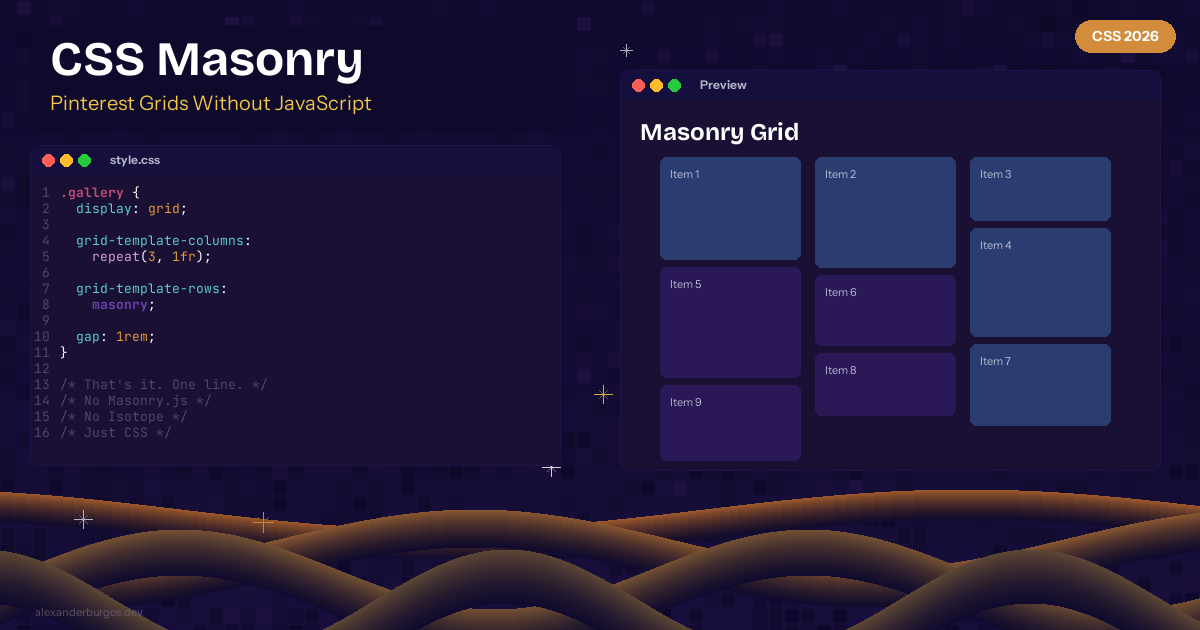
CSS Masonry Layout -- Pinterest-Style Grids Without JavaScript
Pinterest-style masonry layouts -- where items of different heights pack tightly into columns -- have always required JavaScript. Libraries like Masonry.js and Isotope have been the go-to for years. Not anymore.
CSS now supports native masonry layout with a single property. Experimental in Firefox and Chrome behind flags.
The Syntax
.gallery {
  display: grid;
  grid-template-columns: repeat(3, 1fr);
  grid-template-rows: masonry;
  gap: 1rem;
}
That's it. One line -- grid-template-rows: masonry -- and your grid items pack tightly without gaps.
Before vs After
/* Before: regular grid -- ugly gaps between different-height items */
.gallery {
  display: grid;
  grid-template-columns: repeat(3, 1fr);
  gap: 1rem;
  /* Items leave empty space below shorter ones */
}

/* After: masonry -- items pack tightly */
.gallery {
  display: grid;
  grid-template-columns: repeat(3, 1fr);
  grid-template-rows: masonry;
  gap: 1rem;
  /* No empty space. Pinterest-style layout. */
}
Responsive Masonry
Combine with responsive column counts for a fully adaptive layout:
.gallery {
  display: grid;
  grid-template-columns: repeat(auto-fill, minmax(250px, 1fr));
  grid-template-rows: masonry;
  gap: 1rem;
}
Browser Support
Experimental. Firefox (behind flag layout.css.grid-template-masonry-value). Chrome/Edge 140+ (behind flag). The spec is being finalised as 'CSS Grid Lanes.'
Let's be honest -- this has been one of the most requested CSS features for years. It's not production-ready yet, but it's coming fast. When it ships, an entire category of JavaScript libraries becomes obsolete.
Happy coding!
If you want to go deeper and learn how to build real, production-ready CSS design systems step by step, check out my full course here: CSS Design Systems Course If you found this helpful, I'd love to connect! Follow me on Twitter/X @alexandersstudi or LinkedIn for more CSS and design system tips.