We've all been there: you're building a beautiful, reusable Card component for your design system. You've got your padding set perfectly, but as soon as a user drops a heading or a paragraph inside, the vertical rhythm breaks. The top margin of the first element pushes against the container's padding, creating an awkward, uneven gap.
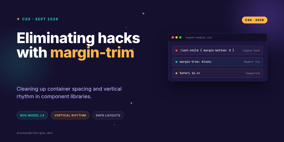
For years, our solution has been a messy collection of :first-child and :last-child resets. We've written thousands of lines of code just to tell CSS to stop doing what it was designed to do. But finally, there's a better way. Let's talk about margin-trim.
The Problem with the 'Last-Child' Hack
In a robust design system, we want components to be layout-agnostic. We want a <TextStack> to manage its own internal spacing without worrying about where it lives. However, margins are 'leaky'. If a paragraph has a margin-bottom of 1.5rem, that margin persists even when it's the very last item in a container, effectively doubling the perceived padding at the bottom.
I've seen (and written) some truly creative ways to solve this, usually involving variations of this CSS:
.container > *:first-child { margin-top: 0; }
.container > *:last-child { margin-bottom: 0; }
It works, sure. But it's brittle. It fails the moment you have nested wrappers, hidden elements, or complex selectors. It's a patch, not a solution.
Enter margin-trim
Defined in the CSS Box Model Module Level 4, margin-trim is a property applied to the container, not the children. It tells the container: "If a child's margin touches my edge, chop it off."
It's a surgical tool for layout safety. Instead of targeting specific children, the container becomes responsible for its own internal boundaries. Here's what the modern version looks like:
.stack-container {
  display: flex;
  flex-direction: column;
  padding: 2rem;
  margin-trim: block;
}
With margin-trim: block, the container will automatically truncate the margin-block-start of the first child and the margin-block-end of the last child. It's clean, declarative, and handles margin collapsing far more gracefully than manual overrides.
Logical Values for Global Systems
One of the reasons I'm so excited about this is the support for logical properties. As design system engineers, we have to think about RTL (right-to-left) and vertical writing modes. The spec gives us granular control:
block: Trims both start and end in the block axis.inline: Trims both start and end in the inline axis (perfect for flex-wrap rows).block-start/block-end: For when you only want to trim one side.
The Reality Check: Browser Support
Right, let's address the elephant in the room. As of late 2026, margin-trim is a WebKit superstar. It's been shipping in Safari 16.4+ and iOS Safari for a while now. However, Chrome and Firefox are still catching up.
Does that mean you shouldn't use it? Absolutely not. It's the perfect candidate for progressive enhancement. You can use @supports to apply it for Safari users while maintaining your legacy resets for other browsers, or simply let the extra margin exist as a 'non-breaking' visual bug in older browsers while the future is clean.
A Practical Example: The Chip Row
Imagine a row of filter chips that wraps onto multiple lines. Usually, you'd add margin-right and margin-bottom to every chip. But the chips on the far right shouldn't have that margin. margin-trim: inline solves this instantly.
.filter-group {
  display: flex;
  flex-wrap: wrap;
  margin-trim: inline;
}

.chip {
  margin-inline-end: 1rem;
  margin-block-end: 0.5rem;
}Wrapping Up
margin-trimshifts layout responsibility from the child to the container, making components more modular.- It eliminates the need for brittle
:first-childand:last-childselectors in your CSS architecture. - While support is currently strongest in Safari, it's a vital tool for the future of layout-safe design systems.
I highly encourage you to try this out in your next internal tool or Safari-heavy project. It feels remarkably 'correct' once you stop fighting the box model and start letting the container manage its boundaries.
If you want to go deeper and learn how to build real, production-ready CSS design systems step by step, check out my full course here: CSS Design Systems Course
I cover the full pipeline in Ship Your Design System, 200 pages on Amazon Kindle.
For more CSS architecture tips and design system deep-dives, let's connect on Twitter or LinkedIn.