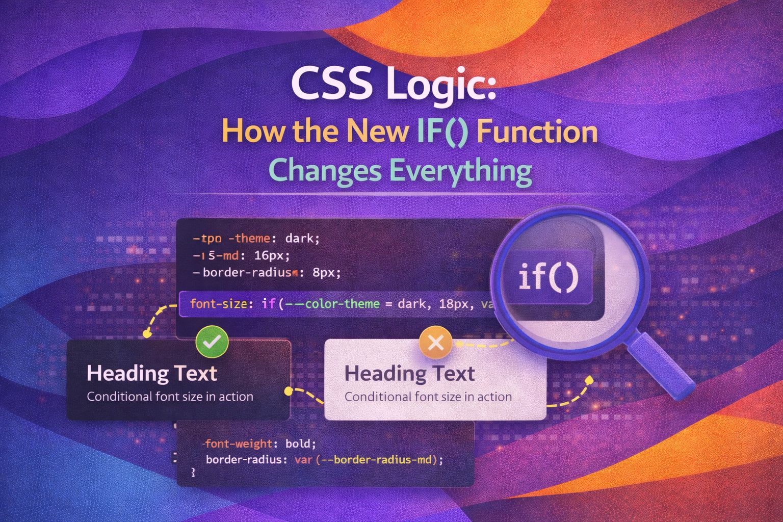
I've been waiting for this moment for years. Real conditional logic in CSS. Not hacks, not workarounds—actual if() statements that work exactly how you'd expect them to.
The CSS if() function landed in Chrome 137, and I honestly think this is one of the biggest additions to CSS since Grid. Let me show you why.
The Problem We've Been Solving Wrong
For years, we've been doing gymnastics with CSS custom properties to create "conditional" styles:
/* The old hacky way */
.button {
  --is-primary: 0;
  background: hsl(
    calc(var(--is-primary) * 174 + (1 - var(--is-primary)) * 220),
    84%,
    50%
  );
}

.button.primary {
  --is-primary: 1;
}
This works, but let's be honest—it's painful to read, hard to maintain, and completely unintuitive for anyone new to your codebase.
Enter the if() Function
The new if() function brings clean, readable conditional logic to CSS. Here's the basic syntax:
property: if(condition: value; else: fallback);
It supports three types of conditions:
- style() — checks custom property values
- media() — checks media query conditions
- supports() — checks feature support
Real Examples That Work Today
Style Queries: Theme Switching
This is probably the most exciting use case. You can now check the value of a CSS custom property and respond accordingly:
.card {
  background-color: if(
    style(--theme: dark): #1a1a1a;
    style(--theme: light): #ffffff;
    else: #f5f5f5;
  );

  color: if(
    style(--theme: dark): #f0f0f0;
    else: #1a1a1a;
  );
}
Set the property on a parent, and all children react:
:root {
  --theme: light;
}

/* Or toggle it */
:root.dark-mode {
  --theme: dark;
}
Media Queries: Responsive Values
No more separate media query blocks for simple value changes:
.container {
  padding: if(
    media(width >= 1024px): 4rem;
    media(width >= 768px): 2rem;
    else: 1rem;
  );

  margin: if(
    media(width >= 768px): 0 auto;
    else: 0 1rem;
  );
}
Feature Queries: Progressive Enhancement
Test for browser support right in your property value:
.element {
  color: if(
    supports(color: oklch(70% 0.15 200)): oklch(70% 0.15 200);
    else: #4ea8de;
  );
}
Combining Conditions with Logic Operators
You can use and, or, and not to create complex conditions:
.alert {
  background-color: if(
    style((--type: error) or (--type: critical)): #ef4444;
    style(--type: warning): #f59e0b;
    style(--type: success): #10b981;
    else: #6b7280;
  );
}
Or combine conditions:
.sidebar {
  width: if(
    media((width >= 1024px) and (width < 1440px)): 280px;
    media(width >= 1440px): 320px;
    else: 100%;
  );
}
Using if() Inside Other Functions
One powerful feature—you can nest if() inside other CSS functions:
.box {
  width: calc(100% - if(
    media(width >= 768px): 2rem;
    else: 1rem;
  ));
}
The Important Caveat: Browser Support
Here's the reality check. As of now, if() is supported in:
- Chrome 137+
- Edge 137+
- Opera 121+
It's not yet supported in Firefox or Safari.
This means you need fallbacks for production:
/* Fallback for browsers without if() support */
.card {
  background: #f5f5f5;
  background: if(
    style(--theme: dark): #1a1a1a;
    else: #f5f5f5;
  );
}
The browser will use the first background value if it doesn't understand if().
Why This Matters
The if() function isn't just syntactic sugar. It fundamentally changes what's possible in CSS:
- Component variants become trivial to implement
- Responsive design requires less code
- Theme systems are cleaner and more maintainable
- Progressive enhancement is built into your properties
We're moving toward CSS that reads like logic, not CSS that requires mental gymnastics to understand.
My Recommendation
Start experimenting with if() in personal projects today. For production, keep using your current approaches but add if() as progressive enhancement where it makes sense.
The future of CSS is conditional, and it's more readable than ever.