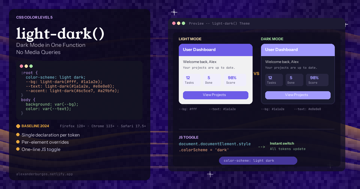
Let's be honest -- dark mode support in CSS has always been a bit of a pain. You define a beautiful set of custom properties for your light theme, then you open a prefers-color-scheme: dark media query and duplicate the entire block with different values. Every single variable. Twice.
Sound familiar?
And it gets worse. As your design system grows, those two blocks drift apart. Someone adds a new token to the light theme and forgets to add it to the dark one. Before you know it, your "dark mode" is a patchwork of missing values and inconsistent contrasts.
The good news is CSS now has a proper solution -- the light-dark() function. One function. Two values. No media queries. And it's supported in every major browser since May 2024.
What Is light-dark() and How Does It Work?
The light-dark() function takes exactly two arguments -- a value for light mode and a value for dark mode. The browser picks the right one based on the computed color-scheme of the element.
:root {
  color-scheme: light dark;
}

body {
  background-color: light-dark(#ffffff, #121212);
  color: light-dark(#1a1a1a, #e0e0e0);
}
That's it. The first value is for light mode, the second is for dark mode. The browser handles the rest.
But here's the thing -- light-dark() doesn't work on its own. You must set the color-scheme property somewhere in the element's ancestry. Without it, the function defaults to light and your dark values do nothing.
The Old Way vs. The New Way
The Old Way -- Media Queries and Duplication
:root {
  --bg-primary: #ffffff;
  --bg-secondary: #f5f5f5;
  --text-primary: #1a1a1a;
  --text-secondary: #555555;
  --border-color: #e0e0e0;
  --accent: #6366f1;
  --shadow: rgba(0, 0, 0, 0.1);
}

@media (prefers-color-scheme: dark) {
  :root {
    --bg-primary: #121212;
    --bg-secondary: #1e1e1e;
    --text-primary: #e0e0e0;
    --text-secondary: #a0a0a0;
    --border-color: #333333;
    --accent: #818cf8;
    --shadow: rgba(0, 0, 0, 0.4);
  }
}
Every variable declared twice. Seven variables means fourteen lines of token definitions. And if your design system has fifty tokens? Good luck keeping them in sync.
The New Way -- light-dark() in a Single Block
:root {
  color-scheme: light dark;

  --bg-primary: light-dark(#ffffff, #121212);
  --bg-secondary: light-dark(#f5f5f5, #1e1e1e);
  --text-primary: light-dark(#1a1a1a, #e0e0e0);
  --text-secondary: light-dark(#555555, #a0a0a0);
  --border-color: light-dark(#e0e0e0, #333333);
  --accent: light-dark(#6366f1, #818cf8);
  --shadow: light-dark(rgba(0, 0, 0, 0.1), rgba(0, 0, 0, 0.4));
}
Same result. Half the code. Zero duplication. Every token lives in one place, and you can see both the light and dark values at a glance.
Design Token Integration -- Primitive to Semantic
If you're building a proper design system, light-dark() fits beautifully into the primitive-to-semantic token architecture. Your primitive tokens don't change between themes. What changes is which primitive gets assigned to which purpose.
/* Primitive tokens */
:root {
  --color-white: #ffffff;
  --color-gray-50: #f9fafb;
  --color-gray-900: #111827;
  --color-gray-950: #030712;
  --color-indigo-500: #6366f1;
  --color-indigo-400: #818cf8;
}

/* Semantic tokens */
:root {
  color-scheme: light dark;

  --surface-primary: light-dark(var(--color-white), var(--color-gray-950));
  --text-primary: light-dark(var(--color-gray-900), var(--color-gray-50));
  --interactive: light-dark(var(--color-indigo-500), var(--color-indigo-400));
}
Your components only ever reference the semantic tokens. They never need to know whether the user is in light or dark mode. The token layer handles the entire mapping.
Per-Element Overrides -- Force Dark on a Widget
One of the most powerful features of color-scheme is that it's inherited. You can override it on specific elements to force a particular mode.
.cookie-banner {
  color-scheme: dark;
  background-color: light-dark(#ffffff, #1a1a1a);
  color: light-dark(#1a1a1a, #f0f0f0);
}
Because color-scheme: dark is set on the banner, light-dark() will always pick the dark value for that element and all its children. The rest of the page stays in the user's preferred mode.
JavaScript Toggle -- One Line of Code
// Toggle to dark mode
document.documentElement.style.colorScheme = 'dark';

// Toggle to light mode
document.documentElement.style.colorScheme = 'light';

// Respect system preference (reset)
document.documentElement.style.colorScheme = '';
One line. No toggling CSS classes, no swapping stylesheets. You change colorScheme on the root element and every single light-dark() value updates instantly.
Browser Support -- It's Already Here
- Firefox 120+ -- shipped November 2023 (first to ship!)
- Chrome 123+ -- shipped March 2024
- Safari 17.5+ -- shipped May 2024
- Edge 123+ -- same Chromium base
As of early 2026, global support is well above 90%. You can use light-dark() in production today.
The Critical Gotcha -- Not the Same as prefers-color-scheme
This trips people up. light-dark() checks the computed color-scheme of the element, not the user's OS preference. If you forget to set color-scheme: light dark, the function always returns the light value -- even on a dark OS.
This distinction is what makes per-element overrides work, but it can cause confusion. Always set color-scheme: light dark on :root.
Limitations
Colours only (for now). You can't use it for spacing, font sizes, or non-colour properties. For those, media queries are still needed.
Images coming soon. Chromium 148+ is adding image support inside light-dark().
No multi-theme. It's strictly light and dark. Custom themes need class-based approaches.
But colours are by far the most common thing you change between themes. light-dark() handles 80-90% of the work.
My Honest Take
I think light-dark() is one of the most practical CSS additions in recent years. The duplication problem was real. I've worked on projects where the light and dark variable blocks drifted so far apart that we had to write automated tests to keep them in sync.
The per-element override feature is genuinely powerful. Being able to force a component into dark mode with a single CSS property -- without JavaScript -- is the kind of thing that makes you wonder why we didn't have this sooner.
If you're starting a new project or refactoring your token system, there's no reason not to adopt light-dark() today.
Happy coding!
If you want to go deeper and learn how to build real, production-ready CSS design systems step by step, check out my full course here: CSS Design Systems Course
If you found this helpful, I'd love to connect! Follow me on Twitter/X @alexandersstudi or LinkedIn for more CSS and design system tips.