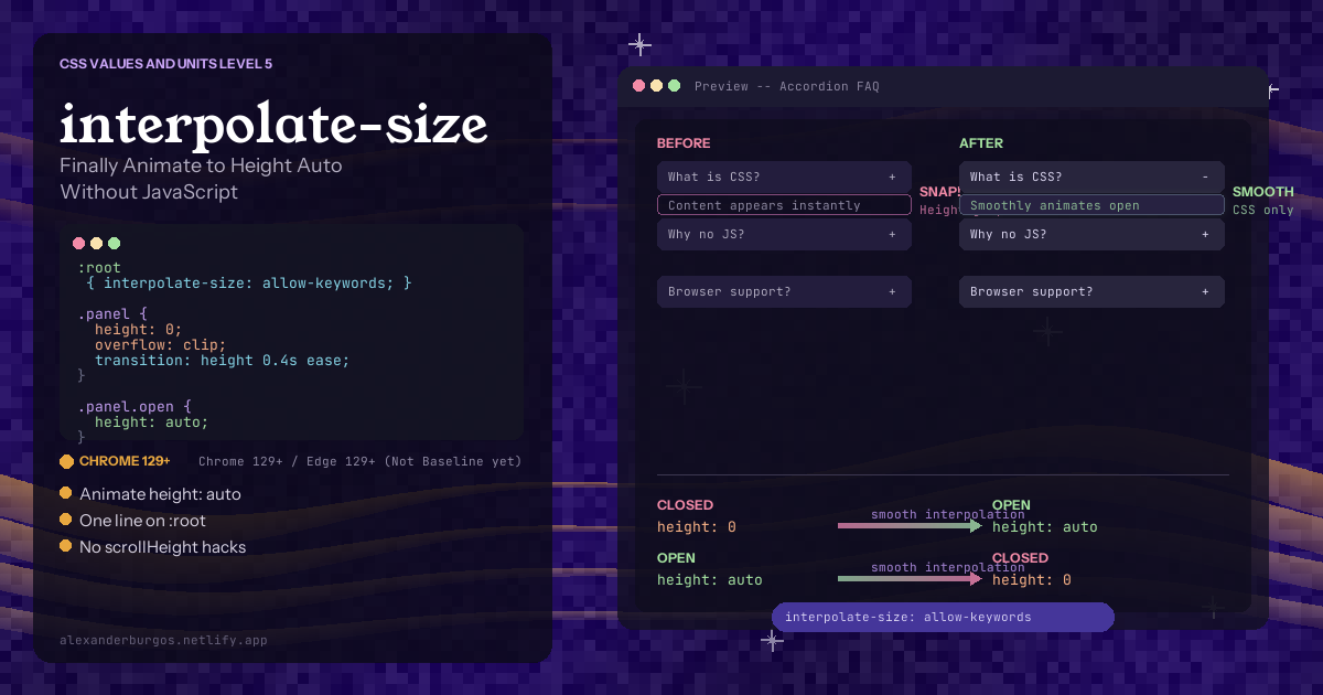
Let's be honest -- if there's one thing that has frustrated every single frontend developer at some point, it's trying to animate height: auto in CSS. You want a smooth accordion. You want a panel that expands to fit its content. Simple, right? Except CSS has never been able to transition between a fixed value like 0 and an intrinsic keyword like auto.
Sound familiar?
For over 20 years, developers have been using the same hacky workarounds. You measure scrollHeight with JavaScript, set a fixed pixel value, trigger a reflow, then switch back to auto after the transition ends. Or you use the infamous max-height: 9999px trick, which technically works but completely breaks your easing curve because the browser is transitioning from 0 to 9999 pixels when your content is only 200 pixels tall.
Here's the thing -- CSS now has a proper solution. One line of code. No JavaScript. No hacks. Just interpolate-size: allow-keywords on your :root and suddenly everything works.
Why Animating Height Auto Was Impossible
Before we get to the solution, it helps to understand why this was broken in the first place. CSS transitions work by interpolating between two numeric values over time. The browser calculates the intermediate steps -- halfway between 0px and 200px is 100px, for example.
But auto isn't a number. It's a keyword that tells the browser "figure out the right size based on the content." The browser had no defined way to calculate the steps between 0px and "figure it out." So it just snapped instantly.
The same problem applied to all intrinsic sizing keywords -- min-content, max-content, fit-content. None of them could participate in transitions.
The Classic Workarounds (And Why They're Bad)
Let's quickly review the hacks we've all used, so you can appreciate how much better the new solution is.
1. The scrollHeight JavaScript Hack
// Step 1: Measure the actual pixel height
const fullHeight = element.scrollHeight + 'px';

// Step 2: Set a fixed start value
element.style.height = '0px';

// Step 3: Force reflow (layout thrashing!)
element.offsetHeight;

// Step 4: Set the measured value to trigger transition
element.style.height = fullHeight;

// Step 5: After transition ends, snap back to auto
element.addEventListener('transitionend', () => {
  element.style.height = 'auto';
});
This causes layout thrashing (reading scrollHeight forces synchronous layout), it breaks if content changes during the animation, and it requires cleanup with event listeners. Not great.
2. The max-height: 9999px Trick
.panel {
  max-height: 0;
  overflow: hidden;
  transition: max-height 0.4s ease;
}

.panel.open {
  max-height: 9999px; /* Way too high */
}
This "works" but the easing is completely wrong. If your content is 200px tall, the browser is transitioning from 0 to 9999px. The visible animation finishes in the first 2% of the transition duration, making the easing curve meaningless. The closing animation is even worse -- the first 98% of the duration is invisible.
3. The grid-template-rows: 0fr Trick
.grid-wrapper {
  display: grid;
  grid-template-rows: 0fr;
  transition: grid-template-rows 0.4s ease;
}

.grid-wrapper.open {
  grid-template-rows: 1fr;
}

.grid-wrapper > .content {
  overflow: hidden;
}
This one actually works fairly well, but it requires a specific grid structure. You need a wrapper element and an inner content element. It's not a general-purpose solution.
The One-Line Fix: interpolate-size
Ready for it? Here's the entire solution:
:root {
  interpolate-size: allow-keywords;
}
That's it. One property on :root. Because interpolate-size is inherited, this applies to every element on the page. Now the browser knows it's allowed to interpolate between fixed values and intrinsic keywords.
With that single line, this CSS suddenly works:
.panel {
  height: 0;
  overflow: clip;
  transition: height 0.4s ease;
}

.panel.open {
  height: auto;
}
The panel smoothly animates from height: 0 to height: auto. No JavaScript. No hacks. No magic numbers. The browser calculates the actual content height and interpolates to it frame by frame.
The good news is that the default value is numeric-only (the old behaviour), so adding allow-keywords is a pure opt-in. It won't break any existing code on your site.
Why the Opt-In?
You might be wondering why the browser doesn't just do this by default. The CSS Working Group discovered that enabling keyword interpolation globally would break some existing stylesheets that assume intrinsic keywords can't be animated. Certain layouts depend on the snap behaviour. So they made it opt-in to maintain backwards compatibility.
My recommendation? Add it to your CSS reset and forget about it. Josh Comeau, the Utilitybend team, and others have already started recommending this as a default reset rule.
Practical Example: Smooth Accordion
Here's a complete accordion with smooth height animation and zero JavaScript for the animation logic (you still need a tiny bit of JS to toggle the open class):
:root {
  interpolate-size: allow-keywords;
}

.accordion-item {
  border-bottom: 1px solid var(--border);
}

.accordion-header {
  cursor: pointer;
  padding: 1rem;
  font-weight: 600;
}

.accordion-content {
  height: 0;
  overflow: clip;
  transition: height 0.35s ease;
  padding: 0 1rem;
}

.accordion-item.open .accordion-content {
  height: auto;
  padding: 0 1rem 1rem;
}
Notice I'm using overflow: clip instead of overflow: hidden. The clip value is better here because it doesn't create a scroll container, which avoids potential issues with nested scrollable elements and focus management.
Native Details Element
Even more exciting -- you can now animate the native HTML <details> element using the new ::details-content pseudo-element:
:root {
  interpolate-size: allow-keywords;
}

details {
  overflow: clip;
}

details::details-content {
  height: 0;
  overflow: clip;
  transition: height 0.3s ease,
    content-visibility 0.3s ease allow-discrete;
}

details[open]::details-content {
  height: auto;
}
This gives you a fully accessible, smooth-animating accordion with zero JavaScript. The <details> element handles all the toggling natively, and CSS handles the animation. The content-visibility transition with allow-discrete is needed because it's a discrete property that also needs to participate in the transition.
Expanding Navigation Labels
Another great use case -- navigation items that expand to show their full label on hover:
:root {
  interpolate-size: allow-keywords;
}

nav a {
  width: 48px;
  overflow-x: clip;
  white-space: nowrap;
  transition: width 0.3s ease;
}

nav a:hover {
  width: max-content;
}
The link smoothly expands from a fixed 48px (showing just an icon) to its natural max-content width (showing the full label). Previously this required JavaScript to measure the text width.
What About calc-size()?
The calc-size() function is the companion to interpolate-size. While interpolate-size just enables animation to/from keyword values, calc-size() lets you do actual maths with intrinsic sizes.
/* Animate to max-content plus some extra padding */
section:hover {
  height: calc-size(max-content, size + 2rem);
}

/* 70% of fit-content width */
.sidebar {
  width: calc-size(fit-content, size * 0.7);
}
The size keyword inside the calculation refers to the resolved value of the first argument. You can add, subtract, multiply, and even use round() functions on it.
Why not just add keywords to regular calc()? Two reasons: first, calc(max-content - min-content) is nonsensical, and calc-size() enforces that you can only use one keyword. Second, the browser's layout engine treats intrinsic keywords with special logic, and calc-size() preserves that behaviour.
Rule of thumb from Chrome DevRel: Use interpolate-size: allow-keywords all the time, and only reach for calc-size() when you need to do maths on the intrinsic value.
Browser Support
Here's the current state of browser support:
- Chrome 129+ -- shipped September 2024
- Edge 129+ -- same Chromium base
- Opera 129+ -- follows Chromium
- Firefox -- in development (positive standards position, active Bugzilla work)
- Safari -- under consideration (WebKit standards-positions issue open)
This is NOT Baseline yet -- it's Chromium-only for now. But that covers roughly 65-70% of global users, and the feature degrades perfectly. In unsupported browsers, elements still change state -- they just snap instead of animating. No broken layouts, no errors.
You can use feature detection to be safe:
@supports (interpolate-size: allow-keywords) {
  :root {
    interpolate-size: allow-keywords;
  }
}
My honest take? Start using it now behind @supports. Your Chrome/Edge users get smooth animations, everyone else gets the same functional experience without the animation. Progressive enhancement at its best.
Gotchas and Limitations
It's not all smooth sailing. Here are the things I've learnt the hard way:
1. Can't interpolate between two keywords. Going from height: auto to height: max-content won't animate. One end must be a fixed <length-percentage> value.
2. You need overflow: clip or hidden. Without it, content spills out during the transition as the height grows from 0 to auto. Almost always pair height: 0 with overflow: clip.
3. Accessibility with height: 0. Elements collapsed with height: 0; overflow: hidden still have focusable children that are reachable via keyboard and screen readers. You might need visibility: hidden or the inert attribute to truly hide them from assistive technology.
4. calc-size() needs fallbacks. Unlike interpolate-size (which is harmless if unsupported), calc-size() will invalidate the entire property declaration in unsupported browsers. Always provide a fallback value before it.
5. Performance. Animating height triggers layout recalculation every frame. This is the same performance concern as any height animation -- it's not unique to interpolate-size. But it's still better than the JavaScript scrollHeight approach because there's no layout thrashing from forced reflows.
My Honest Take
interpolate-size: allow-keywords is one of those features that makes you think "why didn't we have this 15 years ago?" The amount of JavaScript that's been written just to animate a panel open is staggering, and most of it was fragile, performance-heavy, and unnecessary.
Yes, it's Chromium-only for now. But Firefox and Safari are actively working on it, and the progressive enhancement story is perfect. Add it to your reset today and your users get a better experience the moment their browser catches up.
The combination of interpolate-size, @starting-style, and scroll-driven animations means we're entering an era where CSS handles 90% of the animations that used to require JavaScript. As someone who's been building design systems for years, I couldn't be more excited about where CSS is heading.
Add that one line to your reset. Delete the scrollHeight hack. Your future self will thank you.
Happy coding!
If you want to go deeper and learn how to build real, production-ready CSS design systems step by step, check out my full course here: CSS Design Systems Course
If you found this helpful, I'd love to connect! Follow me on Twitter/X @alexandersstudi or LinkedIn for more CSS and design system tips.