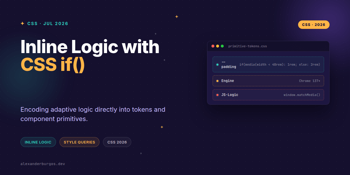
Ever wondered why we're still jumping through hoops to change a single value based on a media query? For years, if we wanted a button's padding to change based on screen size or a theme, we had to write separate blocks of CSS, create utility classes, or worse—handle it in JavaScript.
The arrival of the if() function in CSS changes the game for those of us building design systems. It's a value-level conditional that lets us put the logic exactly where the data lives. No more jumping between lines 50 and 500 of a stylesheet just to see how a component adapts.
What is the CSS if() function?
At its heart, if() is a value function. It allows you to set different values for a property depending on the result of a test. According to the MDN documentation, it works inside the value of any property, making it incredibly versatile.
The syntax is straightforward: you provide a series of condition-value pairs separated by semicolons, and optionally an else branch. As of Chrome 137, we can query three specific things: style(), media(), and supports().
.card {
  padding: if(
    media(width < 40rem): 1rem;
    media(width >= 40rem): 2rem;
    else: 1.5rem
  );
}
I've found this shift remarkably liberating. Instead of the CSS engine looking at the selector to decide which block to apply, the property itself becomes 'smart'. It knows how it should behave in different contexts.
Encoding logic into Design Tokens
In a design system, we often struggle with 'contextual tokens'. You might have a --surface-primary token that needs to be white in light mode but deep grey in dark mode. Traditionally, we'd redefine that variable inside a [data-theme='dark'] selector.
With if() and style queries, we can encode that logic directly into the token definition. This is a massive win for maintainability because the 'truth' of how a token adapts stays in one place.
:root {
  --theme: light;
  --bg-color: if(
    style(--theme: dark): #1a1a1a;
    style(--theme: light): #ffffff;
    else: #f0f0f0
  );
}
It's worth noting that style queries currently work best with CSS custom properties. You aren't querying the DOM state in an imperative way; you're querying the computed values of other properties. It's declarative, clean, and stays within the CSS engine.
Replacing JavaScript and Preprocessor Hacks
We've all seen those React components that use useWindowSize hooks just to toggle a padding class. It's a performance hit and causes layout shift during hydration. if() eliminates the need for that for a vast majority of use cases.
Similarly, Sass mixins that generate dozens of utility classes for every breakpoint can be refactored. Instead of p-sm-2 p-md-4, you have a single padding property that handles its own responsiveness.
Common Gotchas to Watch Out For
Right, let's talk about the sharp edges. First, if() is not a replacement for Media Queries or Container Queries when it comes to layout. If you need to change a grid-template-areas layout, a standard media query is still your best friend.
- Browser Support: It's early days. Chrome 137+ is the primary target right now. Always use progressive enhancement.
- Complexity: Just because you can nest conditionals doesn't mean you should. Keep your logic readable.
- Fallbacks: If a browser doesn't understand
if(), it will ignore the entire property declaration. Provide a fallback value above the conditional.
.component {
  /* Fallback for older browsers */
  padding: 1rem;
  /* Modern logic */
  padding: if(media(width > 1200px): 2rem; else: 1rem);
}Wrapping Up
- Use
if()to move micro-decisions out of JS and into CSS tokens. - Leverage
style()queries to create self-adapting theme variables. - Always provide a standard property declaration as a fallback for non-supporting browsers.
I'm genuinely excited to see how this cleans up our component libraries. Start experimenting with it in your internal tools or Chromium-only environments to get a feel for the workflow shift.
If you want to go deeper and learn how to build real, production-ready CSS design systems step by step, check out my full course here: CSS Design Systems Course
If this is the kind of thing you keep finding out late about, my book Modern CSS 2026 on Amazon is one chapter per shift, with honest support labels.
Let's chat about CSS architecture over on Twitter or connect with me on LinkedIn to stay updated with the latest in UX Engineering.