Okay, I'm genuinely excited about this. We've spent years jumping through hoops to make our design systems truly adaptive, usually relying on a messy cocktail of JavaScript props and complex CSS variable mapping. But the game is changing.
The new CSS if() function is finally here, and it's set to kill off those tiny, annoying pockets of logic that have traditionally lived in our React or Vue components. I've been playing with it in Chrome 137+, and it's a breath of fresh air for anyone managing a design system.
What is CSS if() anyway?
In simple terms, if() is an inline conditional function. It allows a single CSS property to choose its value based on a condition—like a style query, a media query, or even a support query—right there in the declaration.
It follows a clean syntax: property: if(condition: value; else: fallback);. It's important to note that this isn't a replacement for @media rules that handle big layout shifts. Instead, it's a precision tool for property-level decisions.
Killing the JS "Density Prop"
We've all been there: building a button component that needs 'compact', 'default', and 'comfy' modes. Usually, we pass a density prop in React, which then maps to a specific CSS class or sets a bunch of inline styles. It's extra code that doesn't really belong in our logic layer.
With if(), we can handle this entirely within our CSS using style queries. Check out how much cleaner this feels:
.button {
  padding: if(
    style(--density: compact): 0.375rem 0.75rem;
    style(--density: comfy): 0.75rem 1rem;
    else: 0.625rem 0.875rem
  );
  font-size: if(
    style(--density: compact): 0.875rem;
    else: 1rem
  );
}
Now, your JavaScript only needs to update one custom property (--density), and the CSS handles the rest. No more mapping objects or complex template literals in your component files.
Theming Without the Headache
Theming is another area where if() shines. Instead of wrapping every single property in a dark-mode selector or relying on massive token files that branch at the root, you can make local decisions.
.card {
  background: if(
    style(--theme: dark): #111;
    else: #fff
  );
  color: if(
    style(--theme: dark): #eee;
    else: #111
  );
}
I've found this particularly useful for "component-level" theming, where you might want a specific section of your app to stay dark even if the rest is light. It keeps the logic encapsulated within the component style itself.
Responsive Variants Made Easy
We've traditionally used media queries to change values, but that often leads to fragmented code where one property's logic is spread across three different places in a stylesheet. if() lets us bring that logic back to the property it affects.
.panel {
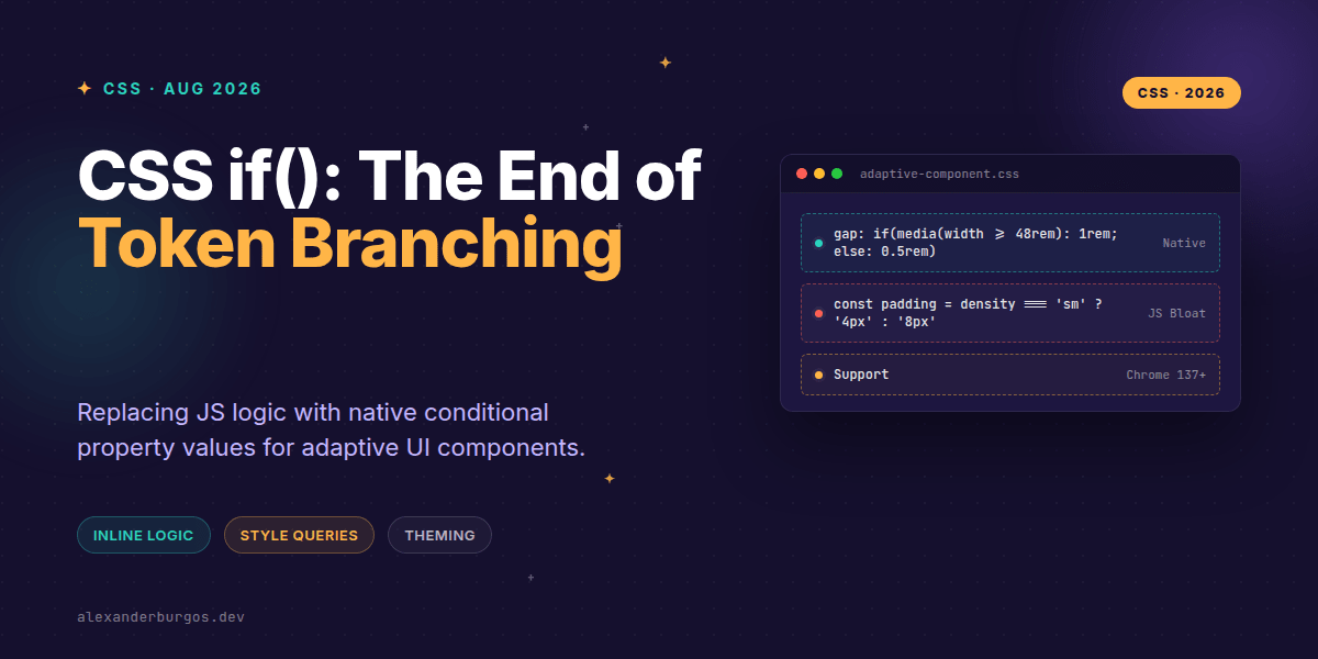
  gap: if(
    media(width >= 48rem): 1rem;
    else: 0.5rem
  );
}
It's concise, readable, and keeps the 'intent' of the property clear. You're saying: "This gap is 1rem on large screens, otherwise it's 0.5rem." Simple.
The Reality Check: Support and Performance
Now, I have to be the bearer of some slightly sober news. As of right now, this is experimental. Chrome 137 and other Chromium-based browsers are the only ones supporting it. If you're building for a broad audience today, you'll need to use progressive enhancement.
Also, don't go overboard with nesting. While you can nest if() functions, it can quickly become a debugging nightmare. Treat it like you would an if/else in JavaScript—if it gets too complex, it might be time to rethink your architecture.
Wrapping Up
- Use
if()to move component-level logic (like density and themes) from JS to CSS. - Stick to property-level decisions; keep layout orchestration in
@mediaand container queries. - Always provide a fallback value using the
else:keyword to ensure your UI doesn't break.
I'd highly recommend opening up Chrome Canary and giving this a spin. It's one of those features that feels like a 'missing piece' of the CSS puzzle.
If you want to go deeper and learn how to build real, production-ready CSS design systems step by step, check out my full course here: CSS Design Systems Course
If this is the kind of thing you keep finding out late about, my book Modern CSS 2026 on Amazon is one chapter per shift, with honest support labels.
Let's keep the conversation going! You can find me sharing more CSS tips on Twitter or connect with me for more design system talk on LinkedIn.