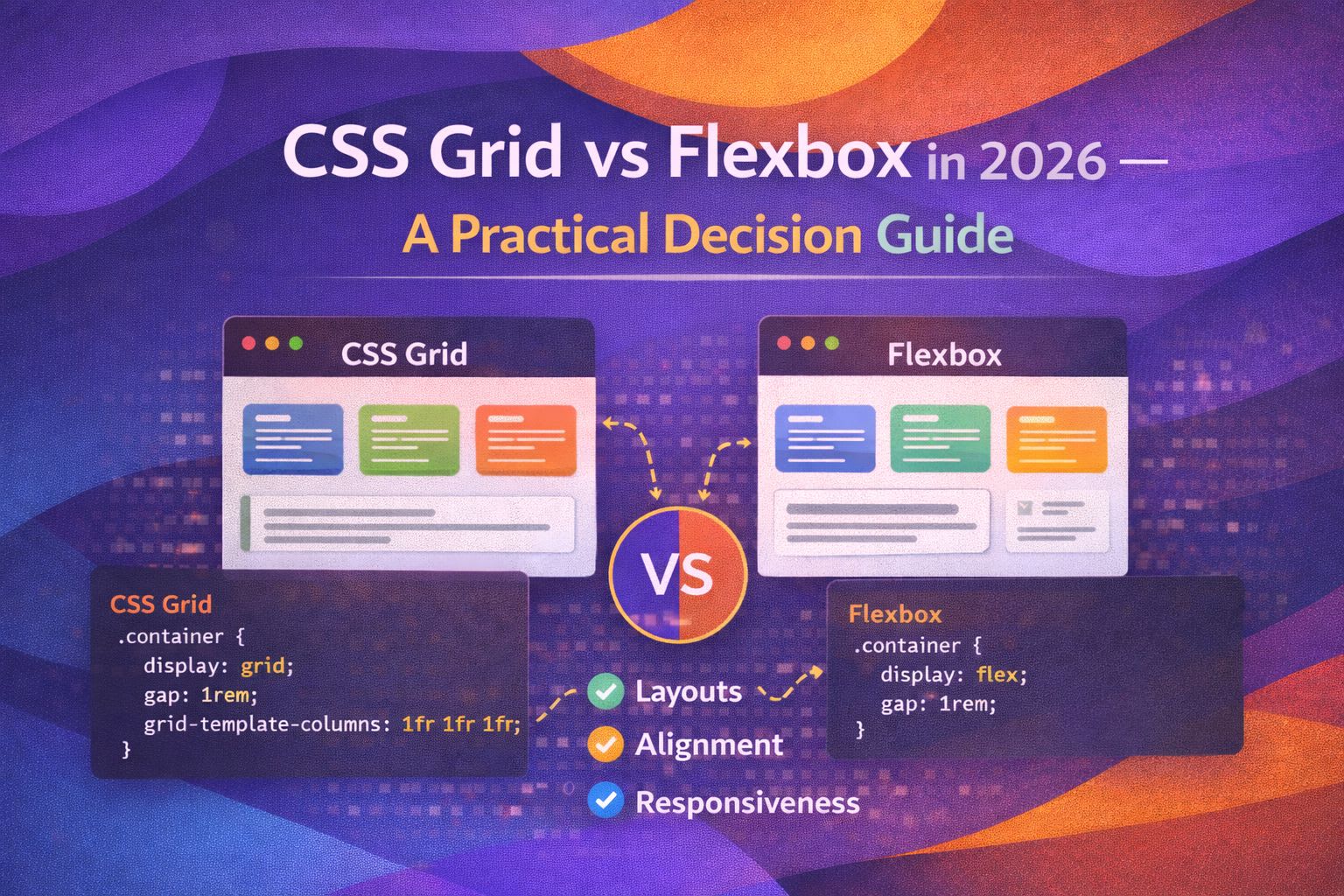
By 2026, the 'Grid vs Flexbox' debate has matured into a beautiful partnership. I've spent years building design systems, and I've found that choosing between them isn't about which is 'better', but about whether you're thinking in one dimension or two.
Flexbox: The One-Dimensional Specialist
I personally love Flexbox for UI components where items need to flow naturally and distribute space along a single axis. It's my go-to for navigation bars, button groups, and simple card headers.
/* The classic modern navbar pattern */
.nav-container {
  display: flex;
  justify-content: space-between;
  align-items: center;
  gap: 1.5rem;
  padding: 1rem 2rem;
}
This setup allows the logo and the menu to push to opposite ends while keeping everything vertically centered. For the individual items inside that menu, I'll often use the shorthand `flex` property to control growth.
/* Flexible item control */
.nav-item {
  flex: 0 1 auto; /* Don't grow, allow shrink, use content size */
}

.search-input {
  flex: 1 1 200px; /* Grow to fill space, start at 200px */
}CSS Grid: The Two-Dimensional Powerhouse
When I'm building a page skeleton or a complex dashboard, Grid is non-negotiable. It gives you control over both rows and columns simultaneously, which Flexbox simply wasn't designed to do.
/* A standard 2026 dashboard layout */
.dashboard-layout {
  display: grid;
  grid-template-columns: 240px 1fr;
  grid-template-rows: auto 1fr auto;
  min-height: 100vh;
  gap: 0;
}
I then use line-based placement to ensure the header and footer span the entire width, regardless of the sidebar.
.header, .footer {
  grid-column: 1 / -1; /* Span from first line to last */
}

.sidebar {
  grid-column: 1 / 2;
  grid-row: 2;
}

.main-content {
  grid-column: 2 / 3;
  grid-row: 2;
}The 'Auto-Magic' Responsive Grid
One of the most powerful tricks I use daily is the `auto-fit` pattern. It handles responsiveness without a single media query, which is a massive win for maintainability.
/* The responsive grid without media queries */
.product-grid {
  display: grid;
  grid-template-columns: repeat(auto-fit, minmax(280px, 1fr));
  gap: 2rem;
}
In this example, the browser automatically calculates how many 280px columns fit, then stretches them to fill the remaining space. Here's how I apply it to a React component for a design system.
// React Component Example
const CardGrid = ({ children }) => {
  return (
    <div style={{
      display: 'grid',
      gridTemplateColumns: 'repeat(auto-fit, minmax(300px, 1fr))',
      gap: 'var(--spacing-lg)',
      padding: 'var(--spacing-md)'
    }}>
      {children}
    </div>
  );
};Subgrid: The Game Changer
In 2026, Subgrid is fully supported and it's changed how I handle card alignment. It allows child elements to snap to the parent's grid lines, ensuring headers and footers in different cards always align perfectly.
/* Aligning card internals across different cards */
.card-container {
  display: grid;
  grid-template-columns: repeat(3, 1fr);
  grid-auto-rows: auto auto auto; /* Header, Body, Footer */
}

.card {
  display: grid;
  grid-row: span 3; /* Occupy three rows of parent */
  grid-template-rows: subgrid; /* Inherit the parent's row sizing */
}
This ensures that if one card has a longer title, the titles in all other cards in that row expand to match. It's a massive improvement over old 'equal height' hacks.
Browser Support
As of 2026, both Flexbox and CSS Grid (Level 1 and Level 2 Subgrid) are universally supported across all evergreen browsers. You can safely use these in production without heavy fallbacks unless you're supporting extremely ancient legacy systems
Wrapping Up
The secret to a great layout is knowing when to switch tools. I use Flexbox for content-driven, linear items and Grid for layout-driven, structural items.
- Use Flexbox for 1D layouts where items should dictate their own size.
- Use CSS Grid for 2D layouts and complex page structures.
- Leverage Subgrid to align internal component elements across grid items.
- Stop using media queries for grids by mastering `minmax()` and `auto-fit`.
I'd highly recommend jumping into a CodePen and trying to rebuild a complex dashboard using only these two tools—it's incredibly satisfying once it clicks! If you found this helpful, I'd love to connect! Follow me on Twitter/X or LinkedIn for more CSS and design system tips.