CSS Gap Decorations -- Style Grid and Flex Gaps Natively
Adding divider lines between grid items has always required extra DOM elements or pseudo-element hacks. It's one of those things that feels like it should be simple but never was. Sound familiar?
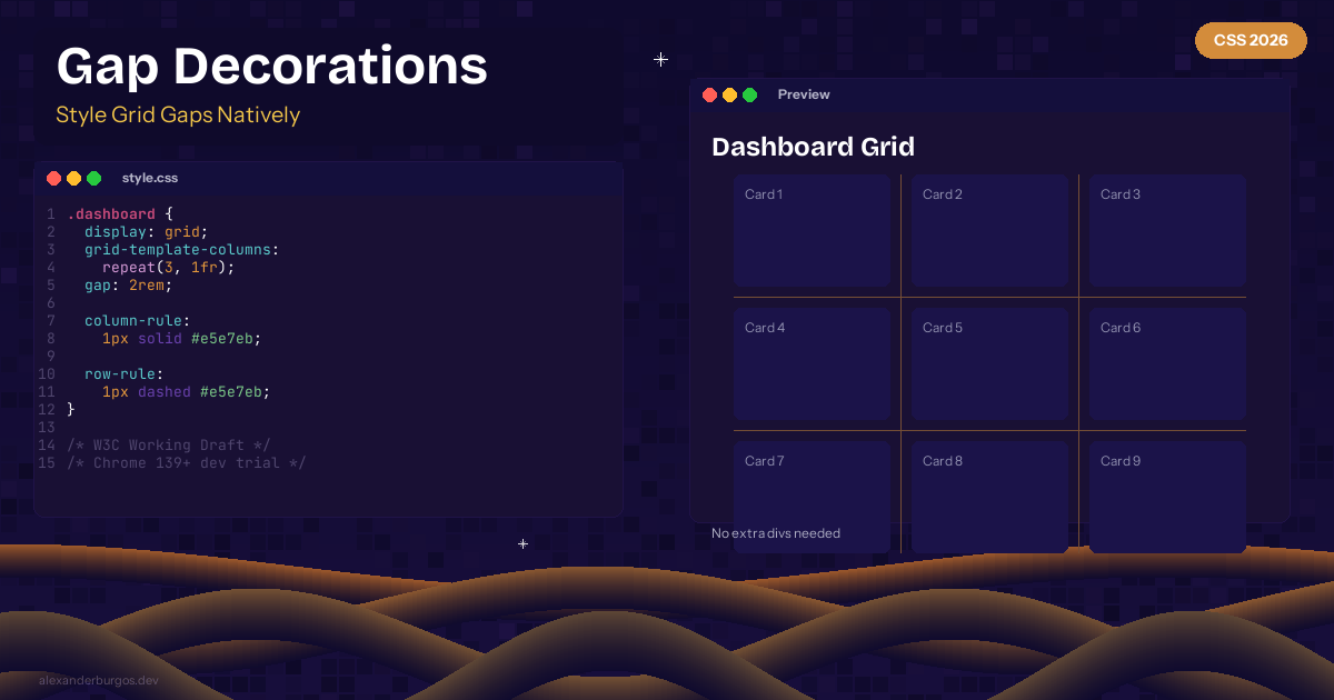
CSS Gap Decorations solve this with column-rule and row-rule properties for grid and flex containers. Chrome 139+ developer trial.
The Syntax
.dashboard {
  display: grid;
  grid-template-columns: repeat(3, 1fr);
  gap: 2rem;
  column-rule: 1px solid #e5e7eb;
  row-rule: 1px dashed #e5e7eb;
}
Styling Options
Gap decorations support the same syntax as border -- width, style, and colour:
.sidebar-layout {
  display: flex;
  gap: 1.5rem;
  column-rule: 2px solid var(--border-color);
  column-rule-break: intersection; /* How rules cross at intersections */
}
Why This Matters
- No extra DOM elements for dividers
- Works with both grid and flexbox
- Supports all border styles -- solid, dashed, dotted, double
- Respects gap sizing automatically
- Part of CSS Gaps Level 1 specification (W3C Working Draft March 2026)
Browser Support
Chrome/Edge 139+ (developer trial). Enable via chrome://flags/#enable-experimental-web-platform-features. W3C Working Draft published March 2026 -- expect broader support soon.
Here's the thing -- this is one of those features that seems small but saves you from writing hacky CSS every single time you need a grid with separators.
Happy coding!
If you want to go deeper and learn how to build real, production-ready CSS design systems step by step, check out my full course here: CSS Design Systems Course If you found this helpful, I'd love to connect! Follow me on Twitter/X @alexandersstudi or LinkedIn for more CSS and design system tips.