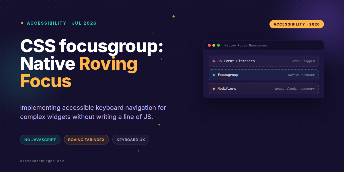
Ever wondered why we're still writing hundreds of lines of JavaScript just to move focus between buttons in a toolbar? It's one of those "web development taxes" we've all paid for years. We want a group of elements to act as a single tab stop, with arrow keys handling the internal navigation—the classic "roving tabindex" pattern.
Last week, I was auditing a design system's menu component and the focus management logic was, frankly, a bit of a nightmare. Between tracking indices, handling Home/End keys, and ensuring focus returns to the right spot, the maintenance cost is huge. But there's a light at the end of the tunnel called focusgroup.
What is focusgroup?
Proposed through Open UI and currently being incubated in Chromium, focusgroup is an HTML attribute that tells the browser: "Hey, manage the keyboard navigation for these children so I don't have to." It turns a subtree of focusable elements into a coordinated unit.
In essence, it provides built-in keyboard behaviours for moving focus among a list or grid. When you apply it, the entire group becomes a single tab stop. Once a user tabs into the group, the browser takes over, using arrow keys to move focus between the items. It's the native implementation of a pattern we've been hacking together with JS for decades.
The End of Roving Tabindex Boilerplate
Travis Leithead from the Open UI team explained it perfectly: this proposal enables authors to add built-in keyboard behaviours "without having to write common boilerplate code (e.g., roving tabindex)." If you've ever written a useEffect hook in React just to manage tabIndex={-1} vs tabIndex={0}, you'll know exactly how much friction this removes.
Let's look at a basic horizontal toolbar. Normally, this would require event listeners for keydown. With the new spec, it looks like this:
<div focusgroup="toolbar inline">
  <button type="button">Bold</button>
  <button type="button">Italic</button>
  <button type="button">Underline</button>
</div>
With those two words in the attribute, the browser handles the Left and Right arrow keys automatically. It even remembers which button was last focused, so if a user tabs out and tabs back in, they land right where they left off.
Fine-Tuning the UX with Modifiers
The beauty of focusgroup isn't just that it moves focus; it's how configurable it is. We often need specific behaviours for different components like carousels or dropdown menus. Here are the primary modifiers you'll use:
- wrap: This allows focus to loop from the last item back to the first. Essential for carousels.
- inline / block: Restricts navigation to specific axes. Use
inlinefor toolbars andblockfor vertical menus. - nomemory: By default, the browser remembers the last focused item. Use this if you want the user to always start at the first item when they tab into the group.
- focusgroupstart: A way to explicitly define which element should receive focus first.
For a navigation menu where you want looping and a fresh start every time, you'd compose it like this:
<nav focusgroup="menu inline wrap nomemory">
  <button>Home</button>
  <button>Products</button>
  <button>Contact</button>
</nav>
The Participation Rules
One thing I love about this spec is how it handles hierarchy. Only "sequentially focusable" descendants participate. This means native elements like buttons and anchors, or anything with a tabindex of 0 or higher. Elements with tabindex="-1" are ignored by the focusgroup logic.
Nested groups are also handled gracefully. If you put a focusgroup inside another one, the nested group becomes its own independent scope. It automatically opts out of the parent's arrow navigation, which is exactly what you want for complex dashboard layouts.
Important: It's Only About Focus
A common misconception is that focusgroup replaces all component logic. It doesn't. As noted in the W3C TPAC minutes, the proposal "doesn't change state or anything." It moves the focus ring, but it won't select a tab or toggle a radio button for you. You still need your React or vanilla JS logic to handle the actual 'activation' or 'selection' of the items.
Browser Support and Fallbacks
Right now, focusgroup is in the experimental phase. In Microsoft Edge or Chrome, you'll likely need to enable the "Experimental Web Platform features" flag to see it in action. Because it's not yet baseline, we can't just delete our JS logic yet.
The recommended approach for design system authors is to perform a feature check. If the browser doesn't support the attribute, fall back to your existing JavaScript-based roving tabindex implementation. It's progressive enhancement for keyboard accessibility.
Wrapping Up
focusgroupeliminates the need for manual roving tabindex JS by making arrow-key navigation a native browser feature.- Use modifiers like
wrapandnomemoryto tailor the UX to specific components like toolbars or menus. - Remember that it only manages focus movement—you're still responsible for handling state changes and ARIA roles.
I'm genuinely excited about this. It's a massive step toward making the web more accessible by default. I encourage you to turn on the flags in Edge or Chrome and try refactoring one of your simpler toolbars. You'll be amazed at how much code just... disappears.
If you want to go deeper and learn how to build real, production-ready CSS design systems step by step, check out my full course here: CSS Design Systems Course
If you want the long-form version of this with 23 chapters and runnable code, Ship Your Design System on Amazon is the handbook.
Have you tried experimenting with focusgroup yet? Let me know your thoughts over on Twitter or connect with me on LinkedIn to chat more about CSS architecture.