Ever wondered why some of the world's biggest apps still feel 'broken' when you switch them to Arabic or Hebrew? It's usually because the layout was built on a foundation of physical directions—left and right—rather than logical ones.
In the past, we relied on heavy JavaScript hacks or duplicated stylesheets (remember style-rtl.css?) to handle bidirectional (bidi) layouts. But it's 2026, and modern CSS has finally given us the tools to handle language and direction as first-class citizens in our design systems.
The Semantic Foundation: dir and lang
Before we touch a single line of CSS, we need to talk about the HTML. Google's internationalisation guidance is clear: language and directionality are inherent to the content itself. You should always use the lang and dir attributes on your <html> element.
<html lang="ar" dir="rtl">
  <!-- Your app lives here -->
</html>
The dir attribute accepts three values: ltr, rtl, and auto. While auto sounds tempting (it lets the browser decide based on the first character with strong directionality), for a design system, you'll usually want to explicitly control this at the document or component level.
The Power of :lang() and :dir()
I've found that many developers confuse document language with browser language. It's important to remember: you cannot identify the browser's UI language with CSS alone. The :lang() pseudo-class looks specifically at the lang attribute of your elements or their ancestors.
This is incredibly useful for typography. Different languages often require different line heights or font stacks to remain legible. For example:
/* Adjust line-height for Arabic script */
article:lang(ar) {
  line-height: 1.8;
  font-family: 'Noto Sans Arabic', sans-serif;
}
Then we have :dir(). This pseudo-class is the 'new kid on the block'. Unlike an attribute selector like [dir="rtl"], which only matches if the attribute is explicitly present on that exact element, :dir() matches based on the computed direction.
However, here's a reality check: as noted by CSS-Tricks, support for :dir() has historically been limited mostly to Firefox. While it's gaining ground, for most production design systems today, using the attribute selector [dir="rtl"] is still the most robust approach for cross-browser compatibility.
Logical Properties: The Real Game Changer
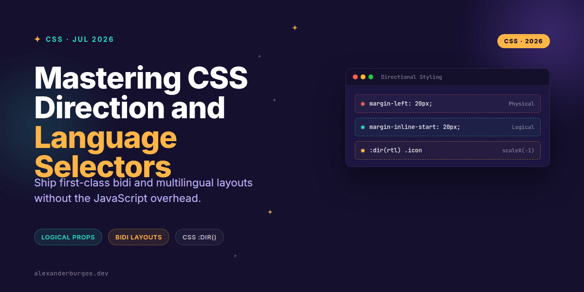
If you're still writing margin-left, you're making life harder for yourself. The W3C defines logical properties to map layouts to 'inline' and 'block' axes rather than physical ones. This means your layout automatically mirrors itself when the direction changes.
- margin-inline-start instead of margin-left
- padding-inline-end instead of padding-right
- inset-inline-start instead of left
- text-align: start instead of text-align: left
By using these, your CSS becomes 'direction-agnostic'. You write it once, and it works for both London and Dubai.
Handling Icons and Motion
We've all been there: you flip the layout to RTL, but the 'back' arrow is still pointing left. That's a classic UX failure. Some icons need to flip, while others (like a search magnifying glass or a checkmark) should stay exactly as they are.
In my experience, the cleanest way to handle this in a design system is to use a global utility or a component prop that hooks into the direction attribute.
/* Flip directional icons automatically */
[dir="rtl"] .icon-mirror-rtl {
  transform: scaleX(-1);
}

/* Slide-in animations using logical values */
@keyframes slideIn {
  from {
    transform: translateX(var(--slide-dist));
  }
  to {
    transform: translateX(0);
  }
}

[dir="ltr"] { --slide-dist: -100%; }
[dir="rtl"] { --slide-dist: 100%; }
Notice how the animation needs careful thought. In LTR, a 'slide-in' might come from the left (-100%). In RTL, that same 'start' position is on the right, so we need to invert the value. This is where CSS variables combined with direction selectors really shine.
Common Pitfalls to Avoid
Don't fall into the trap of inventing your own classes like .is-rtl. Stick to the standard dir attribute. It's not just about styling; it's about accessibility. Screen readers and layout engines rely on these standard attributes to interpret your content correctly.
Also, watch out for box shadows. If your design has a light source coming from the top-left, you might need to adjust the X-offset of your shadows when switching to RTL to maintain visual consistency.
Wrapping Up
- Use
dir="rtl"andlang="..."on the HTML element as your source of truth. - Adopt logical properties (
inline-start,block-end) to eliminate 90% of your RTL styling debt. - Selectively flip icons and animations using
[dir="rtl"]or:dir(rtl)where supported.
I encourage you to try refactoring just one component using logical properties today. You'll be surprised at how much 'hacker' CSS you can delete.
If you want to go deeper and learn how to build real, production-ready CSS design systems step by step, check out my full course here: CSS Design Systems Course
The full story including the testing layers and governance lives in Ship Your Design System on Amazon.
Let's keep the conversation going! Connect with me on Twitter or over on LinkedIn to share your RTL wins and woes.