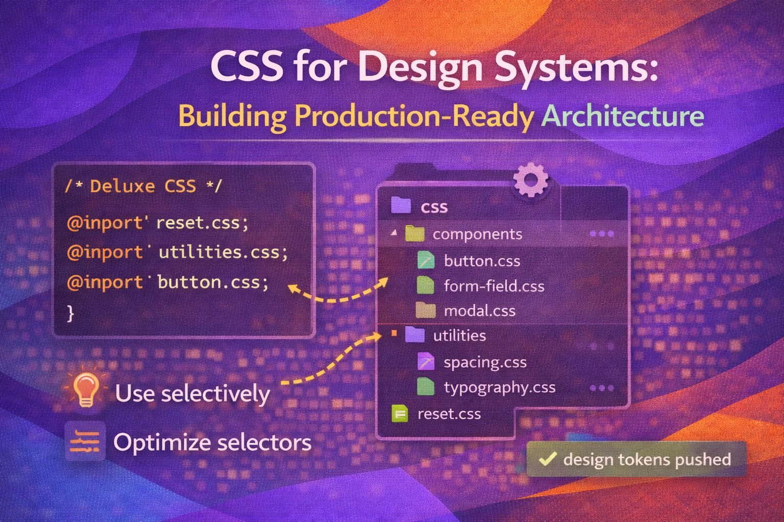
Let's be honest - most CSS architectures start with good intentions and end up as a 'specificity war' that nobody wins. I've found that the secret to a design system that doesn't crumble under its own weight isn't more tools, but a smarter approach to how we structure our styles.
The Foundation: Design Tokens and Variables
Everything starts with tokens; they are the single source of truth for your brand's visual language. I prefer a tiered approach, separating global primitives from semantic aliases to make future rebranding a breeze.
/* 1. Global Primitives (The 'What') */
:root {
  --color-blue-500: #3b82f6;
  --color-blue-600: #2563eb;
  --space-4: 1rem;
  --radius-md: 0.5rem;
}

/* 2. Semantic Tokens (The 'Where') */
:root {
  --action-primary-bg: var(--color-blue-500);
  --action-primary-hover: var(--color-blue-600);
  --surface-padding: var(--space-4);
  --component-radius: var(--radius-md);
}
By using semantic aliases, you can change your entire brand colour palette by updating one line without touching a single component file. Here is how that looks when applied to a button component.
.button-primary {
  background-color: var(--action-primary-bg);
  padding: var(--surface-padding);
  border-radius: var(--component-radius);
  transition: background 0.2s ease;
}

.button-primary:hover {
  background-color: var(--action-primary-hover);
}Taming Specificity with Cascade Layers
The cool bit? We finally have a native way to manage the 'cascade' without using !important hacks. Cascade layers (@layer) let us explicitly define which styles should win, regardless of their selector specificity.
/* Define the order of priority - last one wins */
@layer reset, base, components, utilities;

@layer base {
  h1 {
    font-family: sans-serif;
    color: var(--text-main);
  }
}

@layer components {
  .card {
    background: white;
    border: 1px solid #ddd;
  }
}
Even if a utility class has a simple selector like '.u-margin-0', it will override a complex component selector because its layer is defined later in the order. This makes debugging so much easier.
@layer utilities {
  .u-hide {
    display: none !important; /* Final safety net */
  }

  .u-flex {
    display: flex;
  }
}Modern Theming Strategies
Theming used to mean duplicating entire stylesheets, but now we can just swap token values. I'm a huge fan of using data attributes to toggle themes at any level of the DOM tree.
/* Light mode (default) */
:root {
  --bg-main: #ffffff;
  --text-main: #1a1a1a;
}

/* Dark mode overrides */
[data-theme='dark'] {
  --bg-main: #121212;
  --text-main: #f5f5f5;
}

body {
  background-color: var(--bg-main);
  color: var(--text-main);
}
And for a more robust approach, we can leverage the prefers-color-scheme media query to respect user system settings automatically.
@media (prefers-color-scheme: dark) {
  :root:not([data-theme='light']) {
    --bg-main: #121212;
    --text-main: #f5f5f5;
  }
}The Future: Conditional Logic with CSS if()
Right, let's talk about the upcoming if() function. While it is still experimental, it's a total game changer for design systems because it allows us to handle logic directly in CSS without JS 'prop-drilling'.
/* Concept: Conditional styling based on custom properties */
.button {
  padding: if(var(--size) == 'large', 2rem, 1rem);
  border-radius: if(var(--pill) == true, 999px, 4px);
}
Until if() is fully supported, we rely on the 'Space Toggle' trick or standard variable overrides to achieve similar component logic.
/* Current Production Fallback Pattern */
.button {
  --padding: 1rem;
  padding: var(--padding);
}

.button--large {
  --padding: 2rem;
}Accessibility at the Core
Accessibility isn't a 'nice to have'; it is part of the architecture. I always include a standard set of utility classes for screen readers and focus management.
/* Visually hidden but accessible to screen readers */
.sr-only {
  position: absolute;
  width: 1px;
  height: 1px;
  padding: 0;
  margin: -1px;
  overflow: hidden;
  clip: rect(0, 0, 0, 0);
  white-space: nowrap;
  border-width: 0;
}
I also recommend implementing a high-contrast focus ring that works across different background colours using outline-offset.
:focus-visible {
  outline: 3px solid var(--action-primary-bg);
  outline-offset: 2px;
}

@media (prefers-reduced-motion: reduce) {
  * {
    animation-duration: 0.01ms !important;
    transition-duration: 0.01ms !important;
  }
}Browser Support
Here is the current state of the modern features we've discussed. Always check your project's specific requirements before going all-in.
- CSS Variables: Full support in all modern browsers (97%+).
- Cascade Layers (@layer): Supported in all major browsers since early 2022.
- Container Queries: Supported in Chrome 105, Safari 16, and Firefox 110.
- CSS if() function: Experimental/Draft status. Do not use in production without polyfills or heavy fallback
Wrapping Up
Building a design system is not just about components — it’s about creating a solid and resilient environment where other developers can succeed and move fast with confidence. When you focus on design tokens and the native CSS cascade, you’re building something that will last.
A few key takeaways to keep in mind:
- Use semantic tokens to decouple your components from specific brand colours.
- Use @layer to stop specificity wars before they even start.
- Always include accessibility utilities, such as .sr-only and reduced-motion overrides.
Trust me on this one — take an afternoon to refactor your base variables into semantic tokens. It’s one of those changes you’ll thank yourself for later.
If you want to go deeper and learn how to build real, production-ready CSS design systems step by step, you can check out my full course here: 👉 https://alexanderburgos.netlify.app/curso-css-design-systems
And if you found this useful, I’d love to connect. Follow me on Twitter/X or LinkedIn for more CSS, UX, and design system tips 🚀