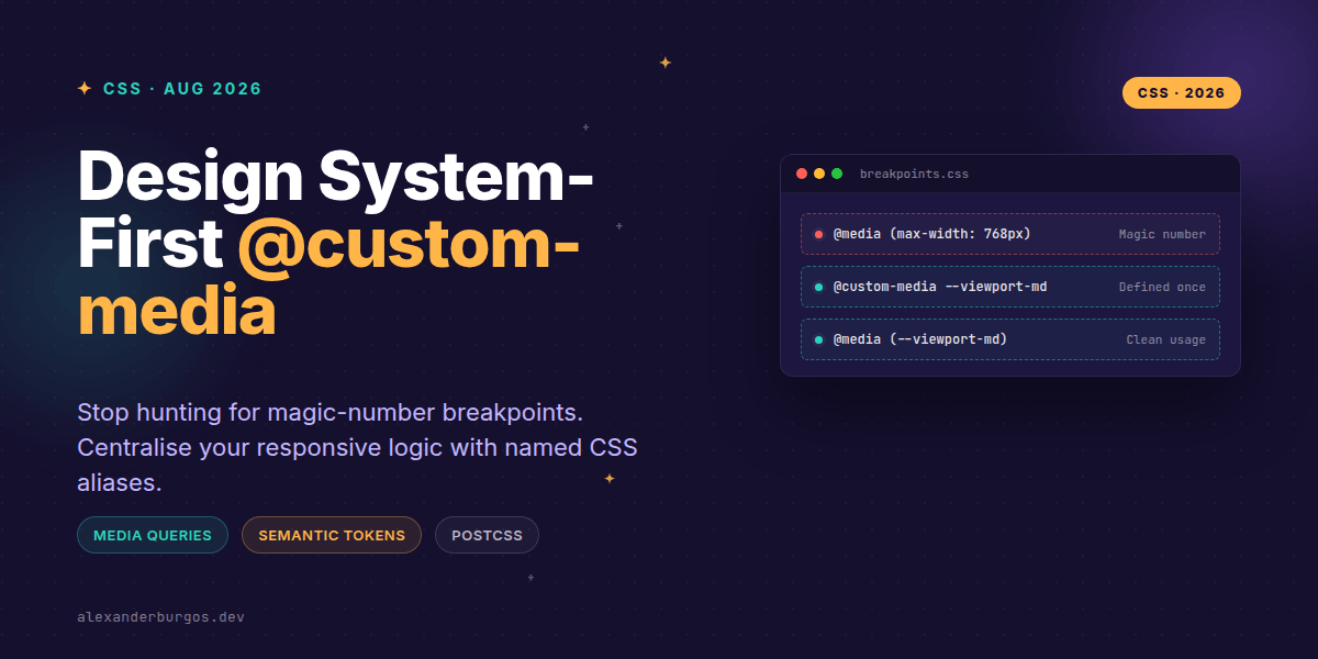
Ever wondered why we're still copy-pasting 768px across fifty different CSS files in 2026? It's one of those weird industry hangovers. We've mastered design tokens for colours and spacing, yet our media queries often remain stuck in the dark ages of hardcoded magic numbers.
I've found that maintaining a large-scale design system becomes a nightmare when you decide to shift a breakpoint by 20 pixels. You're not just changing a variable; you're performing a 'find and replace' operation that feels more like heart surgery. That's where @custom-media steps in to save our sanity.
The Problem: Breakpoint Fragmentation
In a typical project, breakpoints are scattered. Even if you use Sass variables or Tailwind's config, the resulting CSS is still full of duplicated raw values. If you're building a framework-agnostic design system, you want those responsive rules to be as semantic as your colour palette.
The Media Queries Level 5 specification introduces @custom-media as a way to define aliases for complex or repetitive queries. It allows us to treat breakpoints as first-class tokens within our CSS architecture.
How @custom-media Works
The syntax is delightfully simple. Just like CSS custom properties, these names must start with a double dash (--). You define the alias once, and then reference it inside your standard @media blocks.
/* Define your design system tokens */
@custom-media --viewport-sm (min-width: 30em);
@custom-media --viewport-md (min-width: 48em);
@custom-media --viewport-lg (min-width: 64em);

/* Use them anywhere */
.card {
  padding: 1rem;
}

@media (--viewport-md) {
  .card {
    padding: 2rem;
    display: grid;
    grid-template-columns: 1fr 1fr;
  }
}
MDN notes that grouping all breakpoints in a single location makes it significantly easier to maintain responsive designs. When a value needs to change, it's a single update in your tokens.css file rather than a global search across your entire codebase.
Semantic Scales Over Device Names
One mistake I often see is naming tokens after specific hardware, like --iphone-pro. Devices change every six months. Instead, we should align our @custom-media definitions with semantic scales or viewport tiers. This keeps the design system resilient.
- --viewport-xs: Tiny screens and narrow sidebars.
- --viewport-md: Tablets and small laptops.
- --reduced-motion: A semantic alias for
(prefers-reduced-motion: reduce). - --high-contrast: For accessibility-focused styling.
@custom-media --motion-safe (prefers-reduced-motion: no-preference);

@media (--motion-safe) {
  .hero-image {
    transition: transform 0.6s cubic-bezier(0.16, 1, 0.3, 1);
  }
}
The Implementation Reality
Right, let's talk about the elephant in the room: browser support. As of late 2026, @custom-media is still considered experimental in some environments. While the Interop 2024 initiative pushed major vendors to track this, we aren't quite at the point where we can ship it raw to every user without a safety net.
But that shouldn't stop you. In fact, most design system teams I work with use PostCSS (specifically postcss-custom-media) to handle this. You write the modern, semantic CSS today, and the build tool flattens it into standard media queries for older browsers.
Wrapping Up
- Centralise your breakpoints using
@custom-mediato eliminate magic numbers. - Use semantic names like
--viewport-lginstead of device-specific names. - Leverage PostCSS to use this syntax today while maintaining full browser compatibility.
I really encourage you to try moving one of your smaller projects over to this pattern. Once you experience the clarity of reading @media (--viewport-md) instead of squinting at 768px, you'll never want to go back.
If you want to go deeper and learn how to build real, production-ready CSS design systems step by step, check out my full course here: CSS Design Systems Course
I cover the full pipeline in Ship Your Design System, 200 pages on Amazon Kindle.
For more CSS architecture tips and design system deep-dives, let's connect on Twitter or LinkedIn.