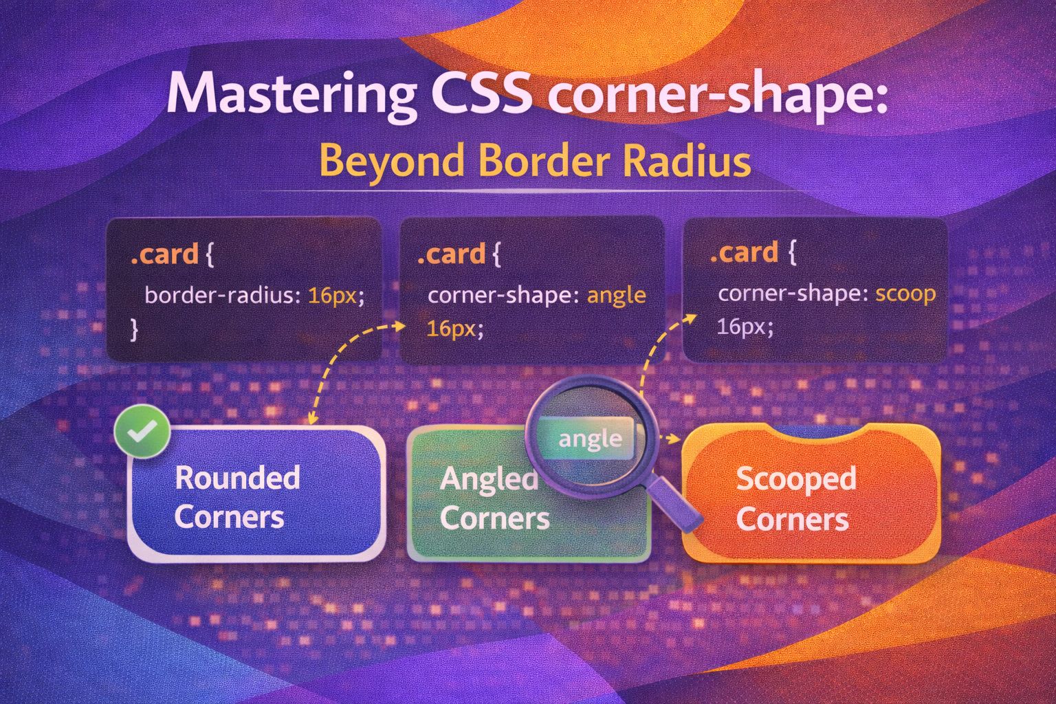
Let's be honest - we've all spent far too many hours wrestling with complex clip-paths or nested SVGs just to get a 'squircle' or a notched corner. I've always felt that border-radius, while a workhorse of the web, was a bit limited when designers wanted something more 'Apple-like' or aggressive than a simple round corner.
The good news? The experimental `corner-shape` property is changing the game by allowing us to redefine the geometry of our corners using simple keywords. It's essentially a modifier that reshapes the area defined by your existing `border-radius`.
The Basic Syntax
Here's the thing: `corner-shape` doesn't work in isolation; it requires a `border-radius` to define the size of the corner first. Once you've set the radius, you can swap the default 'round' look for something like a 'bevel' or a 'notch'.
/* A standard notched corner */
.card-notched {
  width: 300px;
  height: 200px;
  background: #2dd4bf;
  border-radius: 2rem;
  corner-shape: notch;
}
What I love about this is how intuitive the shorthand is—it follows the exact same 1-to-4 value pattern we've used for years with margins and padding. You can mix and match different shapes for each corner to create some really unique UI elements.
/* Mixing shapes: TL, TR, BR, BL */
.abstract-shape {
  border-radius: 3rem;
  corner-shape: round bevel scoop notch;
  background: #f43f5e;
}Keywords and Superellipses
The `squircle` keyword is likely going to be everyone's favourite because it provides that smooth, premium curvature that standard circular radii just can't match. If you want more granular control, the `superellipse()` function lets you define the exponent for the curve.
/* The classic iOS-style squircle */
.app-icon {
  border-radius: 40px;
  corner-shape: squircle;
}

/* Using a custom superellipse exponent */
.custom-curve {
  border-radius: 50px;
  corner-shape: superellipse(3);
}
The `scoop` keyword creates an inverted radius, which used to require absolute-positioned pseudo-elements or mask-images. Now, it's just a single line of CSS, which is frankly a massive relief for maintainable design systems.
/* Creating a 'ticket' or 'coupon' look with scoops */
.ticket-stub {
  border-radius: 20px;
  corner-shape: scoop;
  border: 2px dashed #334155;
}Longhands and Logical Properties
Just like `border-radius`, we have full access to physical and logical longhands. In modern UX engineering, I always recommend using logical properties to ensure your designs adapt correctly to different writing modes like RTL (Right-to-Left).
/* Physical longhands for specific control */
.sidebar-tab {
  border-radius: 12px;
  corner-top-right-shape: bevel;
  corner-bottom-right-shape: bevel;
}

/* Logical properties for global accessibility */
.notification-toast {
  border-radius: 1.5rem;
  corner-start-start-shape: squircle;
  corner-end-start-shape: squircle;
}
There are also side shorthands available in Chromium that let you target the top, bottom, left, or right sides specifically. This is incredibly handy for buttons that are part of a grouped set.
/* Target only the left side corners */
.grouped-button-first {
  border-radius: 10px;
  corner-left-shape: notch;
}Progressive Enhancement and Fallbacks
Since this is an experimental feature, we can't just throw it into production and hope for the best. The pro move here is to treat it as a progressive enhancement: users on modern Chromium browsers get the fancy shapes, while everyone else gets a standard round corner.
/* Safe production implementation */
.button {
  background: #8b5cf6;
  color: white;
  padding: 1rem 2rem;

  /* Fallback: standard round corners */
  border-radius: 1rem;
}

@supports (corner-shape: bevel) {
  .button {
    corner-shape: bevel;
  }
}Browser Support
Currently, `corner-shape` is only supported in Chromium-based browsers (Chrome, Edge, Opera). Firefox and Safari do not support it yet. Always use `@supports` or ensure your design still looks professional with the standard `border-radius` fallback.
Wrapping Up
This property is a fantastic addition to the CSS toolbelt. Even if it's not ready for every project today, understanding how it shifts the paradigm from 'everything is a circle' to 'everything is a shape' is key for the next generation of web UI.
- Always define a `border-radius` first; `corner-shape` modifies that existing boundary.
- Use `squircle` for smooth, modern UI and `notch` or `bevel` for more technical or brutalist aesthetics.
- Leverage `@supports` to ensure your layouts remain functional across all browsers while rewarding modern ones.
I'm genuinely excited to see how this evolves. If you found this helpful, I'd love to connect! Follow me on Twitter/X @alexandersstudi or LinkedIn for more CSS and design system tips.