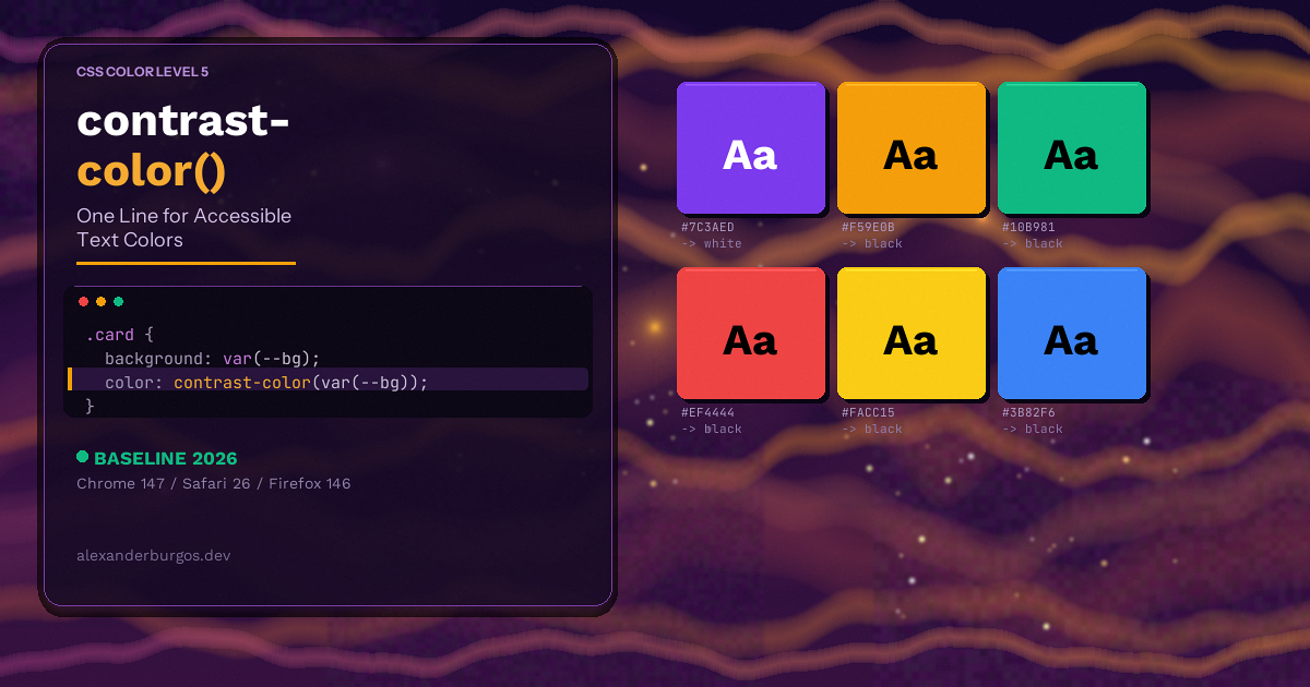
You've got a design system with 30 brand colours. Every time you add a new one, you open a contrast checker, test black text, test white text, write it down somewhere, and hope nobody changes the token later. Sound familiar?
Or maybe you've written a Sass function that calculates relative luminance and spits out the "right" text colour at build time. It works -- until someone changes a colour with a CSS custom property at runtime, and suddenly your clever mixin knows nothing about it.
Let's be honest -- this has been one of the most tedious parts of building accessible UIs. But as of March 2026, browsers have finally given us a native solution.
What is contrast-color()?
contrast-color() is a CSS function that takes a single colour and returns either black or white -- whichever has the higher contrast ratio according to WCAG guidelines.
That's it. One argument in, one colour out. Here's the syntax:
.badge {
  background-color: var(--badge-bg);
  color: contrast-color(var(--badge-bg));
}
If --badge-bg is a dark purple, you get white text. If it's a light yellow, you get black text. The browser figures it out for you -- at runtime.
The function is part of the CSS Color Level 5 specification. You might have seen an earlier version called color-contrast() with a more complex syntax that let you pick between arbitrary colours. That extended vs syntax hasn't been implemented yet, but the simple black-or-white version is here and ready to use.
Real-World Examples
Dynamic Buttons
Imagine a button component that accepts any brand colour as a prop. Before contrast-color(), you'd need logic to decide the text colour. Now:
.btn {
  background-color: var(--btn-bg, #6200ee);
  color: contrast-color(var(--btn-bg, #6200ee));
  padding: 0.75rem 1.5rem;
  border: none;
  border-radius: 0.5rem;
}
Change --btn-bg to any colour at runtime -- through a theme toggle, a CMS setting, or even a colour picker -- and the text colour updates automatically.
Status Badges
Status badges are a classic pain point. You might have success (green), warning (amber), error (red), and info (blue) -- each needing different text colours.
.badge--success { --badge-bg: #4caf50; }
.badge--warning { --badge-bg: #ff9800; }
.badge--error   { --badge-bg: #f44336; }
.badge--info    { --badge-bg: #2196f3; }

.badge {
  background: var(--badge-bg);
  color: contrast-color(var(--badge-bg));
  padding: 0.25rem 0.75rem;
  border-radius: 1rem;
  font-weight: 600;
}
One rule handles all four variants. No more maintaining a separate text colour for every status.
Design Tokens
If you're building a token-based design system, this is where things get really nice. You can define an "on" colour for every surface automatically:
:root {
  --surface-primary: #1a1a2e;
  --on-surface-primary: contrast-color(var(--surface-primary));

  --surface-secondary: #e8e8e8;
  --on-surface-secondary: contrast-color(var(--surface-secondary));

  --surface-accent: #e94560;
  --on-surface-accent: contrast-color(var(--surface-accent));
}
When a designer updates a surface colour, the text colour follows. No manual sync needed.
User-Generated Colours
This is probably my favourite use case. Think of apps where users pick their own profile colour, team colour, or label colour -- like project management tools or social platforms. You never know what colour they'll choose, so you need a bulletproof fallback.
.user-tag {
  background-color: var(--user-colour);
  color: contrast-color(var(--user-colour));
}
Previously, you'd need JavaScript to calculate luminance and set the text colour. Now the browser does it natively.
How It Handles Accessibility
The browser uses the WCAG 2.1 contrast ratio algorithm under the hood. It calculates the contrast ratio of the input colour against both black (#000) and white (#fff), then returns whichever one wins.
Here's the thing -- this doesn't guarantee you'll always hit the WCAG AA threshold of 4.5:1 for normal text. For most colours, you absolutely will. But there's an edge case I'll cover in the limitations section.
What I really like is that this makes accessibility the default behaviour, not something you have to remember to add. It's baked into the CSS itself.
Fallback Strategies with @supports
Even though browser support is strong now, you'll probably want a fallback for older browsers. The good news is that @supports makes this straightforward:
.badge {
  background: var(--badge-bg);
  /* Fallback: hardcoded text colour */
  color: #fff;
}

@supports (color: contrast-color(red)) {
  .badge {
    color: contrast-color(var(--badge-bg));
  }
}
You could also use a Sass mixin as your fallback layer and let contrast-color() take over when supported. Progressive enhancement at its finest.
Limitations -- What It Can't Do (Yet)
Let's be upfront about what contrast-color() doesn't handle:
- Black or white only -- You can't pick between two custom colours (like your brand dark and brand light). The extended
vssyntax from the spec isn't implemented yet. - Mid-luminance edge case -- Colours close to
#808080(medium grey) are tricky. Neither black nor white may achieve the 4.5:1 contrast ratio needed for WCAG AA on normal text. The function still returns the better option, but "better" doesn't always mean "sufficient". - No gradient support -- You can't pass a gradient as the input. It only works with flat, opaque colours.
- No transparency -- Semi-transparent colours won't give reliable results because the function doesn't know what's behind them.
- WCAG 2.1 only -- It uses the classic contrast ratio algorithm, not the newer APCA (Accessible Perceptual Contrast Algorithm) that some designers prefer.
My honest take -- these limitations are real but relatively narrow. For 90%+ of use cases -- buttons, badges, tags, cards, tokens -- the black-or-white output is exactly what you need.
Before vs. After
Here's what the "before" world looked like. A typical Sass mixin for contrast:
// Sass mixin -- build time only
@function contrast-text($bg) {
  $luminance: (red($bg) * 0.299 + green($bg) * 0.587 + blue($bg) * 0.114) / 255;
  @if $luminance > 0.5 {
    @return #000;
  } @else {
    @return #fff;
  }
}

.badge {
  background: $badge-bg;
  color: contrast-text($badge-bg);
}
Or the JavaScript approach:
// JavaScript -- runtime but manual
function getContrastColor(hex) {
  const r = parseInt(hex.slice(1, 3), 16);
  const g = parseInt(hex.slice(3, 5), 16);
  const b = parseInt(hex.slice(5, 7), 16);
  const luminance = (r * 0.299 + g * 0.587 + b * 0.114) / 255;
  return luminance > 0.5 ? '#000000' : '#ffffff';
}

element.style.color = getContrastColor(bgColor);
And here's the "after":
/* CSS -- runtime, reactive, zero JS */
.badge {
  background: var(--badge-bg);
  color: contrast-color(var(--badge-bg));
}
What I've learnt from years of building design systems is that the less logic you push to JavaScript, the more resilient your UI becomes. This is a perfect example of the platform catching up to what we've been hacking together for years.
Browser Support
contrast-color() hit Baseline in March 2026, meaning it's supported across all major browsers:
- Chrome -- 147+
- Safari -- 26+ (Safari/WebKit shipped first)
- Firefox -- 146+
- Edge -- 147+ (Chromium-based, same as Chrome)
Safari led the way on this one, which is interesting because WebKit doesn't always ship CSS features first. The good news is that by the time you read this, the support story is solid.
Wrapping Up
contrast-color() isn't going to solve every accessibility challenge. But it does eliminate one of the most repetitive and error-prone tasks in front-end development -- choosing a readable text colour for a given background.
It works with custom properties, reacts to runtime changes, requires zero JavaScript, and makes accessible text the default. For design systems, component libraries, and any UI that deals with dynamic or user-generated colours, this is a massive quality-of-life improvement.
Start using it today with a @supports fallback, and you're future-proof.
Happy coding!
If you want to go deeper and learn how to build real, production-ready CSS design systems step by step, check out my full course here: CSS Design Systems Course
If you found this helpful, I'd love to connect! Follow me on Twitter/X @alexandersstudi or LinkedIn for more CSS and design system tips.