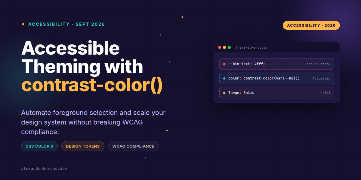
We've all been there: you're defining a new button primary colour in your design system, and suddenly you're stuck in a loop of manual accessibility checks. You pick a shade of blue, then you check if white text passes WCAG. It doesn't. You try black. It looks a bit 'muddy'. You tweak the blue, re-check the white, and repeat until your eyes hurt.
This manual 'text-on-X' dance is one of the most brittle parts of modern CSS architecture. Every time a brand colour changes, we have to manually update a corresponding foreground token. But what if the browser could just... figure it out for us? Enter contrast-color().
What exactly is contrast-color()?
Part of the CSS Color Module Level 6 draft, contrast-color() is a functional notation designed to return a sufficiently contrasting colour against a specified background without requiring manual computation. In its simplest, current implementation, it takes a colour and resolves to either black or white—whichever provides the highest contrast ratio.
As MDN notes, if both white and black happen to have the same contrast level against your input colour, the function defaults to white. It’s a beautifully simple solution to a historically complex problem.
The Design System Shift
In traditional design systems, we often see token pairs like this:
:root {
  --color-primary: #0055ff;
  --color-on-primary: #ffffff;

  --color-success: #22c55e;
  --color-on-success: #052e16;
}
This works, but it's high maintenance. If a designer decides --color-success needs to be lighter for better brand alignment, the developer has to remember to re-verify --color-on-success. With contrast-color(), we can move to a reactive token model.
Pattern 1: The Reactive Button Token
I've found that the best place to start is at the semantic token layer. By wrapping your background tokens in the contrast function, your components become self-aware.
:root {
  --btn-bg-primary: oklch(65% 0.15 250);
  --btn-fg-primary: contrast-color(var(--btn-bg-primary));
}

.btn-primary {
  background-color: var(--btn-bg-primary);
  color: var(--btn-fg-primary);
}
Now, if the oklch lightness value drops to 30%, the --btn-fg-primary will automatically flip from black to white. No manual intervention required.
Pattern 2: Dynamic Status Badges
Status badges are notorious for failing contrast checks, especially when using light tints. Let's look at how we can handle multiple states without individual text tokens.
.badge {
  background: var(--badge-bg);
  /* The magic happens here */
  color: contrast-color(var(--badge-bg));
}

.badge--success { --badge-bg: oklch(85% 0.1 145); }
.badge--warning { --badge-bg: oklch(85% 0.15 75); }
.badge--error   { --badge-bg: oklch(50% 0.2 25); }
The Reality Check: WCAG and Ratios
Right, let's talk about the 'gotchas'. A common misconception is that contrast-color() automatically guarantees a WCAG-compliant ratio like 4.5:1. It doesn't.
It simply picks the best option between the available candidates (currently black and white). If your background colour is a mid-tone grey, both black and white might fail the 4.5:1 ratio for small text, even if one is technically 'better' than the other. You still need to ensure your base colours allow for a valid contrast target.
- 3:1 ratio: Minimum for UI components and large text.
- 4.5:1 ratio: Required for standard body text.
- Future Spec: The Level 6 draft includes a
<target-contrast>parameter which will be a game-changer for strict compliance.
Wait, what about color-contrast()?
You might have heard of color-contrast() (yes, the names are confusingly similar). While color-contrast() allows you to provide a custom list of colours to pick from, contrast-color() is the 'low-config' version designed for the most common use case: foreground text on a background.
Wrapping Up
- Use
contrast-color()to generate semantic 'on-colour' tokens automatically. - Remember that it currently resolves to black or white; it doesn't invent new brand colours for you.
- Always verify your base colours—the function picks the best choice, but it can't fix a fundamentally inaccessible background.
It's an exciting time for CSS. While browser support is still emerging, I highly recommend experimenting with this in your local dev environments or via progressive enhancement. It’s the future of how we write resilient, accessible themes.
If you want to go deeper and learn how to build real, production-ready CSS design systems step by step, check out my full course here: CSS Design Systems Course
If you want the long-form version of this with 23 chapters and runnable code, Ship Your Design System on Amazon is the handbook.
I'd love to hear how you're planning to use this. Let's chat over on Twitter or connect on LinkedIn.