Ever wondered why we're still relying on heavy JavaScript libraries or complex Sass functions just to generate a hover state or a subtle background tint? For years, the 'missing link' in CSS was the ability to manipulate colors mathematically at runtime.
That changed with color-mix(). Since mid-2023, every modern browser has supported this function, and it's a genuine game-changer for anyone building design systems. It allows us to mix base brand colors with neutrals or semantic roles directly in our CSS variables, keeping our themes consistent and lightweight.
What exactly is color-mix()?
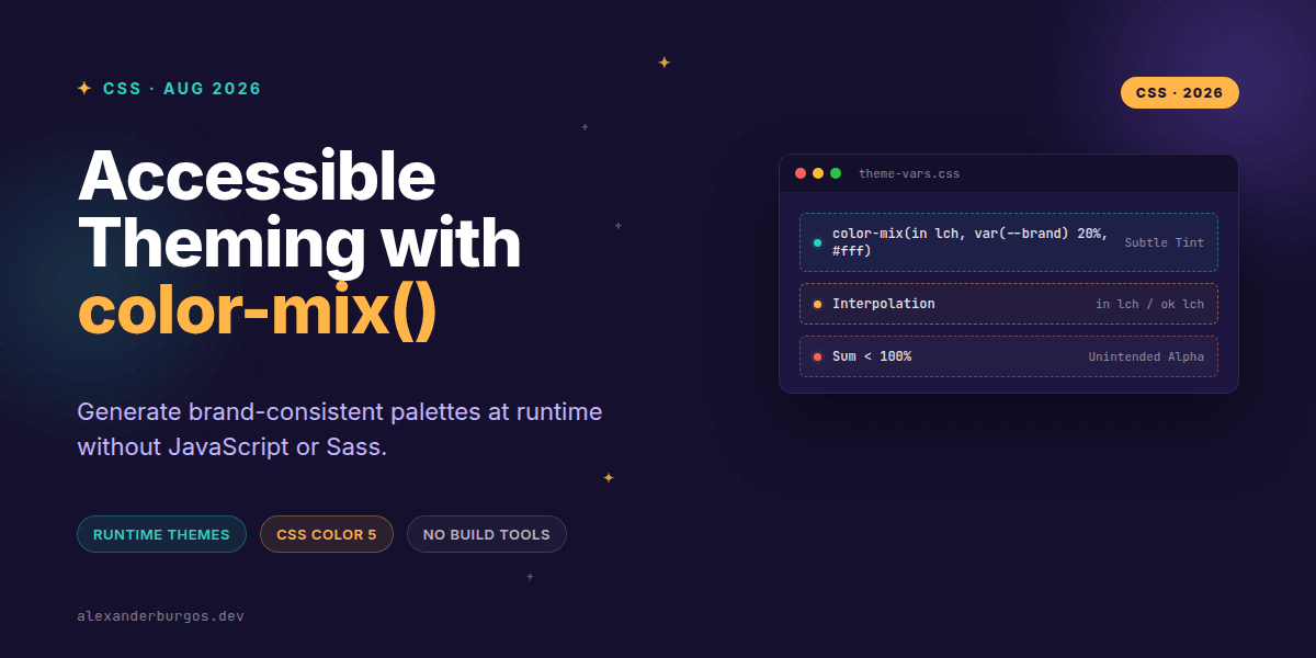
Defined in the CSS Color Module Level 5, color-mix() does exactly what it says on the tin: it takes two colors and blends them together in a specified colour space. The syntax is straightforward, though it requires one specific piece of information: the interpolation method.
/* The basic syntax */
.element {
  background-color: color-mix(in srgb, var(--brand), #ffffff 20%);
}
In this example, we're taking our brand colour and mixing it with 20% white using the srgb colour space. If you omit the percentages, CSS defaults to a 50/50 split. It's elegant, readable, and—most importantly—it lives entirely in the browser.
The Perceptual Advantage: Choosing Your Colour Space
One of the biggest mistakes I see is developers sticking to in srgb for everything. While it's familiar, srgb isn't perceptually uniform. If you're building a design system, I'd strongly suggest looking at in lch or in lab.
Mixing in lch (Lightness, Chroma, Hue) tends to produce results that feel more 'natural' to the human eye. It avoids that muddy, greyish transition you sometimes get when mixing vibrant colours in standard RGB space. As the Chrome Developers team notes, you have full control over which space you mix in, so use it to your advantage.
Practical Implementation: Brand-Tinted Surfaces
Let's look at a real-world scenario. You have a brand colour, and you need a light 'muted' background and a 'strong' surface variant. Instead of hard-coding hex values, you can derive them dynamically.
:root {
  --brand: #0057ff;
  --surface: #fdfdfd;
  --ink: #111827;

  /* Deriving variants */
  --surface-muted: color-mix(in lch, var(--surface) 80%, var(--brand) 20%);
  --surface-strong: color-mix(in lch, var(--surface) 60%, var(--brand) 40%);
  --border-subtle: color-mix(in srgb, var(--ink) 20%, var(--surface) 80%);
}

[data-theme="dark"] {
  --surface: #020617;
  --ink: #e5e7eb;
  /* The variants above update automatically! */
}
The beauty here is that when you switch to dark mode, your --surface-muted automatically recalculates based on the dark surface and the brand colour. No extra classes, no JS logic—just pure CSS.
The Accessibility Reality Check
I've got to be honest with you: color-mix() is not a magic wand for WCAG compliance. It doesn't 'know' if the resulting mix has enough contrast against your text. You still need to verify your contrast ratios during the design phase.
If your designer gives you a specific hex code for a brand-critical button because it hits exactly 4.5:1, use that hex code. Don't try to 'guess' it with a mix. Use color-mix() for the systematic pieces—the hovers, the disabled states, and the decorative borders—where the exact values are less critical than the relationship between the colours.
Common Pitfalls to Avoid
- The Alpha Trap: If your percentages sum to less than 100%, CSS treats the remainder as transparency. If you mix 40% Blue and 40% White, you'll get an 80% opaque result. This is great for overlays but annoying if you wanted a solid colour.
- No Opaque 'Fixing': You can't use
color-mix()to make a semi-transparent color fully opaque. For that, you'll want to look into Relative Color Syntax. - Legacy Support: While it's stable in modern browsers, users on very old versions of Safari or Chrome will see nothing. Always provide a fallback.
.card {
  background-color: #ffffff; /* Fallback for older browsers */
}

@supports (background-color: color-mix(in srgb, #fff, #000)) {
  .card {
    background-color: color-mix(in srgb, var(--surface) 80%, var(--brand) 20%);
  }
}Wrapping Up
- Use
color-mix()to create dynamic, brand-aware themes that react to light and dark mode changes automatically. - Prefer
lchorlabcolour spaces for more perceptually accurate mixing that avoids 'muddy' tones. - Always verify contrast ratios manually; the browser won't ensure accessibility for you.
I'd encourage you to open up your dev tools today and try mixing your brand colour with 10% black or white. You might find you can delete quite a few lines of Sass or JS code by letting the browser handle the heavy lifting.
If you want to go deeper and learn how to build real, production-ready CSS design systems step by step, check out my full course here: CSS Design Systems Course
The long version with support labels and runnable demos is in Modern CSS 2026 on Amazon Kindle.
I'm always keen to see how folks are using these new features in the wild. Drop me a line on Twitter or connect with me on LinkedIn to share your experiments.