This changes everything. For years, we've been fighting a losing battle against the CSS cascade, using increasingly complex BEM strings or sticking !important on everything just to make a button turn blue. It's exhausting, isn't it?
Last week I was debugging a legacy design system where a utility class couldn't override a component style because the component had a slightly more specific selector. We've all been there, staring at the DevTools styles pane, wondering why our code is being ignored. But thanks to CSS Cascade Layers, those days are officially over.
The End of Specificity Wars
If you haven't checked the compatibility tables lately, I have some brilliant news. As of July 2026, CSS Cascade Layers are firmly part of the Baseline. They've been available in every major browser—Chrome, Firefox, Safari, and Edge—since early 2022. We can finally stop talking about them as a 'future' feature and start using them as our primary architectural tool.
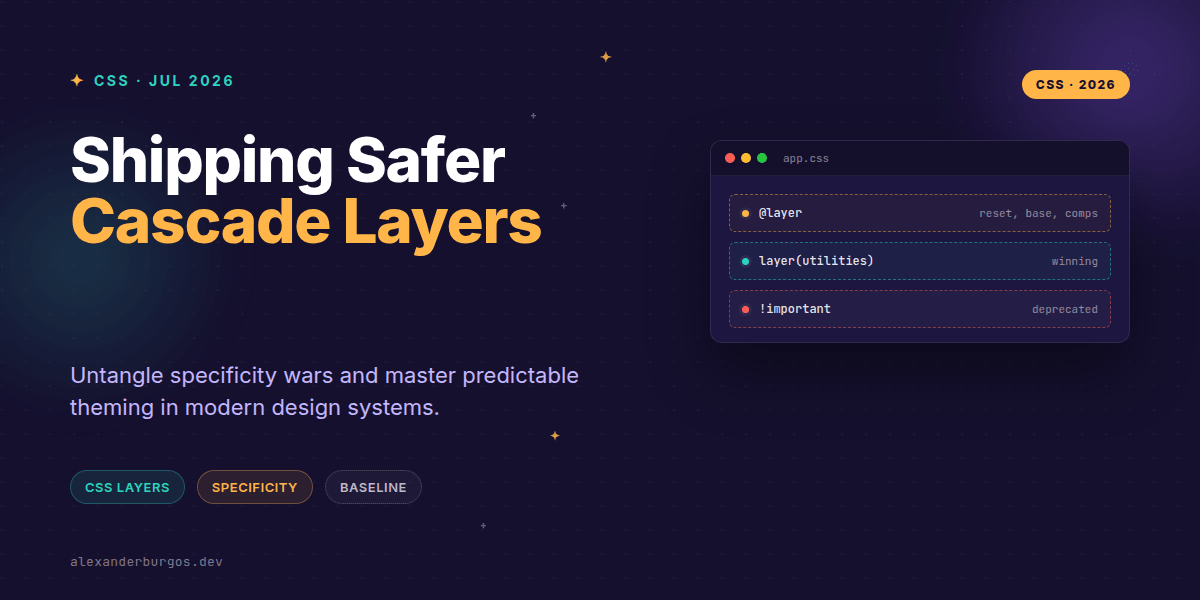
The @layer at-rule allows us to define explicit buckets for our styles. Instead of the browser deciding priority based on how many IDs or classes you've crammed into a selector, it decides based on the layer order you define. It's a total shift in how we think about CSS weight.
Setting Up Your Layer Strategy
The secret sauce to a successful implementation is defining your layer order right at the top of your main CSS file. I've found that a standard 'stack' works best for most design systems. By declaring them early, you control the precedence regardless of when the actual styles are loaded.
@layer reset, base, components, utilities, theme;

@layer reset {
  /* Low priority: Global resets */
  * { box-sizing: border-box; }
}

@layer utilities {
  /* High priority: These will always win over components */
  .text-center { text-align: center !important; }
  .mt-4 { margin-top: 1rem; }
}
In this setup, even if a selector in the components layer is more 'specific' (like .card .btn-primary), a simple class in the utilities layer will win because the utility layer comes later in the declaration. It’s predictable, clean, and honestly, a bit of a relief.
Integrating with Utility Frameworks
One of the biggest headaches in UX Engineering is trying to mix a custom design system with a utility framework like Tailwind or Bootstrap. Usually, you're at the mercy of whichever stylesheet loads last. With layers, we can wrap those third-party tools and tell the browser exactly where they sit in our hierarchy.
MDN shows a fantastic pattern for this using the layer keyword during an import. It looks like this:
@import "external-library.css" layer(framework);

@layer framework, custom-ui;

@layer custom-ui {
  /* Your design system overrides live here */
}
The 'Unlayered' Gotcha
Here's a tip that tripped me up the first time: unlayered styles always win. If you have styles outside of any @layer block, they are treated as the highest priority layer. If you're migrating a legacy system, I'd recommend wrapping your old styles in a @layer legacy block immediately to prevent them from steamrolling your new, layered architecture.
Predictable Theming
Theming is where layers really shine. Instead of fighting with selector depth to apply a dark mode or a high-contrast theme, we can put our theme variables and overrides into their own dedicated layer.
@layer theme {
  :root {
    --color-surface: #ffffff;
    --color-text: #111111;
  }

  [data-theme="dark"] {
    --color-surface: #111111;
    --color-text: #ffffff;
  }

  .card {
    background: var(--color-surface);
    color: var(--color-text);
    border: 1px solid var(--color-text);
  }
}
By placing theme at the end of our layer list, we ensure that our visual tokens and theme-specific component adjustments have the final say. No more body.dark-mode .card selectors just to change a background colour.
A Note on Browser Support
While support is excellent now (Chrome 99+, Safari 15.4+), remember that if a user is on a truly ancient browser, layered rules are ignored entirely. In 2026, this is rarely an issue for most B2B or consumer apps, but it's worth keeping in mind for progressive enhancement. Use a simple, unlayered 'core' style for basic readability if you support very old environments.
Wrapping Up
- Define your layer order upfront to take full control of the cascade.
- Wrap third-party frameworks in a dedicated layer to prevent specificity clashes.
- Remember that unlayered styles sit at the top of the priority stack—use them wisely.
I'd encourage you to try this out on a small internal project first. Once you see how much CSS you can delete when you're no longer fighting specificity, you won't want to go back. It's a game-changer for maintainable design systems.
If you want to go deeper and learn how to build real, production-ready CSS design systems step by step, check out my full course here: CSS Design Systems Course
The long version with support labels and runnable demos is in Modern CSS 2026 on Amazon Kindle.
Got questions about how to structure your layers? Let's chat on Twitter or connect with me over on LinkedIn.