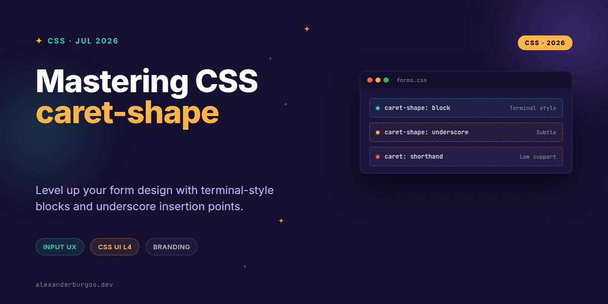
Ever wondered why we've been stuck with the same blinking vertical bar for text inputs since the dawn of the graphical user interface? While we've been able to change the colour of that little line for a while now, the actual geometry has remained frustratingly off-limits.
That's finally changing. With the introduction of the caret-shape property in the CSS Basic User Interface Module Level 4, we're gaining granular control over how that insertion point looks and feels. It's a small detail, but in form-heavy products, it's a massive lever for visual hierarchy and branding.
The Syntax: More Than Just a Bar
The property is straightforward but powerful. It applies to any element that accepts text input—think <input>, <textarea>, or anything with contenteditable="true". Here is how the values break down:
- auto: The default. The browser decides, which usually means the classic vertical bar.
- bar: Explicitly forces the vertical bar shape.
- block: A rectangular block that covers the entire character cell, reminiscent of a classic terminal or Vim.
- underscore: A horizontal line at the baseline of the character.
/* Example: A terminal-style code editor feel */
.code-input {
  caret-shape: block;
  caret-color: #00ff00;
  font-family: 'JetBrains Mono', monospace;
}
Why Shape Matters for UX
I've found that using the block shape is a fantastic way to signal "Power User Mode." If you're building a developer tool or a data-entry heavy internal dashboard, the block caret provides a much stronger visual anchor than a thin 1px line. It tells the user exactly which character they're about to overwrite or interact with.
On the flip side, the underscore shape is brilliant for secondary fields. If you have a complex form where some fields are primary (like a search bar) and others are auxiliary (like metadata tags), varying the caret shape can subtly reinforce that hierarchy without adding extra UI clutter.
The Elephant in the Room: Browser Support
Right, let's talk reality. As of mid-2026, caret-shape is still in the experimental phase. While it's landed in Chromium (you'll usually find it behind the Experimental Web Platform Features flag in Chrome 140+), it's not yet a "set and forget" property for production apps.
This doesn't mean you shouldn't use it. It means you should treat it as a progressive enhancement. If the browser doesn't understand the property, it'll simply fall back to the standard bar. No harm, no foul. Just don't build a UX pattern that relies on the block shape to be legible.
Accessibility and Legibility
We've all been there—trying to find a tiny cursor on a high-density screen. When you start messing with caret-shape, you have a responsibility to keep things accessible. A thin underscore caret can easily get lost against certain background colours or borders.
If you're using block, ensure your caret-color has enough contrast against the text it's covering. Since the block covers the character, the user needs to be able to see the letter through or on the caret. Most modern browsers handle this by inverting the text colour automatically, but you should always verify.
Wrapping Up
- Use
blockfor terminal-style interfaces or to highlight primary editing zones. - Treat
caret-shapeas a progressive enhancement; never rely on it for core functionality while support is still maturing. - Always pair your caret shapes with high-contrast
caret-colorvalues to ensure accessibility.
I'd encourage you to pop into your Chrome flags and give this a spin. It's one of those small details that, when polished, makes a design system feel truly bespoke and considered.
The long version with support labels and runnable demos is in Modern CSS 2026 on Amazon Kindle.
If you want to go deeper and learn how to build real, production-ready CSS design systems step by step, check out my full course here: CSS Design Systems Course
I'm always sharing CSS tips and design system architecture over on Twitter and LinkedIn. Let's connect!