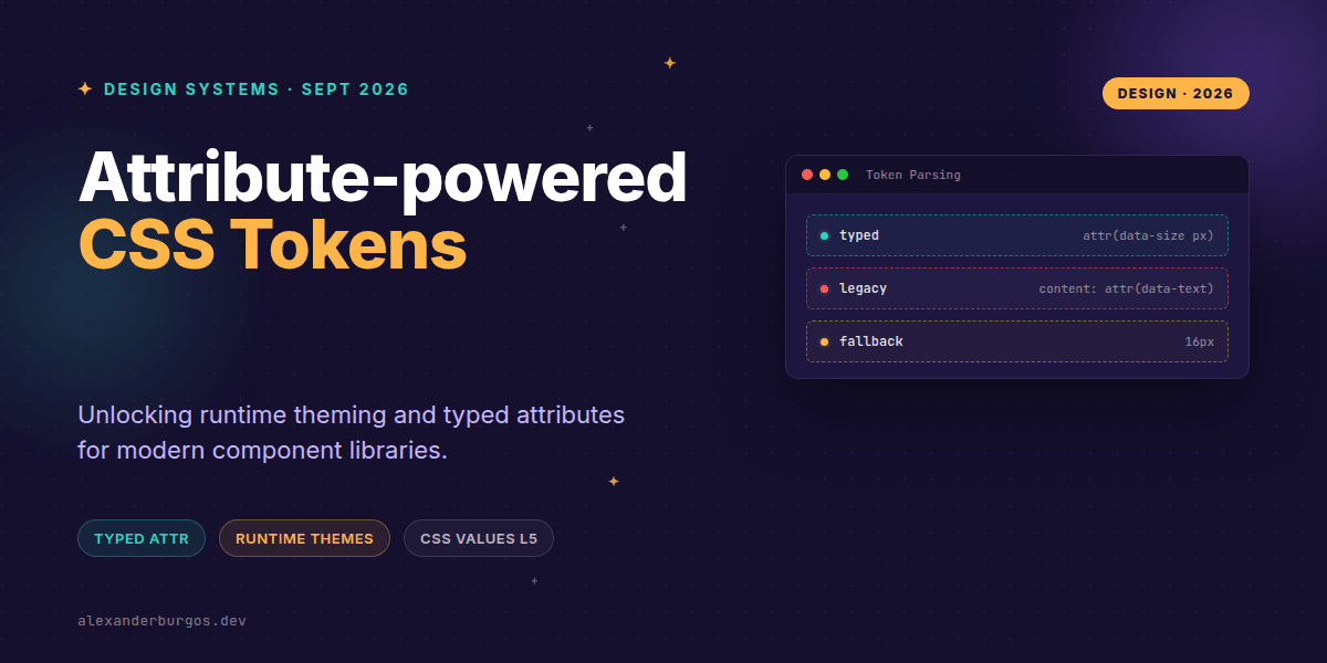
Right, let's talk about the attr() function. For the longest time, it was that slightly frustrating CSS tool that only worked within the content property of pseudo-elements. Useful for tooltips, sure, but not much else. That's all changed.
The CSS Values and Units Level 5 specification has officially supercharged attr(), turning it into a first-class design token primitive. We can now pull values directly from HTML attributes into any CSS property, with full support for data types like colours, lengths, and percentages. It's a game-changer for how we bridge the gap between React props and CSS variables.
The New Syntax: More Than Just Strings
In the past, attr() always returned a string. If you tried to use padding: attr(data-spacing), the browser would just stare at you blankly because it didn't know if that string was meant to be pixels, rems, or a colour. The new syntax solves this by introducing types and units.
/* The modern format */
attr( <attr-name> <attr-type>? , <fallback>? )
You can now specify exactly how the browser should parse the attribute. Want a numeric value to be treated as pixels? Just add px. Need a hex code from a data-color attribute? Use type(. It even allows for a fallback value if the attribute is missing or invalid, which is critical for robust design systems.
Runtime Theming with data-attributes
I've found this particularly powerful for components that need dynamic, user-defined styling—like a card component where the user picks an accent colour. Instead of injecting inline styles (which can be a nightmare for CSP policies and specificity), we can use a typed attribute.
/* CSS */
.card {
  --card-accent: attr(data-theme-color type(<color>), #1e90ff);
  border-color: var(--card-accent);
  box-shadow: 0 0 10px var(--card-accent);
}

/* HTML */
<div class="card" data-theme-color="#ff4a4a">...</div>
In this example, the browser parses #ff4a4a as a proper CSS colour token. If the attribute is missing, it gracefully falls back to a nice Dodger Blue. This keeps our styles in the CSS file where they belong, while still allowing the DOM to drive the visual state.
Integration with React and Design Systems
When building a React-based design system, we often struggle with how to pass layout props down to the CSS. We usually end up with a messy style object or a massive list of utility classes. With advanced attr(), we can create a very clean mapping.
const ProgressBar = ({ progress }) => (
  <div
    className="progress-bar"
    data-pct={progress}
    role="progressbar"
  />
);

/* CSS */
.progress-bar {
  width: attr(data-pct type(<percentage>), 0%);
  background: #eee;
  height: 8px;
}
It's elegant because the data-pct attribute serves two purposes: it provides the data for the CSS to render the bar, and it remains accessible for testing or screen readers. It’s a single source of truth for the component's state.
The Browser Support Reality Check
Now, a word of caution. While Chrome 133+ has shipped this upgrade, it's still fresh. Older browsers—and even current versions of Safari and Firefox at the time of writing—only support the legacy string-based attr() inside the content property.
In my experience, you should treat this as a progressive enhancement. Always provide a standard CSS variable or a static value as a fallback. If the browser doesn't understand the typed attr(), it will ignore the declaration, allowing your fallback to take over.
- Invalid types: If the attribute value doesn't match the specified type (e.g., passing 'hello' to a
pxtype), the entire expression becomes invalid. - Defaulting: If you don't specify a type, it defaults to
string, which won't work for properties likewidthorcolor. - Selectors vs. Functions: Don't confuse
[data-attr]selectors with theattr()function; one matches elements, the other reads values.
Wrapping Up
- Advanced
attr()allows for typed parsing (px, color, %, etc.) directly in CSS. - It enables cleaner React component APIs by using data attributes as runtime tokens.
- Always include a fallback value to ensure your UI doesn't break in older browsers.
I'd encourage you to start experimenting with this in your internal tools or prototypes. It’s a glimpse into a future where our HTML and CSS are much more tightly integrated without the need for heavy JavaScript logic to sync styles.
If you want to go deeper and learn how to build real, production-ready CSS design systems step by step, check out my full course here: CSS Design Systems Course
The full story including the testing layers and governance lives in Ship Your Design System on Amazon.
Feel free to reach out on Twitter or LinkedIn if you have questions about implementing this in your own system!