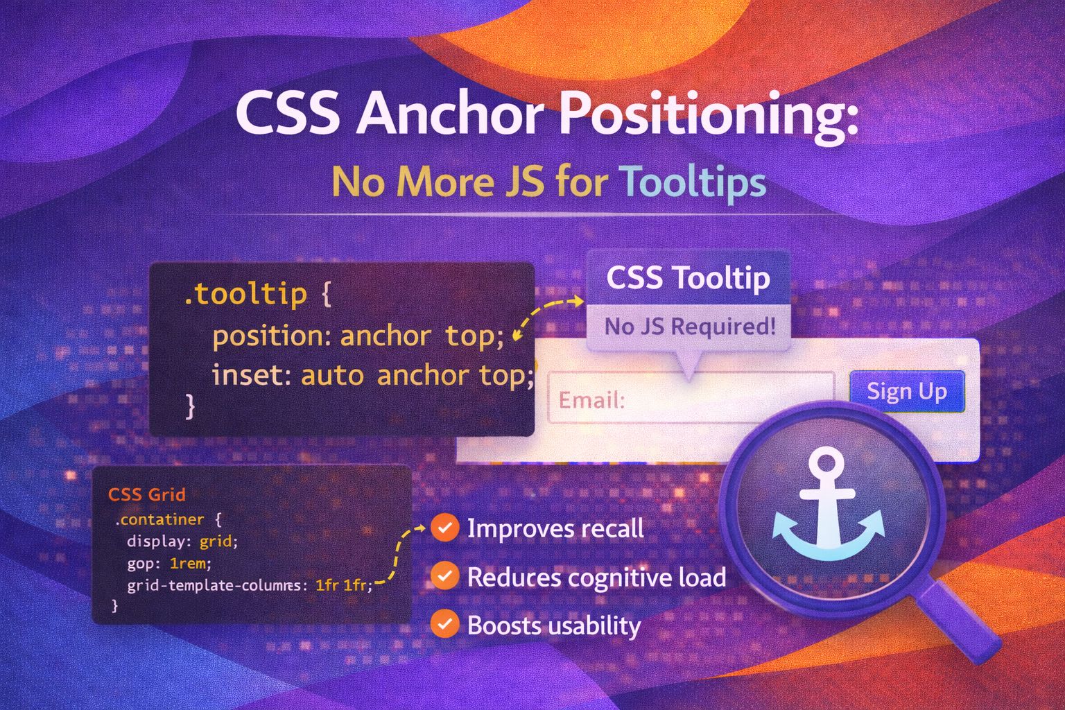
I've spent years wrestling with Popper.js and Floating UI just to get a simple tooltip to stay put. It's always felt a bit heavy-handed to load a JavaScript library just to pin one element to another, which is why I'm absolutely buzzing about CSS Anchor Positioning.
This new API lets us tether elements together natively in the browser. It's cleaner, more performant, and honestly, it's the way web development should have always worked.
The Basic Setup: Naming Your Anchor
First, you need to tell the browser which element is the 'anchor' using a dashed-ident name. I find it helpful to keep these names descriptive so they're easy to manage in larger design systems.
/* HTML */
<button class="anchor-btn">
  Hover for Info
</button>

<div class="my-tooltip" role="tooltip">
  I am tethered to the button!
</div>

/* CSS */
.anchor-btn {
  anchor-name: --my-button;
}
Once the anchor is named, you can tell your tooltip to follow it using the `position-anchor` property. I love how declarative this feels compared to calculating offsets in a script.
.my-tooltip {
  position: absolute;
  position-anchor: --my-button;
  /* The tooltip now 'knows' it belongs to --my-button */
}Effortless Placement with position-area
The real magic happens with `position-area`. Instead of manual math, you use logical keywords to place the element in a 3x3 grid around the anchor.
.my-tooltip {
  position: absolute;
  position-anchor: --my-button;
  position-area: top center; /* Places it above, horizontally centred */
  margin-bottom: 8px; /* Adds a bit of breathing room */
}
You can quickly move things around just by changing the keywords. Here's how I'd handle a side-aligned popover.
.popover-menu {
  position: absolute;
  position-anchor: --my-button;
  position-area: right span-bottom;
  /* Aligns to the right side, spanning towards the bottom */
}Fine-tuning with the anchor() Function
Sometimes `position-area` is too rigid, and you need pixel-perfect control. The `anchor()` function lets you grab specific coordinates from any side of the anchor.
.custom-tooltip {
  position: absolute;
  /* Set the top of the tooltip to the bottom of the anchor */
  top: anchor(--my-button block-end);
  /* Align the left of the tooltip to the left of the anchor */
  left: anchor(--my-button start);
  margin-top: 10px;
}
What's even cooler is that you can use these values inside `calc()`. I use this trick all the time for complex UI components.
.fancy-overlay {
  position: absolute;
  /* Position 20px below the anchor's bottom edge */
  top: calc(anchor(--my-button bottom) + 20px);
  width: 200px;
}Matching Sizes with anchor-size()
I often want my dropdown menus to be exactly the same width as the button that opened them. The `anchor-size()` function makes this trivial.
.dropdown-list {
  position: absolute;
  position-anchor: --select-button;
  position-area: bottom span-right;

  /* Match the width of the button exactly */
  width: anchor-size(--select-button inline);
}
You can also use it to set maximum constraints, ensuring your popover never gets smaller than its trigger.
.min-width-popover {
  position: absolute;
  position-anchor: --trigger;
  min-width: anchor-size(--trigger width);
  padding: 1rem;
}Browser Support & Progressive Enhancement
While I'm incredibly excited about this, we have to be realistic about browser support. It's moving fast, but we still need fallbacks for production-ready apps.
- Chromium (Chrome/Edge): Fully supported since version 125.
- Safari: Supported from 17.4+.
- Firefox: Currently behind a flag (Experimental).
I always wrap my anchor styles in a `@supports` block to ensure the UI doesn't break for users on older browsers.
/* Fallback for basic positioning */
.tooltip {
  position: absolute;
  top: 40px;
}

/* Modern enhancement */
@supports (position-anchor: --foo) {
  .tooltip {
    position-anchor: --my-button;
    position-area: top center;
    top: auto; /* Reset fallback */
  }
}Wrapping Up
CSS Anchor Positioning is a game-changer for UX Engineers. It moves the responsibility of UI layout back into the stylesheet where it belongs, reducing our reliance on heavy JS logic.
- Use `anchor-name` to define your reference element.
- Use `position-area` for quick, grid-based placement around an anchor.
- Leverage `anchor()` and `anchor-size()` for precise, dynamic sizing and offsets.
- Always use `@supports` to provide a functional fallback for Firefox users.
I highly encourage you to try this out in your next internal project or prototype. It's one of those features that makes you wonder how we ever lived without it!
If you found this helpful, I'd love to connect! Follow me on Twitter/X @alexandersstudi or LinkedIn for more CSS and design system tips.