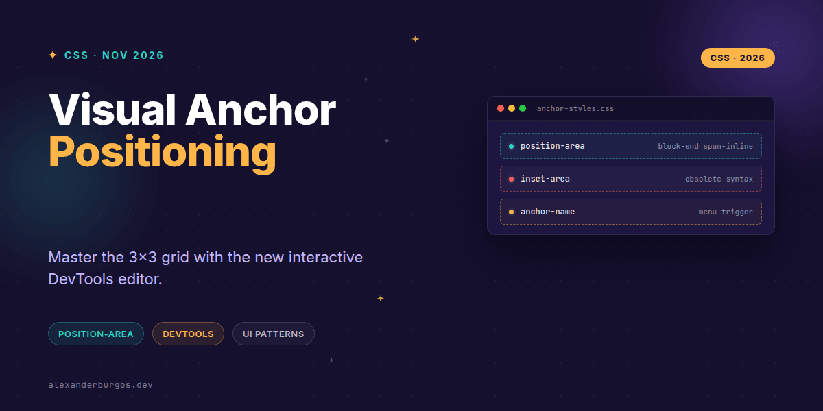
Right, let's talk about CSS Anchor Positioning. If you've ever spent a frustrating afternoon wrestling with absolute positioning, z-index stacks, and JavaScript-heavy libraries like Popper or Floating UI just to get a tooltip to sit nicely, you'll know the struggle is real.
The good news? We've had the Anchor Positioning API for a while now. But the really good news is that as of the November 2026 Chrome update, we finally have the visual tooling we deserve. The new interactive position-area editor in DevTools changes the game from "guess-and-check" to "point-and-click".
The End of Trial-and-Error Debugging
We've all been there: repeatedly switching between top, bottom, start, and end in the Styles pane, hoping the popover lands in the right spot. With Chrome 155/156, those days are effectively over.
When you click the new inline swatch next to a position-area declaration, DevTools opens a visual 3x3 grid editor. This represents the implicit anchor grid where your anchor element is the centre tile. You can visually select regions, toggle the self keyword, and see the browser's geometry in real-time.
- Visual Selection: Pick grid regions without memorising keyword combinations.
- Geometry Overlays: Inspect the inset-modified containing block, including margin, padding, and border boxes.
- Smart Linking: Click through from
position-anchordirectly to the associated anchor element in the DOM tree.
Authoring with the 3x3 Grid
The mental model for position-area is straightforward but powerful. Imagine a tic-tac-toe board. Your anchor element sits in the middle. Your positioned element (the popover or tooltip) can occupy any of the surrounding tiles or even span across them.
/* The modern way to anchor a menu */
#trigger {
  anchor-name: --menu-trigger;
}

#menu {
  position: fixed;
  position-anchor: --menu-trigger;
  position-area: block-end span-inline;
}
In this example, block-end span-inline tells the menu to sit below the trigger and stretch across its horizontal width. It's clean, readable, and—thanks to the new editor—incredibly easy to tweak.
Design Tokens and Semantic Placement
One of the most exciting shifts I've seen is how this affects our design systems. Instead of hard-coding physical coordinates or pixel offsets, we can now store semantic placement tokens.
I've started using tokens like --popover-placement: block-end span-inline;. This makes it trivial to swap placements for different writing modes or override them for specific component variants. Because position-area handles the heavy lifting of the containing block, our tokens become much more resilient.
Handling Collisions and Fallbacks
A visually perfect default position is great until your user scrolls and the tooltip hits the edge of the viewport. That's where @position-try comes in. DevTools now links these rules directly, allowing you to debug your collision logic as easily as your primary placement.
/* Define how to react when space runs out */
#menu {
  position-try-options: flip-block, --custom-fallback;
}

@position-try --custom-fallback {
  position-area: inline-end;
}
Common Gotchas to Avoid
Even with great tools, there are a few traps I've fallen into while implementing this in production-grade design systems:
- Positioning is Required:
position-areadoes nothing if the element isn'tabsoluteorfixed. - Forget Inset-Area: Early experimental versions used
inset-area. Make sure you're using the standardposition-areasyntax now. - Anchor Connection: Simply naming an anchor isn't enough; the positioned element must explicitly reference it via
position-anchor. - Grid Limits: If you need complex offsets (like "10px away from the edge"),
position-areamight be too blunt. That's when you drop down to theanchor()function.
Wrapping Up
- The 3x3 grid model in
position-areais the new standard for simple, robust anchoring. - Chrome's visual editor removes the guesswork from debugging complex UI overlays.
- Use semantic tokens to manage placement across your design system for better maintainability.
I'd highly encourage you to open up Chrome DevTools today and play with the swatch editor on a simple popover. It's one of those "aha!" moments where the spec finally feels intuitive.
If you want to go deeper and learn how to build real, production-ready CSS design systems step by step, check out my full course here: CSS Design Systems Course
I cover this and the other twenty-seven CSS shifts of 2026 in Modern CSS 2026 on Amazon, my catch-up book for people who learned CSS five years ago.
For more CSS tips and design system deep-dives, let's connect on Twitter/X or LinkedIn.