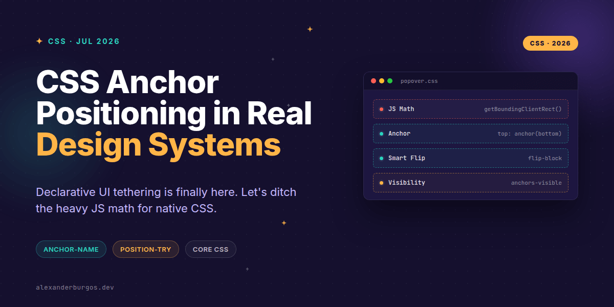
Ever wondered why we're still shipping hundreds of lines of JavaScript just to make a tooltip stay next to a button? It's one of those "web development taxes" we've been paying for decades. We've relied on heavy libraries like Popper or Floating UI to handle the complex math of viewport collisions, scroll containers, and z-index battles.
This changes everything. CSS Anchor Positioning is officially landing in our design systems, and it's set to fundamentally shift how we build floating UI. I'm genuinely excited about this because it moves geometry logic back where it belongs: the stylesheet.
The End of the JS Measurement Tax
In a mature design system, performance is everything. Every time a user scrolls or resizes their window, traditional JS-based tooltips have to fire expensive getBoundingClientRect() calls to recalculate positions. It's jittery, it's heavy, and it's a maintenance nightmare.
With Anchor Positioning, we can declaratively tether a popover, tooltip, or dropdown to an "anchor" element. The browser handles the layout engine optimisations, meaning smoother frame rates and significantly less code to ship. As Chrome's official guidance notes, anchor positioning provides a way to declaratively position an element relative to another, and it's been available since Chrome 125.
The Core Syntax You'll Need
To get this working, you essentially need two parts: the anchor and the positioned element. We use anchor-name to identify the trigger and position-anchor to tell the floating element who its "parent" is in terms of layout.
.trigger {
  anchor-name: --menu-trigger;
}

.menu {
  position: absolute;
  position-anchor: --menu-trigger;
  top: anchor(bottom);
  left: anchor(left);
}
It's clean, readable, and incredibly powerful. Notice how we use the anchor() function? It returns a CSS length, which means you can even use it inside calc() functions if you need specific offsets or complex spacing logic.
Solving the 'Flip' Problem with @position-try
One of the toughest parts of building a design system is collision handling. What happens when a tooltip is at the bottom of the screen? Usually, we write JS logic to 'flip' it to the top. CSS now handles this with @position-try.
.popover {
  position: absolute;
  position-anchor: --button;
  position-try-options: flip-block, flip-inline;
  position-try-order: most-block-size;
}
By using position-try-order: most-block-size, the browser will automatically choose the placement that has the most available space. It's a massive win for UX consistency across different screen sizes.
The Production Strategy: Progressive Enhancement
I'll be honest with you: you shouldn't delete your JS positioning logic just yet. Browser support is still growing. While Chrome has been on board since version 125, other browsers are catching up. In a production design system, I recommend using @supports to gate your styles.
@supports (anchor-name: --a) and (position-anchor: --a) {
  /* Native anchor styles here */
  .tooltip {
    position: absolute;
    position-anchor: --tip;
    inset-block-end: anchor(top);
  }
}
If you need to support older browsers today, there is a fantastic polyfill by Oddbird that works in much older environments. This allows you to write the modern syntax now and let the polyfill handle the heavy lifting for legacy users.
Common Gotchas to Avoid
- Accessibility: Anchor positioning only handles geometry. You still need JS for focus management, ARIA states, and keyboard dismissal.
- Visibility: Use
position-visibility: anchors-visible. This ensures that if the trigger scrolls out of view, the tooltip doesn't stay floating awkwardly in the middle of the screen. - Scope: Remember that
anchor()is specifically for inset-related positioning (top, left, etc.). It's not a general-purpose layout tool for every property.
Wrapping Up
- Start small by using Anchor Positioning for simple tooltips while keeping JS fallbacks for complex menus.
- Leverage
@position-tryto replace bespoke 'flip' logic and reduce your bundle size. - Always pair anchor styles with
position-visibilityto maintain a polished UI during scroll.
The web is getting better at layout so we don't have to keep hacking it. Give this a go in your next component update—your performance metrics will thank you.
The long version with support labels and runnable demos is in Modern CSS 2026 on Amazon Kindle.
If you want to go deeper and learn how to build real, production-ready CSS design systems step by step, check out my full course here: CSS Design Systems Course
Have you tried migrating your system to native anchors yet? Let's chat about it on Twitter or connect with me over on LinkedIn.