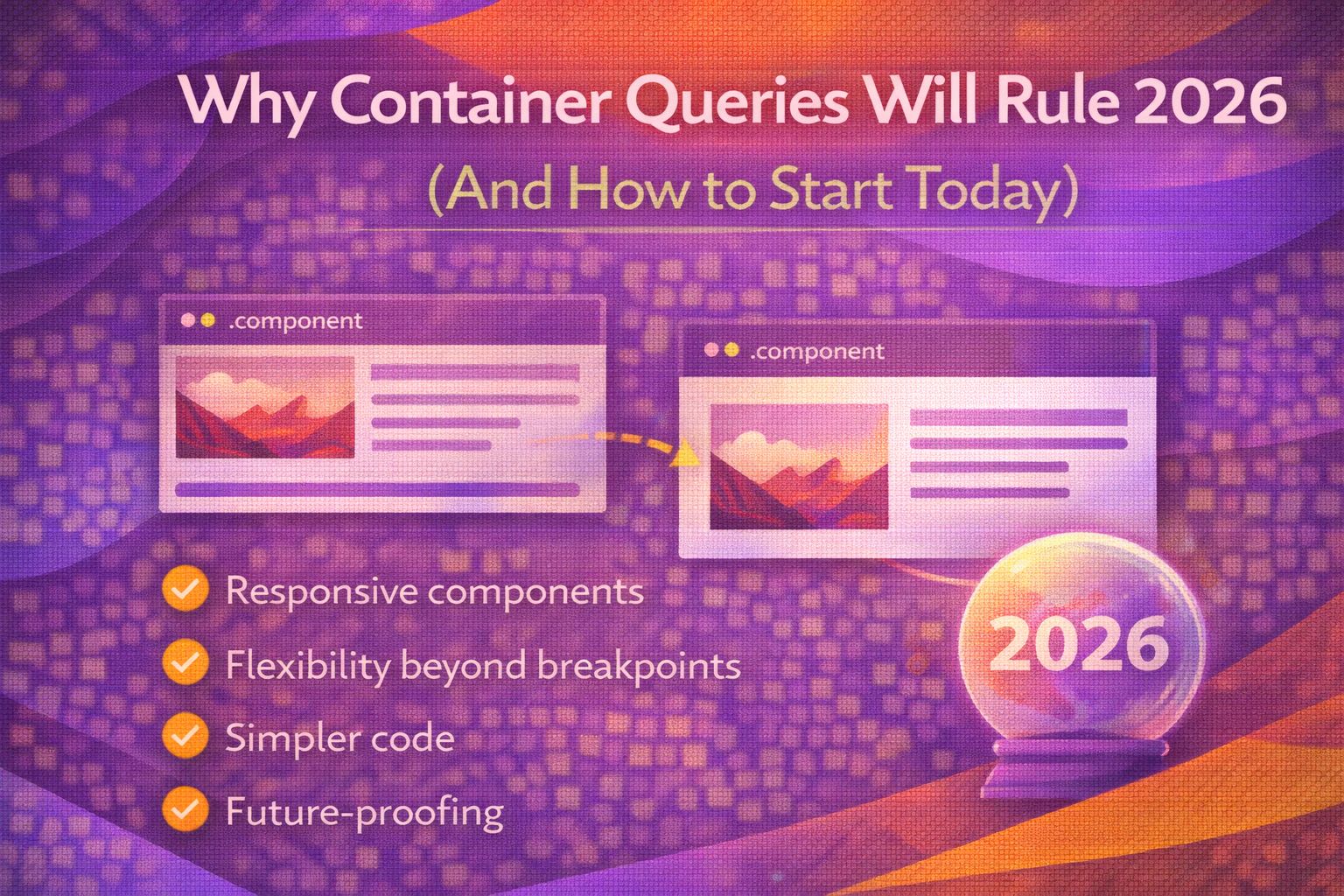
Let's be honest - Media Queries are starting to feel a bit 'last decade' for component-driven development. We've all wrestled with a card component that looks great on the homepage but breaks the moment it's shoved into a narrow sidebar.
The shift toward Container Queries isn't just a trend; it's the final piece of the puzzle for design systems. By 2026, if you aren't using these, you're likely writing ten times more CSS than you actually need. Let's dive into the code.
The Foundation: Size Queries
Before a child can react to its parent's size, we have to explicitly define that parent as a container. I usually stick to `inline-size` because it's the most common use case for responsive layouts.
/* Step 1: Define the container */
.card-wrapper {
  container-type: inline-size;
  container-name: product-grid;
}

/* Step 2: Query the container, not the viewport */
@container product-grid (min-width: 400px) {
  .product-card {
    display: grid;
    grid-template-columns: 150px 1fr;
    gap: 1.5rem;
  }
}
The cool bit here is that `.product-card` doesn't care if the screen is 1920px wide or 375px; it only cares how much room its parent `.card-wrapper` provides. You can also use the modern range syntax which I find much more readable.
/* Modern range syntax for cleaner queries */
@container (width > 600px) {
  .article-content {
    font-size: 1.25rem;
    line-height: 1.6;
    columns: 2;
  }
}

/* Using container relative units */
.dynamic-title {
  font-size: clamp(1rem, 5cqw, 3rem);
}Style Queries: The Design System Secret Weapon
While size queries are the heavy lifters, style queries allow us to change child elements based on the computed styles of the parent. This is massive for complex themes where you don't want to pass down endless React props.
/* Parent sets a custom property */
.theme-dark {
  --card-scheme: dark;
  background: #1a1a1a;
}

/* Child reacts to the property value */
@container style(--card-scheme: dark) {
  .card-title {
    color: #f0f0f0;
    border-bottom: 1px solid #333;
  }
}
Here's another example where we query a direct CSS property like background colour to ensure accessibility. Note that full support for non-custom properties is still rolling out.
/* Experimental: Querying standard properties */
@container style(background-color: #00bcd4) {
  .button-label {
    color: white;
    text-shadow: 0 1px 2px rgba(0,0,0,0.2);
  }
}The Future: Scroll-State Queries
This is the 'magic' territory. Scroll-state queries let us detect if an element is currently stuck (via sticky positioning) or overflowing without a single line of JavaScript. This is a game changer for sticky headers.
/* Define the scroll container */
.header-wrapper {
  container-type: scroll-state;
  position: sticky;
  top: -1px; /* Offset to trigger 'stuck' state */
}

/* Apply styles only when the header is stuck */
@container scroll-state(stuck: top) {
  .main-nav {
    background: rgba(255, 255, 255, 0.9);
    backdrop-filter: blur(10px);
    box-shadow: 0 4px 20px rgba(0,0,0,0.1);
    padding-block: 0.5rem;
  }
}
It's important to wrap these in `@supports` for now, as browser support is still growing. It's the perfect candidate for progressive enhancement.
@supports (container-type: scroll-state) {
  .scroll-indicator {
    display: none;
  }

  @container scroll-state(overflowing: bottom) {
    .scroll-indicator {
      display: block;
      animation: bounce 2s infinite;
    }
  }
}Common Mistakes & Gotchas
I've seen many devs forget that size queries require an explicit opt-in. If you don't set `container-type`, your `@container` rules will simply be ignored. Also, watch out for layout loops.
/* WRONG: Trying to query an element's own size */
.my-component {
  container-type: inline-size;
}

@container (min-width: 500px) {
  .my-component { /* This will cause a loop! */
    width: 600px;
  }
}

/* RIGHT: Query the parent, style the child */
.parent { container-type: inline-size; }
@container (min-width: 500px) {
  .child { width: 100%; }
}Browser Support (2026 Update)
Size queries are now baseline across all major browsers (98%+ global support). Style queries for custom properties are widely supported except for a few pending Firefox implementations. Scroll-state is the 'new kid', currently thriving in Chromium-based browsers.
Wrapping Up
Container queries represent the biggest shift in CSS since Flexbox and Grid. They move us away from 'page-based' design and into true 'component-based' architecture.
- Size queries are production-ready: Use them for any component that lives in multiple layouts.
- Style queries reduce JS overhead: Use them to theme components based on parent context.
- Always opt-in: Remember to set `container-type` on the parent element.
- Progressive enhancement is key: Use `@supports` for newer features like scroll-state.
If you want to go deeper and learn how to build real, production-ready CSS design systems step by step, check out my full course here: CSS Design Systems Course
Got questions or want to share how you're using this? Drop me a message on LinkedIn - I always enjoy chatting about this stuff!