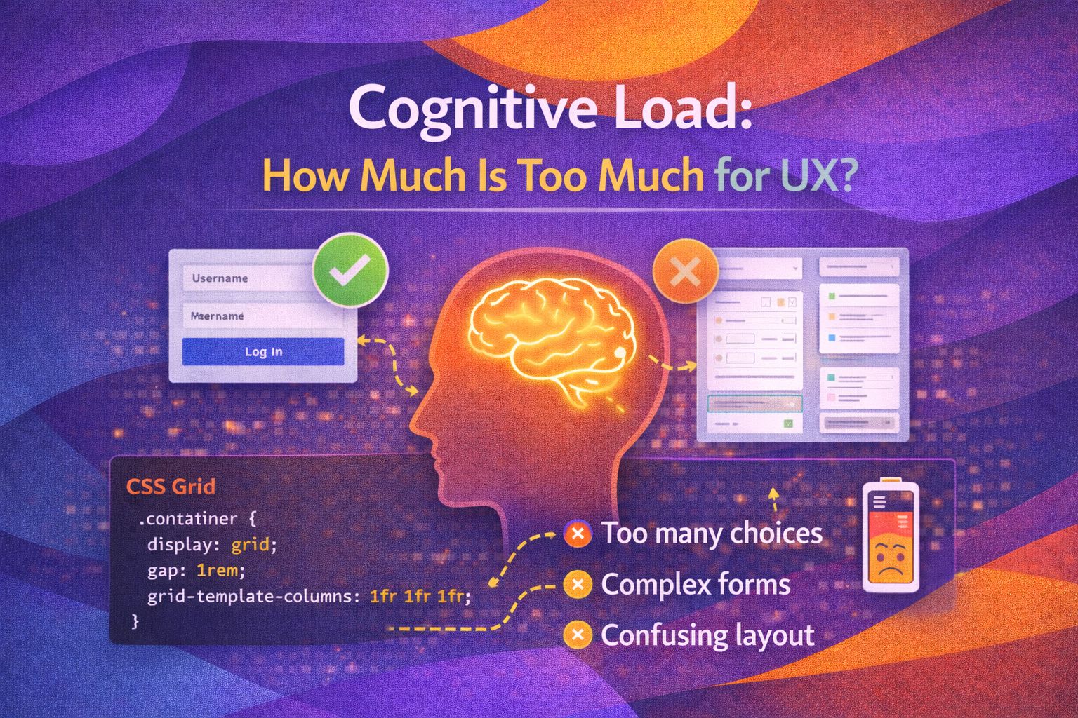
Have you ever landed on a website and felt your brain instantly go into 'freeze' mode? I've been there more times than I care to admit.
You're looking for a simple 'Contact' button, but you're met with three pop-ups, a flashing banner, and a navigation menu that looks like a map of the London Underground.
That feeling of mental paralysis? That's cognitive load hitting its ceiling.
In my years as a UX Engineer, I've found that the difference between a product people love and one they tolerate often comes down to how much thinking they have to do.
We like to think our users are giving us their undivided attention, but the reality is they're usually distracted, tired, or just in a hurry. If we make them think too hard, they'll simply leave.
Understanding the Three Types of Load
Cognitive Load Theory suggests our working memory has a finite capacity. To design better systems, we need to understand the three distinct types of mental effort a user exerts. I like to think of these as the 'Good', the 'Necessary', and the 'Ugly' of UX design.
Our goal as designers isn't to eliminate all thinking. It's to eliminate the extraneous load so the user can focus their limited brainpower on the intrinsic task at hand.
If I'm using a banking app, I want to spend my energy understanding my finances, not figuring out how to find the 'Transfer' button.
Hick’s Law: The Paradox of Choice
We often think more features mean more value. But Hick’s Law tells us that the time it takes to make a decision increases with the number and complexity of choices. I personally see this most often in pricing tables.
Have you ever seen a SaaS product with six different tiers, each with a list of 50 features? It’s exhausting.
The Power of Mental Models
What I find fascinating is how much we rely on what we already know. This is 'Jakob’s Law'—users spend most of their time on other sites. This means they expect your site to work like all the others they use. When you break these patterns, you're forcing the user to build a new mental model from scratch, which is a massive cognitive drain.
Strategies for Reducing Mental Friction
So, how do we actually fix this? Here's a trick I use: Progressive Disclosure. Instead of showing everything at once, we show only what is necessary for the current step. It’s like a conversation; you wouldn't tell someone your entire life story the second you meet them.
- Chunking Information: Break long forms or lists into smaller, manageable groups. The human brain is great at processing 'chunks' of 3 or 4 items.
- Visual Hierarchy: Use size, colour, and weight to tell the user's eyes what to look at first. If everything is bold, nothing is bold.
- Recognition over Recall: Don't make users remember information from one screen to the next. Show it to them. It's much easier to recognise a familiar icon than to recall a specific command.
The ROI of Simplicity
Reducing cognitive load isn't just about 'making it look clean'. It has a direct impact on your business metrics.
When users aren't fighting the interface, they complete tasks faster, make fewer errors, and—most importantly—they feel more confident using your product.
Wrapping Up
Managing cognitive load is arguably the most important job we have as UX professionals. By respecting the user's mental limits, we create experiences that feel intuitive and effortless. Remember, the best interface is often the one you don't even notice.
- Identify the Load: Distinguish between the necessary difficulty of the task and the unnecessary complexity of your UI.
- Limit Choices: Apply Hick's Law to prevent 'analysis paralysis' by offering fewer, more meaningful options.
- Leverage Patterns: Stick to established design conventions to reduce the need for users to learn new mental models.
I encourage you to take a look at your current project today. Is there a screen that feels a bit 'busy'?
try removing one element or grouping related items together and see how much lighter it feels. Experimenting with these small shifts can make a massive difference!
If you found this deep dive into UX psychology helpful, I'd love to connect! Follow me on Twitter/X @alexandersstudi or LinkedIn for more thoughts on design systems and human-centred engineering.