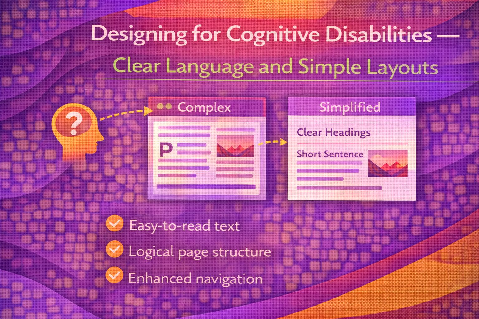
Ever wondered why some of the most 'beautiful' websites feel absolutely exhausting to use? We've all been there staring at a screen, trying to figure out where the navigation went or what a cryptic error message actually wants from us. For most of us, it's a minor annoyance. But for users with cognitive disabilities, these design 'trends' can be total deal-breakers.
Here's the thing: when we talk about accessibility, we often jump straight to screen readers or colour contrast. While those are vital, we sometimes overlook the 'Understandable' principle of WCAG. In my experience, designing for cognitive ease doesn't just help a specific group; it makes your product better for everyone. Whether someone has ADHD, dyslexia, or is just incredibly stressed and sleep-deprived, a simple layout is a lifesaver.
The Mental Load of UI
Before we touch a single line of CSS, let's look at the theory. Cognitive accessibility is about reducing the 'mental load' required to complete a task. If a user has to guess what an icon means or hunt for a submit button, we're failing them. I like to think of it as removing friction from the brain's processing path.
Practical Implementation: The Foundation
Let's get into the code. The biggest favour you can do for your users is to stop trying to reinvent the wheel with layout structures. Use semantic HTML and keep your line lengths under control. A massive wall of text that spans 1920px is a nightmare for focus.
/* Setting a readable foundation */
body {
  font-family: system-ui, -apple-system, sans-serif;
  font-size: 1.125rem; /* Slightly larger for easier scanning */
  line-height: 1.6;    /* Give the text room to breathe */
  color: #1a1a1a;
  max-width: 75ch;     /* Limit line length to ~75 characters */
  margin-inline: auto;
  padding: 2rem;
}

/* Ensure interactive elements are obvious */
a {
  text-decoration-thickness: 2px;
  text-underline-offset: 3px;
}

button {
  cursor: pointer;
  padding: 0.75rem 1.5rem;
  font-weight: 600;
}
The `max-width: 75ch` trick is a personal favourite of mine. It ensures that no matter how wide the screen is, the text remains in a scannable column. This is crucial for users who have difficulty tracking lines of text across a page.
Clear Language and Content Structure
Honestly, the best 'UX hack' is just writing better. Use plain English. If you must use an abbreviation, define it. I've seen so many dashboards that look like alphabet soup because the devs assumed everyone knew the internal lingo. Trust me—they don't.
<!-- Good: Defining abbreviations and using clear hierarchy -->
<article>
  <h1>How to set up your account</h1>
  <p>
    Welcome! To get started, you will need your
    <abbr title="Unique Identification Number">UIN</abbr>.
  </p>

  <section>
    <h2>Step 1: Verification</h2>
    <p>We will send a code to your phone. Enter this code into the box below.</p>
  </section>
</article>
Predictable Interactions and Errors
One of the most stressful experiences for someone with a cognitive disability is an 'invisible' error. You click submit, nothing happens, or the page just refreshes. We need to be loud and clear about what went wrong and how to fix it.
In code, this means using `aria-describedby` to programmatically link our error message to the input field. This way, the relationship is explicit.
<!-- A predictable, helpful form field -->
<div class="form-group">
  <label for="email-address">Email Address</label>
  <input
    id="email-address"
    type="email"
    aria-describedby="email-hint email-error"
    placeholder="e.g. alex@example.com"
  >
  <p id="email-hint" class="hint">We'll use this to send your receipt.</p>
  <p id="email-error" class="error" role="alert">
    Please enter a valid email address (it needs an @ symbol).
  </p>
</div>
Common Pitfalls to Avoid
- Icon-only buttons: Never assume a 'hamburger' or a 'cog' is universal. Always include a text label if space permits.
- Moving targets: Avoid layouts that shift as content loads (Layout Shift). It's disorienting and frustrating.
- Timed sessions: If a user needs more time to read or think, don't time them out without a clear warning and a way to extend it.
- Complex animations: Parallax scrolling might look cool to a designer, but it can cause physical nausea or total confusion for some users.
Wrapping Up
Designing for cognitive disabilities isn't about making 'ugly' or 'boring' sites. It's about clarity, predictability, and respect for the user's focus. When we simplify our layouts and clear up our language, we make the web a more welcoming place for everyone.
- Use semantic HTML and limit line lengths (around 70-80 characters) to improve focus.
- Always label your icons and write instructions in plain, jargon-free language.
- Ensure errors are clearly identified and explicitly linked to their inputs using ARIA.
I'd love to hear your thoughts! Have you found a particular layout pattern that works wonders for readability? Or maybe you've wrestled with a complex form that needed a serious cognitive cleanup? Let me know!
If you want to go deeper and learn how to build real, production-ready CSS design systems step by step, check out my full course here: CSS Design Systems Course
Got questions or want to share how you're using this? Drop me a message on LinkedIn - I always enjoy chatting about this stuff!