Okay, I'm genuinely excited about this. If you've been building design systems lately, you know the struggle of debugging complex responsive logic when it's buried inside nested components.
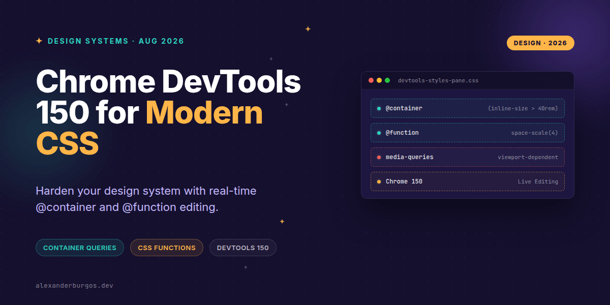
Chrome 150 just dropped, and it feels like the DevTools team finally gave us the keys to the kingdom for modern CSS. We're talking about direct, in-place editing for @container and @function rules right in the Styles pane.
Why this changes the workflow
In my experience, the hardest part of operationalising a token-driven system isn't writing the CSS—it's verifying how those tokens behave across a dozen different container sizes. Before this update, tweaking a container query meant jumping back and forth between your IDE and the browser, or digging through the inspector to find where the logic lived.
According to the Chrome DevTools 150 release, we can now edit container names and query conditions directly. As the Chrome team puts it: “In-place @container rule editing... allowing seamless experimentation with responsive container query designs.”
Hardening your Design Tokens
We've all been there: you change a spacing token, and suddenly three components in the sidebar break. By using the new @function editing capabilities, we can test our logic in real-time without refreshing.
/* Example: Testing a spacing function in DevTools */
@function space-scale($step) {
  @return calc(0.25rem * $step);
}

.card {
  padding: space-scale(4); /* Now editable in Styles pane! */
}
I've found that being able to tweak the body of a @function directly in the browser helps identify edge cases—like boundary values in typography—long before they hit production. It's about reducing that feedback loop to zero.
Eliminating the Noise
One of the slickest additions in version 150 is the preference to collapse non-contributing CSS rules. Design systems are notorious for accumulating "dead" CSS or overridden declarations that just clutter the Styles pane.
When you're debugging a component with multiple container query states, DevTools now emphasises only the rule that currently matches the container size. This is huge for preventing regressions because you aren't accidentally editing an inactive rule and wondering why nothing changed.
Common Pitfalls to Avoid
- Forgetting container-type: Remember,
@containerrules won't fire unless an ancestor hascontainer-typeset. DevTools now makes this relationship much clearer. - Isolated Tweaking: Don't just change the query condition (e.g., 400px to 500px) in a vacuum. Use the DevTools link back to the container element to ensure the context is correct.
- Ignoring functions: With
@functionrules now editable, don't leave your logic static. Test how your math holds up under stress directly in the Styles pane.
Wrapping Up
- Use in-place editing to stress-test your
@containerthresholds against real content. - Leverage
@functionediting in the Styles pane to verify your design tokens and math logic. - Enable 'collapse non-contributing rules' to stay focused on active styles and reduce accidental regressions.
I'd encourage you to open up Chrome 150 today and try breaking your spacing functions. It's the best way to see how robust your system really is!
If you want to go deeper and learn how to build real, production-ready CSS design systems step by step, check out my full course here: CSS Design Systems Course
If this is the kind of thing you keep finding out late about, my book Modern CSS 2026 on Amazon is one chapter per shift, with honest support labels.
Let's keep the conversation going! You can find me sharing more CSS tips on Twitter or connect with me for a deeper dive on LinkedIn.