Okay, I'm genuinely excited about this. After years of "will they, won't they" drama in the Chromium issue tracker, Chrome 155 has officially shipped native JPEG XL decoding by default. It's a massive milestone for those of us obsessed with web performance and high-fidelity design systems.
But before you go and batch-convert your entire S3 bucket to .jxl, we need to talk strategy. This isn't a drop-in replacement for AVIF or WebP yet. It's a powerful new tool that requires a bit of architectural finesse to get right, especially when you're managing components at scale.
The New Reality: Chrome 155 and jxl-rs
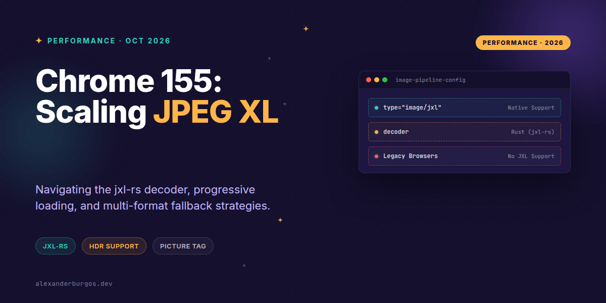
As of October 6, 2026, Chrome 155 uses a pure-Rust implementation called jxl-rs to handle decoding. Why does that matter to us? Because it's memory-safe by design, which was one of the big hurdles for getting this into the browser in the first place.
JPEG XL (standardised as ISO/IEC 18181) brings some heavy-hitting features to the table that WebP and even AVIF sometimes struggle with:
- Progressive decoding: The image starts blurry and sharpens as data arrives, which is fantastic for perceived performance.
- Lossless JPEG transcoding: You can convert existing JPEGs to JXL losslessly and save about 20% in file size.
- Wide Gamut & HDR: Full support for high bit depths and advanced colour profiles.
- Efficiency: Often beats AVIF at higher quality settings and larger resolutions.
The Golden Rule: Never Ship JXL Alone
I've seen some folks get over-eager and try to swap their <img> tags directly. Don't do that. Browser support is still non-universal. While Safari 17+ has support, Firefox is still behind flags, and older Chromium versions obviously won't know what to do with a .jxl file.
Your production markup needs to be robust. We use the <picture> element to handle format negotiation. The browser will look at the list, see if it understands image/jxl, and if not, it'll move to the next <source>.
<picture>
  <!-- Priority 1: JPEG XL -->
  <source
    type="image/jxl"
    srcset="/hero-640.jxl 640w, /hero-1280.jxl 1280w"
    sizes="(max-width: 700px) 100vw, 1200px">

  <!-- Priority 2: AVIF -->
  <source
    type="image/avif"
    srcset="/hero-640.avif 640w, /hero-1280.avif 1280w"
    sizes="(max-width: 700px) 100vw, 1200px">

  <!-- Fallback: Standard JPEG -->
  <img
    src="/hero-1280.jpg"
    width="1200"
    height="675"
    loading="lazy"
    decoding="async"
    alt="Product dashboard">
</picture>
One quick tip: ensure your server is configured to serve .jxl files with the correct image/jxl MIME type. If you serve it as application/octet-stream, the browser will likely ignore the source entirely.
Managing CSS Backgrounds
CSS doesn't have a built-in <picture> equivalent for background images (yet). I usually recommend a small JS probe to check for support and toggle a class on the root element. It's cleaner than trying to guess based on the User Agent.
const probe = new Image();
probe.onload = () => document.documentElement.classList.add("jxl");
probe.onerror = () => document.documentElement.classList.add("no-jxl");
// Tiny JXL base64 probe
probe.src = "data:image/jxl;base64,...";
.hero { background-image: url("/hero.jpg"); }
.jxl .hero { background-image: url("/hero.jxl"); }Design System Integration Strategy
In a design system, I've found it's best to treat JPEG XL as an opt-in format token. Don't force it into every Image component overnight. Start with your high-impact assets—hero banners, editorial photography, and product galleries—where the HDR and progressive loading benefits actually move the needle.
You should also establish per-component budgets. A hero image might have a larger byte budget for JXL because the perceived loading speed is better, but for small avatars, the overhead of the decoder might not be worth it compared to a simple WebP.
Common Gotchas to Watch Out For
- Progressive != Faster: While it looks better as it loads, the actual CPU work to decode a progressive JXL can be higher. Monitor your 'Total Blocking Time' on low-end mobile devices.
- Safari Divergence: Safari's implementation of JXL doesn't always handle progressive rendering the same way Chrome does. Always cross-browser test your LCP (Largest Contentful Paint).
- Layout Shifts: Just like any other format, if you don't define
widthandheight, you're going to get layout shifts. The format change doesn't magically fix bad CSS. - Comparison Bias: When testing, make sure you're comparing apples to apples. If your JXL has an HDR profile but your AVIF doesn't, the file size difference isn't telling the whole story.
If you want the long-form version of this with 23 chapters and runnable code, Ship Your Design System on Amazon is the handbook.
Wrapping Up
- Use the
<picture>tag to offer JXL as the primary source with AVIF and JPEG as fallbacks. - Leverage JXL for high-fidelity needs like HDR and wide-gamut colour where WebP falls short.
- Start with a feature-flagged rollout to monitor RUM (Real User Monitoring) data before a full site-wide adoption.
It's a great time to be a UX engineer. The tooling is finally catching up to our design ambitions. Go experiment with a few hero images and see how the metrics look!
If you want to go deeper and learn how to build real, production-ready CSS design systems step by step, check out my full course here: CSS Design Systems Course
I'd love to hear how your JXL experiments are going. Connect with me on Twitter or LinkedIn to chat more about performance and design systems.