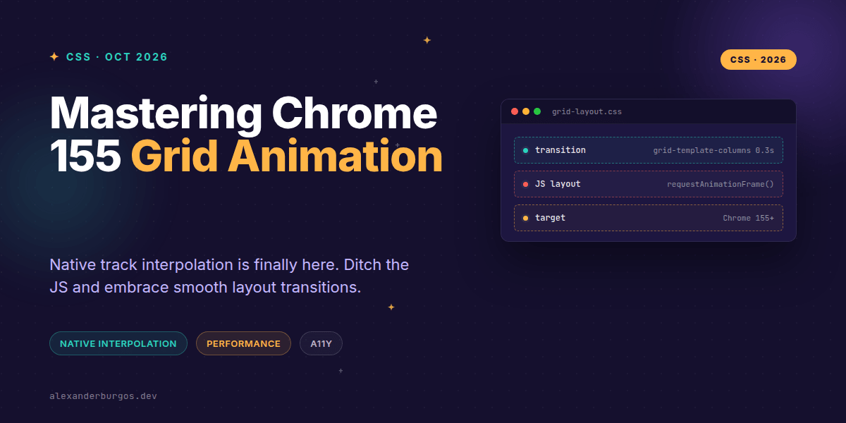
Right, let's talk about layout transitions. For years, if you wanted to smoothly animate a card grid expanding or a sidebar collapsing, you were stuck in JavaScript land. We’ve all been there: measuring DOM nodes, calculating offsets, and fighting requestAnimationFrame just to make a layout feel fluid.
Chrome 155 changes the game by treating grid-template-columns and grid-template-rows as interpolable properties. This means we can finally move layout logic back to where it belongs: the stylesheet. It’s a massive win for performance and developer experience, provided we handle the implementation with a bit of care.
The Technical Shift: Why it Works
In the past, changing a grid track was a discrete jump. The browser would re-calculate the layout and the elements would snap into their new positions instantly. As Google web.dev notes, “Supporting interpolation for these properties allows grid layouts to smoothly transition between states.”
Technically, the browser looks at the computed track lists. If the structure is compatible—meaning the number of tracks stays the same—it can interpolate the lengths, percentages, and even calc() values. Here is how a basic implementation looks in a design system component:
.cards {
  display: grid;
  grid-template-columns: repeat(4, minmax(0, 1fr));
  gap: 1rem;
  transition: grid-template-columns 300ms ease, gap 300ms ease;
}

.cards.is-expanded {
  grid-template-columns: repeat(4, minmax(0, 2fr));
  gap: 1.5rem;
}
By keeping the track count identical (four columns in both states), the browser can calculate the delta for each track and animate it. If you try to jump from repeat(4, 1fr) to repeat(2, 1fr), you’ll lose that smooth interpolation because the structure itself has changed.
Progressive Enhancement is the Secret Sauce
I’m a huge advocate for progressive enhancement. Just because Chrome 155 supports native interpolation doesn't mean we should break the experience for everyone else. We want to ensure that older browsers still get a functional (if static) layout.
We can use @supports to detect if the browser understands the property, but remember: parsing a property isn't the same as supporting the animation of it. The best approach is to define your static layout first, then layer the transition on top.
.cards {
  display: grid;
  grid-template-columns: repeat(2, minmax(0, 1fr));
  gap: 1rem;
}

@supports (grid-template-columns: 1fr 1fr) {
  .cards {
    transition: grid-template-columns 300ms ease;
  }

  .cards[data-wide="true"] {
    grid-template-columns: repeat(2, minmax(0, 2fr));
  }
}
This ensures that legacy browsers simply snap to the new layout—which is exactly what they’ve been doing for years. No harm, no foul, and no expensive JS polyfills required.
Handling Responsive Tracks and Auto-fit
We often use auto-fit or auto-fill for card grids to avoid writing a dozen media queries. While these are brilliant for responsiveness, they are tricky for animation because the number of tracks changes dynamically based on the container width.
In these cases, I’ve found it’s better to focus on animating the gap or using specific track counts within media queries if you need that buttery-smooth motion. For a standard responsive grid, stick to the robust CSS basics:
.card-grid {
  display: grid;
  grid-template-columns: repeat(auto-fit, minmax(min(100%, 16rem), 1fr));
  gap: 1rem;
}

@media (prefers-reduced-motion: no-preference) {
  .card-grid {
    transition: gap 250ms ease;
  }
}
Accessibility and Reduced Motion
Let’s talk accessibility (WCAG). Large-scale layout shifts can be disorienting or even physically nauseating for some users. When you animate a grid, you're potentially moving every single element on the screen.
It is non-negotiable to respect the prefers-reduced-motion media query. If a user has requested less motion, we should kill the transition immediately. The layout should still change, but it should happen instantly.
@media (prefers-reduced-motion: reduce) {
  .cards,
  .card-grid {
    transition: none !important;
    animation: none !important;
  }
}
Common Gotchas to Avoid
- Intrinsic Sizing: Animating tracks that use
auto,min-content, ormax-contentcan lead to jittery results. Stick tofrunits, percentages, orminmax()for smoother interpolation. - Transitioning 'All': Please, don't use
transition: all. It forces the browser to check every property and can lead to massive performance hits during layout shifts. Be explicit:transition: grid-template-columns 300ms ease. - Structural Mismatch: You cannot animate between
repeat(3, 1fr)andrepeat(4, 1fr)smoothly. The browser needs a 1-to-1 track relationship to calculate the path.
Forget everything you know about needing heavy Framer Motion or GSAP setups for simple layout shifts. If your target audience is on modern evergreen browsers, these native capabilities are more than enough to create a high-end feel.
The full story including the testing layers and governance lives in Ship Your Design System on Amazon.
Wrapping Up
- Use identical track counts to ensure smooth interpolation between grid states.
- Layer your transitions using
@supportsand always provide a static fallback for older browsers. - Prioritise accessibility by disabling layout animations for users who prefer reduced motion.
I’d encourage you to experiment with this in your next internal tool or dashboard project. It’s one of those small touches that makes a system feel incredibly polished without adding a single kilobyte of JavaScript.
If you want to go deeper and learn how to build real, production-ready CSS design systems step by step, check out my full course here: CSS Design Systems Course
Got questions about grid interpolation? Let's chat over on Twitter or connect with me on LinkedIn.