Right, let's talk about the humble underline. For years, UX engineers and design system maintainers have been fighting a losing battle against the browser's default text-decoration. It was either too close to the baseline, cut through descenders awkwardly, or looked like a mess when spanning multiple words.
We've all been there: resorting to background-image gradients, box-shadow hacks, or even injecting SVGs just to get a link that looks professional. But with the release of Chrome 154, we're finally getting the native tools we need to make underlines a first-class citizen of our design systems.
The Game Changer: text-decoration-inset
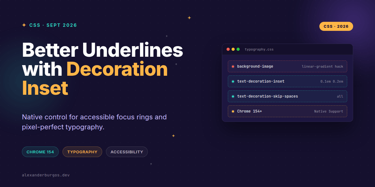
The star of the show in Chrome 154 is text-decoration-inset. According to the Chrome DevRel team, this property controls how far underlines, overlines, and line-throughs are inset from or extended beyond the text run edges. It supports auto, lengths, and percentages.
In my experience, this is the 'missing link' for typographic consistency. Instead of guessing how a specific font's baseline will interact with a decoration, we can now define a precise offset. Even better, it supports a two-value syntax for start and end offsets, allowing for asymmetric underlines that can be used for sophisticated hover effects.
.ds-link {
  text-decoration-line: underline;
  text-decoration-thickness: 0.08em;
  /* Move the underline 0.06em away from the glyphs */
  text-decoration-inset: 0.06em;
}
Cleaning up with text-decoration-skip-spaces
Have you ever noticed how an underline running through the gap between two words looks just a bit... off? Chrome 154 formally supports text-decoration-skip-spaces, a subproperty from the CSS Text Decoration Level 4 spec.
This property allows us to specify whether the decoration should skip whitespace characters entirely. By setting it to all, the underline only appears under the actual glyphs, creating a much cleaner, more modern look that previously required wrapping every single word in a via JavaScript.
Accessibility and Focus Treatments
I've found that these properties aren't just for aesthetics; they're huge for accessibility. We can use text-decoration-inset to create high-contrast focus rings that don't rely on outline, which can sometimes be clipped by overflow: hidden containers.
.ds-link:focus-visible {
  outline: none;
  text-decoration-line: underline;
  text-decoration-thickness: 0.15em;
  text-decoration-color: var(--brand-primary);
  /* Pull the 'focus underline' further down */
  text-decoration-inset: 0.2em;
}
Common Gotchas to Watch Out For
- Legacy confusion: Don't confuse the old
text-decoration-skipshorthand with these new granular subproperties. The implementation details have changed significantly. - Whitespace behavior: Remember that
skip-spacesalso skipsletter-spacingandword-spacing. If you have wide tracking, your underline might look fragmented. - Browser Parity: While Chrome 154 is leading the way, Firefox and Safari have varying levels of support for the Level 4 spec. Always use a progressive enhancement approach.
Wrapping Up
- Use
text-decoration-insetto replacebackground-imagehacks for underlines. - Leverage
text-decoration-skip-spacesto clean up typography without extra DOM nodes. - Experiment with two-value insets for unique, accessible focus indicators.
I'd encourage you to fire up the latest Chrome Beta and try these out in your local component library. It's rare that we get CSS properties that simultaneously improve DX, UX, and performance by deleting legacy hacks.
If you want to go deeper and learn how to build real, production-ready CSS design systems step by step, check out my full course here: CSS Design Systems Course
I cover the full pipeline in Ship Your Design System, 200 pages on Amazon Kindle.
For more CSS tips and design system architecture, follow me on Twitter or connect with me on LinkedIn.