We've all been there: you're building a design system component that needs to embed a third-party form, a checkout widget, or a dynamic card. Suddenly, you're drowning in postMessage() listeners, ResizeObserver hacks, and that flickering scrollbar that just won't go away. It's the classic iframe height problem, and for decades, it's been the bane of UX engineers everywhere.
But as of September 22, 2026, everything has changed. Chrome 154 has finally shipped a native solution for responsive iframe sizing. I'm genuinely excited about this because it moves a complex layout problem out of the JavaScript main thread and directly into the CSS engine where it belongs.
The New Component Contract
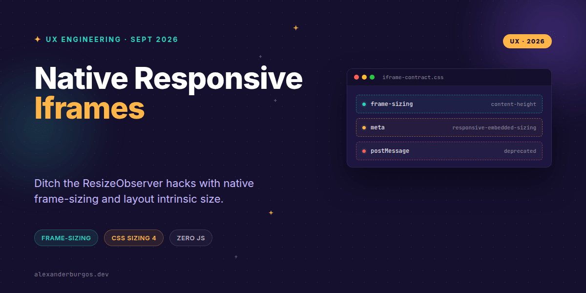
In a design system context, we can't just throw an iframe onto a page and hope for the best. We need a strict contract. The beauty of the new frame-sizing property is that it creates a two-sided agreement between the host (the embedder) and the guest (the provider).
- The Embedder Contract: The parent component owns the layout policy. It defines the constraints like
min-height,max-width, and the specific sizing logic (e.g.,content-height). - The Provider Contract: The embedded document must explicitly opt-in. This isn't a free-for-all; the guest page uses a
metatag to signal that it's happy to share its intrinsic size with the parent. - The Runtime Contract: If the content changes—say, an accordion opens inside the iframe—the child document can trigger
window.requestResize()to tell the parent to recalculate.
Implementing the Solution
Let's look at how we actually build this. It's refreshingly simple. First, the embedder (your design system component) sets the rules in CSS:
.ds-iframe-embed {
  display: block;
  width: 100%;
  /* Reserve space to prevent layout shift */
  min-height: 12rem;
  /* The magic property */
  frame-sizing: content-height;
}
Then, the embedded document (the page inside the iframe) needs to opt-in via its HTML head. I'd recommend being specific with your origins rather than using a wildcard for better security:
<head>
  <meta
    name="responsive-embedded-sizing"
    content="allow-origins=https://your-app.com">
</head>
Progressive Enhancement and Fallbacks
While Chrome 154 is a massive step forward, we can't ignore users on older browsers or other engines just yet. In my experience, the best way to handle this is through a robust CSS fallback strategy. We define a sensible default height and then override it if the browser supports frame-sizing.
.ds-iframe-embed {
  display: block;
  width: 100%;
  height: 400px; /* Legacy baseline */
}

@supports (frame-sizing: content-height) {
  .ds-iframe-embed {
    height: auto;
    frame-sizing: content-height;
  }
}
Critical Gotchas to Watch For
It's easy to assume this solves everything, but there are a few nuances I've found while testing this new API. First, it is not unilateral. If the child document doesn't include that meta tag, the parent's frame-sizing property won't do a thing.
Secondly, don't ditch your accessibility foundations. You still need a descriptive title attribute on the iframe for screen readers, and loading="lazy" is still your best friend for performance. Native sizing doesn't replace these; it complements them.
Finally, remember that frame-sizing: content-height follows the intrinsic layout size. If you have lazy-loaded images or heavy fonts that pop in later, the iframe might still clip unless the child calls window.requestResize(). It's much cleaner than the old way, but the child still needs to be aware of its own layout shifts.
The full story including the testing layers and governance lives in Ship Your Design System on Amazon.
Wrapping Up
- Use
frame-sizing: content-heightto let the browser handle iframe dimensions natively. - Ensure the embedded content opts in with the
responsive-embedded-sizingmeta tag. - Always provide a CSS fallback for browsers that haven't implemented the spec yet.
I'd encourage you to start experimenting with this in your staging environments. It's a huge win for UX engineering and significantly reduces the maintenance burden of cross-origin embeds.
If you want to go deeper and learn how to build real, production-ready CSS design systems step by step, check out my full course here: CSS Design Systems Course
Let's keep the conversation going. You can find me sharing more CSS tips on Twitter or connect with me for a deeper dive on LinkedIn.