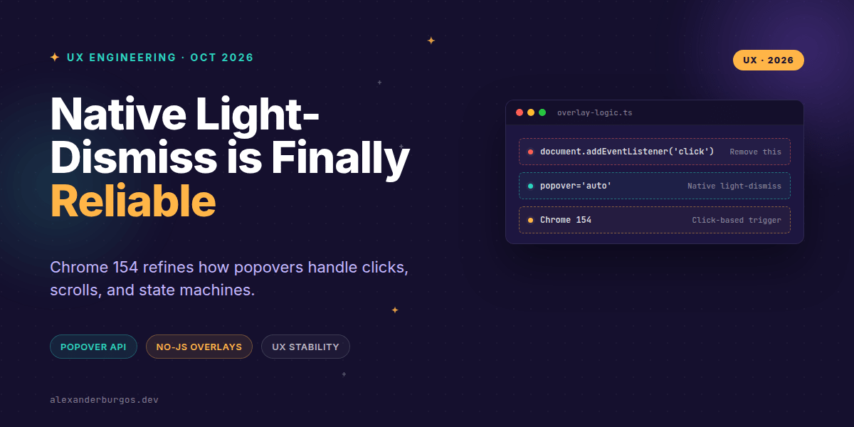
We've all been there: you're building a dropdown menu or a tooltip, and you spend more time debugging the "click-outside" logic than actually styling the component. You've got event.composedPath() checks, global document listeners, and that one annoying bug where scrolling on mobile accidentally closes the whole thing. It's a mess.
Well, Chrome 154 just changed the game. By refining how native light-dismiss works, the browser is taking over the heavy lifting of overlay state management. Let's look at why this matters for your design system and how we can finally delete those bespoke JavaScript handlers.
The Chrome 154 Shift: Clicks vs Pointers
In previous versions, native light-dismiss for popovers was often triggered by a combination of pointerdown and pointerup. While that sounds fine on paper, it led to some frustrating UX. If a user started a drag gesture or a touch scroll inside a popover but ended it outside, the overlay might vanish unexpectedly.
Chrome 154 refines this: dismissal is now triggered by a completed click event. This is a massive win for accessibility and mobile UX. It means right-clicks or accidental drags during a scroll won't trigger a dismissal. The browser is now smart enough to distinguish between a deliberate "dismissal click" and a stray pointer action.
Declarative State Machines
The beauty of the HTML Popover API is that it gives us three distinct state machines right out of the box. Instead of managing isOpen booleans in React or Vue, we can use declarative attributes:
- popover="auto": The gold standard. It participates in the auto-popover stack, supports light-dismiss, and closes other popovers when it opens.
- popover="hint": Perfect for tooltips. It supports light-dismiss but won't close your main "auto" popovers (like a menu) when it appears.
- popover="manual": For when you need total control. It doesn't light-dismiss and ignores the Escape key.
<button popovertarget="user-menu">Open Menu</button>

<div id="user-menu" popover="auto">
  <nav>
    <a href="/profile">Profile</a>
    <button popovertarget="user-menu" popovertargetaction="hide">Close</button>
  </nav>
</div>
Focus Handling and the Escape Key
One of the trickiest parts of UX engineering is focus restoration. When a user closes a menu, focus should ideally return to the button that opened it. Native popovers handle this automatically. If you use autofocus inside your popover, the browser moves focus there on open, and restores it to the trigger on close.
However, keep in mind that popovers are non-modal by default. They don't trap focus like a <dialog>. If you need a true modal experience where the user can't interact with the background, you're looking for the Dialog API, which also got a light-dismiss upgrade recently.
Since Chrome 134, we've had the closedby="any" attribute for dialogs. This brings the best of popover light-dismiss to the modal world:
<dialog id="settings-modal" closedby="any">
  <form method="dialog">
    <h2>Settings</h2>
    <button>Save Changes</button>
  </form>
</dialog>
Refactoring Design System Primitives
If you're maintaining a design system, these changes allow you to drastically simplify your codebase. You no longer need to maintain a complex 'OverlayManager' service. Instead, your primitives can delegate to the platform.
By using popover="hint" for tooltips and popover="auto" for menus, you avoid the 'z-index wars' and the need for event.stopPropagation() hacks. The browser manages the top layer, ensuring your overlays always sit above the rest of the UI without manual stacking context management.
Common Gotchas to Watch For
I've noticed a few patterns that can trip you up when moving to native dismissal:
- Semantics matter: The
popoverattribute is just a behavior, not a role. You still need to applyrole="menu"orrole="tooltip"to ensure screen readers understand the content. - Avoid double-toggling: If you have a legacy global click handler and a native popover, they might fight. The browser might close the popover natively, and your JS might immediately reopen it.
- Manual is manual: If you use
popover="manual", the Escape key won't work. You must provide an explicit close mechanism.
Wrapping Up
- Chrome 154 makes light-dismiss safer by using the
clickevent, preventing accidental closures during scrolls. - Native popovers and dialogs (with
closedby) handle focus restoration and Escape key logic without external libraries. - Design systems should move toward declarative attributes (
auto,hint,manual) to reduce JavaScript overhead.
I'd encourage you to open up your component library today and see how many lines of 'outside-click' logic you can delete. It's incredibly satisfying to let the browser do the work for once.
If you want to go deeper and learn how to build real, production-ready CSS design systems step by step, check out my full course here: CSS Design Systems Course
If this is the kind of thing you keep finding out late about, my book Modern CSS 2026 on Amazon is one chapter per shift, with honest support labels.
For more updates on CSS architecture and UX engineering, let's connect on Twitter or LinkedIn.