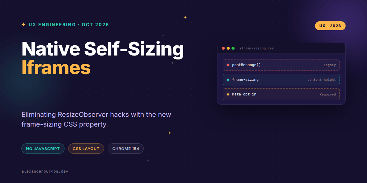
Ever wondered why we're still using 2012-era postMessage() hacks just to make an iframe fit its content? It's one of those "web platform tax" items we've all just accepted: if you want a flexible embed, you need a ResizeObserver in the child, a listener in the parent, and a prayer that the timing doesn't cause a layout thrash.
This changes everything. With the release of Chrome 154, we finally have a native, declarative way to handle responsive iframes using nothing but CSS and a single HTML meta tag. It’s a massive shift for anyone building micro-frontends, widget libraries, or design systems that span multiple domains.
The New Declarative Contract
The magic happens through a new CSS property called frame-sizing. Instead of the parent document guessing the height or waiting for a message, it can now directly observe the embedded document's layout overflow.
.embed-widget {
  width: 100%;
  frame-sizing: content-height;
}
However, this isn't a one-way street. For security and privacy, the embedded document must explicitly opt in to sharing its dimensions. You do this with a new meta tag in the <head> of the content being framed:
<meta name="responsive-embedded-sizing" content="allow-origins=https://your-app.com">I've found this origin-based opt-in to be the most critical part of the new workflow. While you can use allow-origins=*, I’d strongly recommend being specific in production to prevent layout-leakage attacks or unwanted tracking of your component's internal structure.
Why This Matters for Design Systems
In my experience, the hardest part of maintaining a cross-domain design system isn't the styling—it's the communication layer. When we rely on JavaScript for sizing, we're creating a fragile dependency. If the JS fails to load or the origin isn't configured correctly in the script, the UI breaks.
By moving this to the browser's layout engine, we turn a complex "protocol" into a simple "capability." We can now define our embed components in the design system like this:
- Predictable API: We expose a
sizingprop that maps directly toframe-sizingvalues. - Reduced Bundle Size: We can strip out the heavy ResizeObserver polyfills and messaging logic.
- Performance: The browser handles the resize during the layout phase, avoiding the "flash of wrong height" common with JS-based solutions.
Implementation and Fallbacks
Right, let's talk about the reality of browser support. While Chrome 154 is a huge leap forward, you can't just delete your old code yet. Progressive enhancement is our best friend here.
.ds-iframe {
  height: 500px; /* Sensible default for non-supporting browsers */
}

@supports (frame-sizing: content-height) {
  .ds-iframe {
    height: auto;
    frame-sizing: content-height;
  }
}
If your component content changes dynamically (like an accordion expanding inside the iframe), the browser usually picks it up. But if you're doing something really funky with DOM manipulation, the spec provides Window.requestResize() to nudge the parent document manually.
Layout Gotchas to Watch For
We've all been there: you implement a new feature and suddenly the layout explodes. frame-sizing calculates based on layout overflow. This means if you have a stray absolute-positioned element sitting 2000px below your content, your iframe will become 2000px tall.
You also need to be wary of circular dependencies. If your iframe's width is 100% of a container, but that container's size is somehow influenced by the iframe's height, you might trigger an infinite layout loop. Keep your containment clean.
Wrapping Up
- Use
frame-sizing: content-heighton the parent and theresponsive-embedded-sizingmeta tag on the child. - Always define an explicit
allow-originslist to keep your component's size data secure. - Keep your legacy JS-based sizing as a fallback for non-Chromium browsers for the time being.
I’m genuinely excited to see this land. It’s a massive win for UX engineers who want to build seamless, multi-document experiences without the overhead of complex messaging bridges. Go ahead and experiment with it in your next internal dashboard!
If you want to go deeper and learn how to build real, production-ready CSS design systems step by step, check out my full course here: CSS Design Systems Course
If you want the long-form version of this with 23 chapters and runnable code, Ship Your Design System on Amazon is the handbook.
Let's keep the conversation going! Feel free to reach out on Twitter or connect with me on LinkedIn to share your thoughts on the future of CSS.