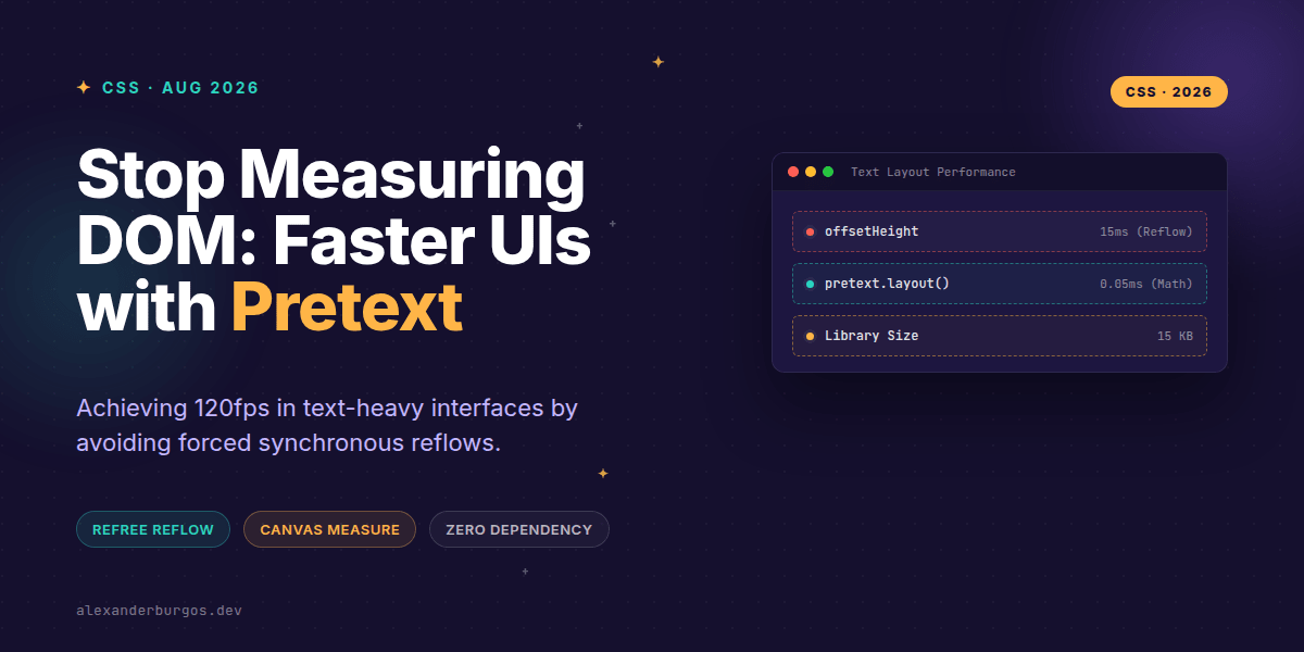
Ever wondered why your perfectly optimized React app still stutters when you resize a window or scroll through a massive feed? I've been digging into this lately, and the culprit is almost always the same: we're asking the DOM to do too much math.
Every time we need to know how tall a text block is—whether for a 'Show More' button, a masonry grid, or a custom truncation logic—we reach for getBoundingClientRect() or offsetHeight. The moment we do that, we force the browser to stop everything and recalculate the layout. It's the 'hot path' killer.
The Pretext Paradigm Shift
Pretext, a DOM-free text layout library by Cheng Lou, changes the game by moving measurement out of the rendering engine and into pure arithmetic. It's a tiny 15 KB TypeScript library that effectively says: 'No DOM, ever.'
Instead of letting the browser's layout engine decide where lines break, Pretext uses Canvas measureText() and Unicode-aware segmentation to calculate exactly how text will wrap before it even hits the screen. This allows us to separate the expensive act of measuring from the frequent act of laying out.
The Two-Phase API
The brilliance of Pretext lies in its two-phase approach: prepare() and layout(). In my experience, this is where the real performance gains live.
- Prepare: You measure the text once. This pays the 'tax' of font metrics and glyph widths.
- Layout: You run pure math to figure out line breaks for a specific width. This is incredibly cheap and can happen at 120fps.
import { prepare, layout } from "@chenglou/pretext";

// Phase 1: Measure once (The 'expensive' part)
const prepared = prepare("This is a content-heavy UI string", "16px Inter");

// Phase 2: Calculate layout (The 'fast' part)
const box = layout(prepared, 320);
console.log(`Height is ${box.height}px with ${box.lines.length} lines.`);
Real-World Patterns: Truncation and Clamping
We've all struggled with -webkit-line-clamp. It's fine for simple CSS, but what if you need to know if the text was clamped so you can show a 'Read More' link? Usually, that requires a DOM read. With Pretext, you just compare the results of the layout math.
Because layout() returns the number of lines and the total height instantly, you can handle responsive containers without triggering a single reflow. When the container width changes, you just re-run the layout() function with the new width.
// Clamping to 3 lines without touching the DOM
const result = layout(prepared, containerWidth);
const isClamped = result.lines.length > 3;
const displayHeight = isClamped ? 3 * result.lineHeight : result.height;
Why This Matters for UX Engineering
Benchmarks show that for 500 text blocks, Pretext can compute layout in under 0.1ms, whereas traditional DOM measurement might take 30ms. That is a 300x to 600x speedup. In a complex dashboard or a social feed, that's the difference between a janky experience and one that feels like native software.
However, it's worth noting that this isn't a magic bullet for everything. It's specifically for text. You'll still use standard CSS for your flexbox layouts and images. But for text-heavy UIs? It's a massive leap forward.
Wrapping Up
- Pretext side-steps the DOM to avoid forced synchronous reflows.
- Use the two-phase API to measure once and layout many times.
- It's perfect for masonry grids, infinite lists, and complex line-clamping logic.
I'd really encourage you to experiment with this in your next performance-critical project. It's one of those tools that makes you rethink how we've been building for the web for the last decade.
If you want to go deeper and learn how to build real, production-ready CSS design systems step by step, check out my full course here: CSS Design Systems Course
I cover this and the other twenty-seven CSS shifts of 2026 in Modern CSS 2026 on Amazon, my catch-up book for people who learned CSS five years ago.
Let's keep the conversation going! Catch me over on Twitter at https://x.com/alexandersstudi or connect with me on LinkedIn at https://www.linkedin.com/in/alexandersstudio/.