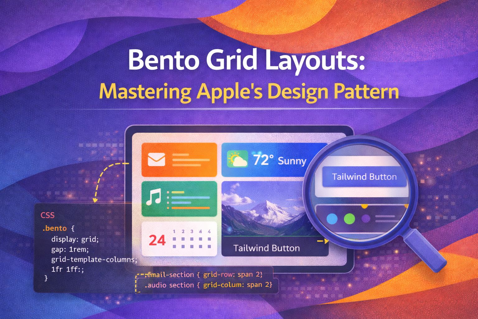
I've always been a fan of how Apple presents data; it's clean, organised, and feels incredibly premium. The 'Bento' layout has taken the design world by storm, and I've found it's one of the most effective ways to display varied content without it looking like a cluttered mess.
The Foundation: Modern CSS Grid
To get that signature look, I start with a robust grid definition using `grid-template-columns` and a sensible gap.
/* The basic Bento container structure */
.bento-grid {
  display: grid;
  grid-template-columns: repeat(4, 1fr);
  grid-auto-rows: 200px;
  gap: 1.5rem;
  padding: 1.5rem;
  max-width: 1200px;
  margin: 0 auto;
}
I personally love using `grid-auto-rows` because it ensures consistency across the grid items while letting the content dictate the flow.
/* Adding responsive behaviour with minmax */
.bento-grid-responsive {
  display: grid;
  grid-template-columns: repeat(auto-fill, minmax(280px, 1fr));
  grid-auto-rows: 240px;
  gap: 1rem;
}Crafting the Tiles: Spans and Styling
The magic of Bento lies in the irregular spans; I use `grid-column` and `grid-row` to create focal points within the layout.
/* Defining the featured 'Hero' tile */
.bento-item-hero {
  grid-column: span 2;
  grid-row: span 2;
  background: var(--surface-accent);
  border-radius: 24px;
  padding: 2rem;
}

/* A wide horizontal tile */
.bento-item-wide {
  grid-column: span 2;
  grid-row: span 1;
  background: var(--surface-muted);
  border-radius: 24px;
}
What I find fascinating is how simple borders and shadows can elevate the look from a basic table to a sleek interface.
/* Premium glassmorphism effect for tiles */
.bento-card {
  background: rgba(255, 255, 255, 0.05);
  backdrop-filter: blur(10px);
  border: 1px solid rgba(255, 255, 255, 0.1);
  box-shadow: 0 8px 32px 0 rgba(0, 0, 0, 0.37);
  transition: transform 0.3s cubic-bezier(0.4, 0, 0.2, 1);
}

.bento-card:hover {
  transform: scale(1.02);
  border-color: rgba(255, 255, 255, 0.2);
}Handling Content within Tiles
Each tile is essentially its own little world, so I usually apply Flexbox inside the grid items to align labels and icons.
/* Internal layout for a Bento tile */
.bento-content {
  height: 100%;
  display: flex;
  flex-direction: column;
  justify-content: space-between;
  align-items: flex-start;
}

.bento-badge {
  font-size: 0.75rem;
  text-transform: uppercase;
  letter-spacing: 0.05em;
  color: var(--text-secondary);
}
Here's a trick I use to ensure images fill the tile perfectly without breaking the grid flow.
/* Image handling within Bento boxes */
.bento-image-wrapper {
  position: relative;
  width: 100%;
  height: 100%;
  overflow: hidden;
  border-radius: inherit;
}

.bento-img {
  width: 100%;
  height: 100%;
  object-fit: cover;
  object-position: centre;
}The Responsive Strategy
On mobile, I typically collapse everything into a single column; there's no room for complex spans on a small screen.
@media (max-width: 768px) {
  .bento-grid {
    grid-template-columns: 1fr;
    grid-auto-rows: auto;
  }

  .bento-item-hero,
  .bento-item-wide {
    grid-column: span 1;
    grid-row: span 1;
    aspect-ratio: 1 / 1;
  }
}
For tablets, I find a 2-column approach works best to maintain that 'tiled' feel without overcrowding the viewport.
@media (min-width: 769px) and (max-width: 1024px) {
  .bento-grid {
    grid-template-columns: repeat(2, 1fr);
  }

  .bento-item-hero {
    grid-column: span 2;
  }
}Advanced: Named Areas for Readability
If the layout is particularly complex, I'll switch to `grid-template-areas`. It makes the CSS much easier to read for my colleagues.
.bento-complex {
  display: grid;
  grid-template-areas:
    "stats stats profile"
    "chart map profile"
    "chart social social";
  grid-template-columns: 1fr 1fr 1fr;
  gap: 20px;
}

.item-profile { grid-area: profile; }
This approach allows you to visualise the layout directly in the code, which is incredibly helpful for design systems.
/* Reordering areas for different breakpoints */
@media (max-width: 600px) {
  .bento-complex {
    grid-template-areas:
      "profile"
      "stats"
      "chart"
      "map"
      "social";
    grid-template-columns: 1fr;
  }
}Wrapping Up
Bento grids are more than just a trend; they're a highly functional way to organise complex information into digestible chunks. By leveraging CSS Grid's spanning capabilities, you can create layouts that are both beautiful and accessible.
- Use `grid-template-columns` with `repeat()` for your base structure.
- Leverage `grid-column: span X` to create visual hierarchy.
- Always include a mobile-first fallback that collapses the grid into a single column.
- Use internal Flexbox to manage content alignment within each tile.
I encourage you to experiment with different span combinations—sometimes the most unexpected layouts end up looking the best! If you found this helpful, I'd love to connect! Follow me on Twitter/X or LinkedIn for more CSS and design system tips.