Ever wondered why we're still writing CSS like it's 2015 when the spec is moving faster than ever? We've all been there: you see a brilliant new feature like @container or :has(), but you've no idea if it's actually safe to ship to your million-plus users without causing a layout meltdown.
The traditional way of handling browser support is, frankly, a bit of a mess. We check Can I Use, look at some vague analytics, and hope for the best. But for those of us building design systems at scale, "hope" isn't a strategy. We need a rigorous, repeatable way to decide when a CSS feature is ready for our core library.
Enter the Web Platform Baseline
Google and its partners have introduced something that genuinely changes the game for UX Engineers: Baseline. As defined by the web.dev team, "Baseline gives you clear information about which web platform features are ready to use in your projects today."
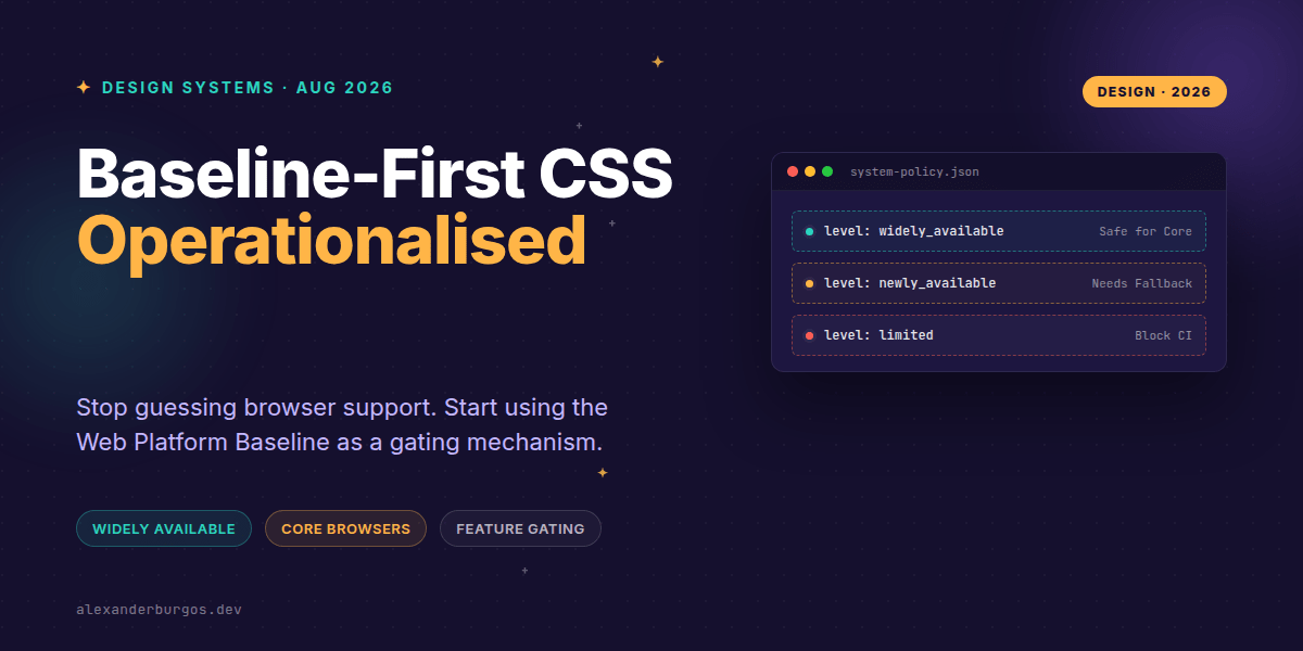
It's not just a list; it's a categorisation of the web platform into three distinct availability states:
- Limited availability: The feature isn't yet supported across all core browsers (Chrome, Edge, Firefox, and Safari).
- Newly available: Support has just landed across all core browsers.
- Widely available: 30 months have passed since the "newly available" date, making it safe for almost any production environment.
Flipping the Script: Baseline-First Development
I'm a huge fan of the "Baseline-first" workflow. Instead of building something and then frantically retrofitting fallbacks when QA finds a bug in Safari 16, you start by asking what the baseline supports. It's a proactive gate rather than a reactive fix.
In my experience, the best way to operationalise this in a design system is to establish Priority Levels. These levels act as a contract between the design system team and the product teams using our components.
The Three Priority Levels for Design Systems
To keep things simple, I like to map these to our internal package tiers:
- Level 0 (Widely-only): Our core primitives (Buttons, Inputs, Grids) only depend on features that are Widely Available. If we use anything newer, a fallback is mandatory.
- Level 1 (Newly+Widely): High-level components or layout patterns can use Newly Available features, provided they are documented as such.
- Level 2 (Experimental): Limited Availability features are only allowed behind feature flags or in "lab" packages.
Encoding Baseline into Design Tokens
One mistake I see often is keeping this logic in people's heads. We should be annotating our tokens and component APIs with this metadata. Imagine a design token file that looks like this:
export const containerQueryToken = {
  css: '@container',
  baselineLevel: 'newly_available',
  fallbackStrategy: 'grid-fallback-v2',
  addedDate: '2023-02-14'
};
By doing this, we can run linting rules in CI. If a developer tries to use a Level 1 token in a Level 0 core component, the build fails. It's an automated way to ensure we don't accidentally ship baseline-source: first to a browser that doesn't understand it yet.
Handling the Enterprise Lag
Right, let's talk about the elephant in the room: Enterprise users. Baseline is fantastic, but it's based on current major versions. If your organisation supports older ESR (Extended Support Release) browsers, you have to treat Baseline as your floor, not your ceiling.
I've found that the best approach is to layer your organisation's specific support window on top of the Baseline data. If Baseline says a feature is "Widely Available" but your data shows 5% of your users are on an ancient version of Chrome, your internal policy should override the global status.
A Technical Example: Progressive Enhancement Gates
When we want to use something exciting like View Transitions, we can use a Baseline-aware gate in our JavaScript to decide which path to take. Here is a pattern I've been experimenting with:
function createAnimatedTransition(element, target) {
  // Check for the API AND the Baseline status
  if (document.startViewTransition &&
      navigator.baseline?.get('CSSViewTransitions') === 'widely_available') {
    document.startViewTransition(() => {
      applyChanges(element, target);
    });
  } else {
    // Standard CSS transition fallback
    element.style.transition = 'opacity 150ms ease';
    applyChanges(element, target);
  }
}
This ensures that we only deliver the most modern experience to browsers where the feature is stable and well-tested, while maintaining a perfectly functional (if less flashy) experience for everyone else.
Wrapping Up
- Use Web Platform Baseline as a formal gating mechanism for your CSS features.
- Categorise your components into Priority Levels (0-2) to manage risk across your product.
- Automate your checks by encoding Baseline levels directly into your design tokens and CI pipeline.
I'd encourage you to try auditing your current component library against the Baseline statuses. You might be surprised to find you're either being too conservative or taking risks you didn't realise. Start small—pick one new feature and define its Baseline path today!
If you want to go deeper and learn how to build real, production-ready CSS design systems step by step, check out my full course here: CSS Design Systems Course
If you want the long-form version of this with 23 chapters and runnable code, Ship Your Design System on Amazon is the handbook.
Let's keep the conversation going! You can find me sharing more CSS tips on Twitter or connect with me for professional insights on LinkedIn.