Ever wondered why we still hesitate to use CSS features that have been out for years? We've all been there: staring at a Can I Use table, squinting at the global usage percentages, and trying to decide if 92% is "good enough" to risk breaking the layout for a few thousand users.
For those of us building design systems, this decision is even heavier. If I bake a feature into the core CSS architecture, I'm not just affecting one page; I'm affecting every product in the organisation. We need more than just a green square on a chart; we need a clear signal of stability.
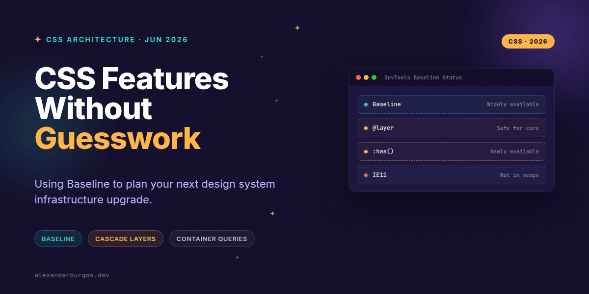
That's exactly where Baseline comes in. It's not a new CSS property, but a compatibility signal that tells us when a feature is truly ready for the big leagues.
Wait, what exactly is Baseline?
Baseline is a web-platform support framework created by the folks at Google and web.dev. It's designed to cut through the noise of browser release cycles. Instead of tracking individual version numbers, it groups features into two distinct stages:
- Newly available: The feature is supported across all major engines (Chrome, Edge, Safari, Firefox). It's fresh, it's interoperable, but it's still finding its feet.
- Widely available: The feature has been interoperable for at least 30 months. This is the "set it and forget it" stage for production-heavy environments.
The brilliant part? This data is now surfaced directly in MDN documentation and even inside Chrome DevTools. You don't have to go hunting for it anymore; it's right there while you're inspecting your elements.
Operationalising Baseline for Design Systems
As senior engineers, we shouldn't just look at Baseline as a "yes/no" switch. We should use it to tier our adoption strategy. Let's look at three game-changing features and how to plan their rollout.
1. Cascade Layers (@layer)
Cascade layers are the ultimate fix for specificity wars. If your design system is Widely available for your target audience, you should move from seeing layers as an "experiment" to making them your default infrastructure.
@layer reset, tokens, components, utilities;

@layer components {
  .card {
    border: 1px solid var(--border);
    padding: 1rem;
  }
}
I've found that using layers early in the stack prevents third-party libraries from overriding your carefully crafted component styles. It's a massive win for maintainability.
2. The :has() Selector
The "parent selector" we've wanted for decades is now Newly available. It's incredibly powerful for conditional styling, like highlighting a form field's container when the input inside it is focused.
/* Parent-state styling with :has() */
.field:has(:focus-visible) {
  outline: 2px solid var(--focus-ring);
}
Because this is often "Newly available," I'd suggest using it for progressive enhancement first. If a user is on an older browser and doesn't see the outline on the container, is the app still functional? If yes, ship it. If it's a critical UI hint, wait for that 30-month "Widely available" mark.
3. Container Queries
This is the holy grail for component-driven design. It allows a component to react to its own width rather than the viewport. It's a perfect candidate for your token-driven systems.
.card {
  container-type: inline-size;
}

@container (min-width: 30rem) {
  .card__media {
    display: grid;
    grid-template-columns: 1fr 2fr;
  }
}
Your Adoption Checklist
Before you refactor your entire CSS codebase, run through this mental checklist I use for my own projects:
- Check the Baseline status: Is it Widely available? If so, the risk is minimal.
- Verify your fleet: Baseline doesn't account for niche enterprise browsers or specific embedded webviews. Check your own analytics.
- Use Chrome DevTools: Inspect your components and look for the Baseline status in the hover cards. It's the quickest way to verify support while you code.
- Progressive Enhancement: Use @supports for features that aren't quite "Widely available" yet to ensure a graceful fallback.
One common misconception is that Baseline replaces testing. It doesn't. It reduces the guesswork in the planning phase, but you still need to verify that your implementation works as expected on the devices your customers actually use.
Wrapping Up
- Use the Widely available status (30 months of interoperability) as your green light for core architectural changes.
- Leverage Newly available features for progressive enhancements that don't break the core experience.
- Don't leave DevTools—use the built-in Baseline indicators to make informed decisions as you build.
I'd encourage you to start looking for those Baseline labels next time you're on MDN or in your inspector. It completely changes how you view the "risk" of modern CSS.
If you want to go deeper and learn how to build real, production-ready CSS design systems step by step, check out my full course here: CSS Design Systems Course
The long version with support labels and runnable demos is in Modern CSS 2026 on Amazon Kindle.
I'd love to hear how your team handles browser support policies. Let's chat over on Twitter or connect on LinkedIn to keep the conversation going.