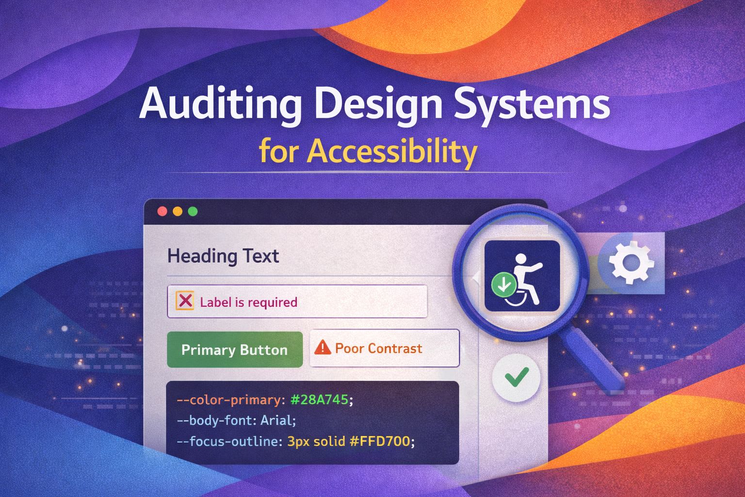
I've spent years building and breaking design systems, and if there's one thing I've learnt, it's that accessibility isn't a 'nice-to-have'—it's the foundation. When we audit a system, we aren't just ticking boxes; we're ensuring our components work for everyone, regardless of how they navigate the web.
Automating Colour Contrast Audits
I love using CSS custom properties to manage my palette, but we need a way to flag when combinations fall below WCAG AA standards. Here is a trick I use to create a 'debug mode' for contrast using CSS variables.
/* CSS Debugger for Contrast */
[data-a11y-debug="true"] .btn-primary {
  outline: 5px solid red !important;
  position: relative;
}

[data-a11y-debug="true"] .btn-primary::after {
  content: "Check Contrast!";
  background: red;
  color: white;
  font-size: 10px;
  position: absolute;
  top: -20px;
}
This simple CSS overlay helps me visually identify components that haven't been vetted yet. For a more programmatic approach, I've found that using a JS-based contrast checker during the design token build step is much more reliable.
import { colorContrast } from 'some-a11y-lib';

const auditTokens = (tokens) => {
  tokens.forEach(token => {
    const ratio = colorContrast(token.background, token.foreground);
    if (ratio < 4.5) {
      console.error(`🚨 Contrast failure: ${token.name} ratio is ${ratio}`);
    }
  });
};

const theme = { background: '#FFFFFF', foreground: '#767676' }; // Fails AA
auditTokens([{ name: 'Body Text', ...theme }]);
Enforcing Semantic HTML in React Components
In my experience, developers often reach for a `div` when a `button` or `section` is required. I prefer building 'Polymorphic' components that force a sensible default but allow flexibility.
/* React Polymorphic Box Component */
const Box = ({ as: Component = 'div', children, ...props }) => {
  return <Component {...props}>{children}</Component>;
};

// Usage in Audit
const MyComponent = () => (
  <Box as="main">
    <Box as="header">Accessible Heading</Box>
    <Box as="nav">Navigation items...</Box>
  </Box>
);
What I find fascinating is how often we forget to validate the presence of ARIA labels. I use TypeScript to make certain accessibility props mandatory for specific components.
interface IconButtonProps {
  icon: React.ReactNode;
  'aria-label': string; // Mandatory for accessibility
  onClick: () => void;
}

const IconButton = ({ icon, 'aria-label': ariaLabel, onClick }: IconButtonProps) => (
  <button onClick={onClick} aria-label={ariaLabel} type="button">
    {icon}
  </button>
);
Visible Focus States and Keyboard Navigation
Never, ever use `outline: none`. Instead, I like to use `:focus-visible` to ensure keyboard users see a clear highlight while mouse users don't see a 'distracting' ring.
/* Global Focus Ring Audit */
:focus {
  outline: none; /* Only if replaced by focus-visible */
}

:focus-visible {
  outline: 3px solid var(--focus-ring-color, #005fcc);
  outline-offset: 2px;
  box-shadow: 0 0 0 4px rgba(0, 95, 204, 0.3);
}
For complex components like Modals, we must handle 'Focus Trapping'. Here's a pattern I've found effective for auditing whether a component correctly captures the tab key.
const useFocusTrap = (ref) => {
  useEffect(() => {
    const handleKeyDown = (e) => {
      if (e.key !== 'Tab') return;

      const focusables = ref.current.querySelectorAll('button, [href], input');
      const first = focusables[0];
      const last = focusables[focusables.length - 1];

      if (e.shiftKey && document.activeElement === first) {
        last.focus();
        e.preventDefault();
      } else if (!e.shiftKey && document.activeElement === last) {
        first.focus();
        e.preventDefault();
      }
    };

    document.addEventListener('keydown', handleKeyDown);
    return () => document.removeEventListener('keydown', handleKeyDown);
  }, [ref]);
};
Testing for Reduced Motion
We often forget that animation can cause physical discomfort for some users. I always audit my design system's motion tokens to respect the user's system preferences.
/* Motion Audit Utility */
@media (prefers-reduced-motion: reduce) {
  *,
  *::before,
  *::after {
    animation-duration: 0.01ms !important;
    animation-iteration-count: 1 !important;
    transition-duration: 0.01ms !important;
    scroll-behavior: auto !important;
  }
}
In React, I use a custom hook to conditionally apply animations based on this preference. It's a much cleaner way to handle it than scattered CSS overrides.
const usePrefersReducedMotion = () => {
  const [prefersReducedMotion, setPrefersReducedMotion] = useState(false);

  useEffect(() => {
    const mediaQuery = window.matchMedia('(prefers-reduced-motion: reduce)');
    setPrefersReducedMotion(mediaQuery.matches);

    const handler = () => setPrefersReducedMotion(mediaQuery.matches);
    mediaQuery.addEventListener('change', handler);
    return () => mediaQuery.removeEventListener('change', handler);
  }, []);

  return prefersReducedMotion;
};
Wrapping Up
Auditing for accessibility isn't a one-time event; it's a continuous process of refinement. By baking these checks directly into your CSS and React components, you make the 'right way' the 'easy way' for your entire team.
- Use CSS variables and debug modes to visually audit contrast and focus states.
- Leverage TypeScript to enforce mandatory ARIA attributes in your component library.
- Always respect system-level preferences like reduced motion to ensure a comfortable experience for all.
I'd love to see how you're auditing your own systems! If you found this helpful, let's connect. Follow me on Twitter/X or LinkedIn for more CSS and design system tips.