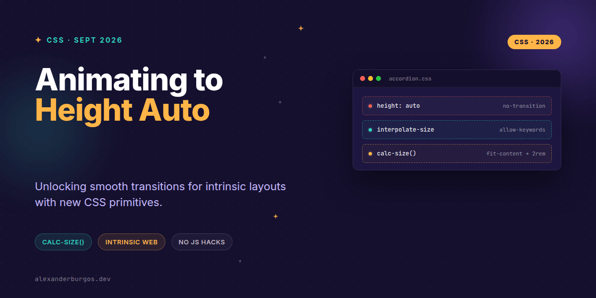
Ever wondered why, in the year 2026, we're still struggling to animate a simple accordion from height: 0 to height: auto? It's been the white whale of CSS for decades. We've tried max-height hacks (which ruin easing) and JavaScript measurement scripts (which ruin performance), but we've never had a native way to tell the browser: "Just animate to whatever size the content needs."
Right, let's talk about the solution that's finally landed. The new interpolate-size property and the calc-size() function are game-changers for design systems. They allow us to bridge the gap between fixed lengths and intrinsic keywords like auto, fit-content, and max-content without a single line of JS.
The problem with 'Auto'
Until recently, browsers couldn't interpolate between a number (like 0px) and a keyword (like auto). Because auto is determined during the layout phase, the browser didn't know the intermediate values to paint during a transition. This forced us into the "measure-set-animate" trap: using JS to calculate the scrollHeight, setting a fixed pixel value, and then triggering the transition. It's brittle, it causes layout thrashing, and frankly, it's a bit of a faff.
Enter interpolate-size
The interpolate-size property is an opt-in. By default, it's set to numeric-only, but we can change that to allow-keywords. When you do this, you're telling the browser it's okay to try and animate those intrinsic keywords.
/* Opt in globally for the whole project */
:root {
  interpolate-size: allow-keywords;
}

.accordion__content {
  height: 0;
  overflow: clip;
  transition: height 0.3s ease-out;
}

.accordion__content[aria-hidden="false"] {
  height: auto;
}
It's that simple. With those few lines, the browser handles the layout calculations internally and provides a buttery-smooth transition to the actual height of the content. In my experience, this makes component libraries significantly lighter and more resilient.
Leveling up with calc-size()
Sometimes just going to "auto" isn't enough. Maybe you want your card to be the size of the content plus a little extra breathing room, or you want to cap it at a percentage of the intrinsic size. That's where calc-size() comes in. Standard calc() can't handle keywords, but calc-size() is purpose-built for it.
.card {
  /* The 'size' keyword refers to the basis (fit-content) */
  width: calc-size(fit-content, size + 2rem);
  transition: width 0.2s ease;
}
The function takes two arguments: a basis (the intrinsic keyword) and a calculation. Using calc-size() actually implies interpolate-size: allow-keywords for that specific property, so it's a great way to handle localized animations without changing global styles.
Why this matters for Design Systems
From a UX Engineering perspective, this is about more than just "pretty animations." It's about performance and maintainability. When we use JS to measure heights, we often trigger multiple reflows. If you have twenty accordions on a page, that adds up. By moving this logic to the CSS engine, we're letting the browser optimise the render cycle.
- Reduced Bundle Size: You can delete those 'useHeight' hooks and ResizeObserver wrappers.
- Better Accessibility: Smoother transitions help users maintain context without the jank that comes from frame drops.
- Layout Stability: CSS-native animations are generally more robust against sudden content changes (like images loading in late).
A few things to watch out for
While I'm genuinely excited about this, don't throw away your fallbacks just yet. Support started rolling out in Chrome 129, but you'll want to check the latest status for Safari and Firefox before going all-in for production. Also, remember that animating height still causes a reflow of the surrounding elements—it's just a faster reflow because the browser is handling the interpolation.
Wrapping Up
- Use
interpolate-size: allow-keywordsto enable animations for keywords likeautoandfit-content. - Reach for
calc-size()when you need to perform math on intrinsic sizes. - Prioritise these CSS-native methods over JS measurement scripts to reduce layout thrashing.
I'd encourage you to start experimenting with this in your staging environments. It’s one of those rare CSS features that feels like magic the first time you see it work.
If you want to go deeper and learn how to build real, production-ready CSS design systems step by step, check out my full course here: CSS Design Systems Course
The full story including the testing layers and governance lives in Ship Your Design System on Amazon.
Feel free to reach out and share your progress or ask questions on Twitter or LinkedIn. Let's build a faster, smoother web together!