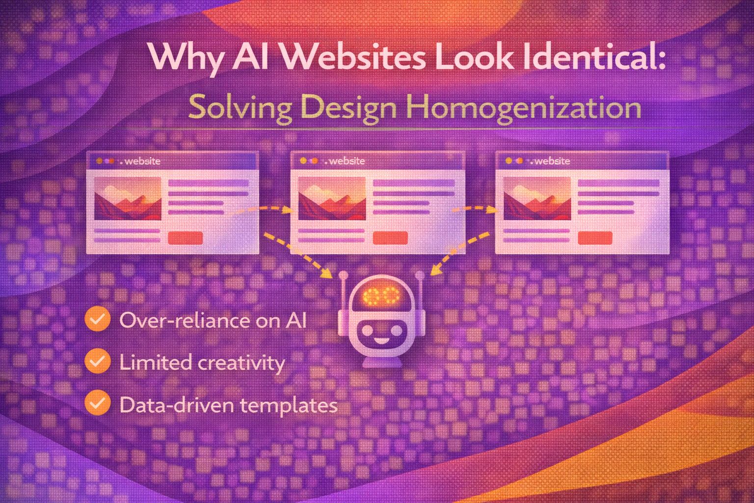
Ever wondered why every AI-generated landing page feels like you've seen it a thousand times before? It's not your imagination; we're witnessing a massive convergence where training data bias and 'safe' defaults are creating a sea of digital sameness.
The Template Trap: Breaking Standard Layouts
AI models love a standard 12-column grid and a centered hero section because that's what dominated the 2010s web. To fight this, I've started leaning into CSS Grid areas that break the expected flow.
/* The 'AI Standard' vs a Custom Grid */
.hero-container {
  display: grid;
  grid-template-columns: repeat(12, 1fr);
  grid-template-rows: auto;
  /* Breaking the centered AI pattern */
  grid-template-areas:
    ". . . . . . . h h h h h"
    "i i i i i i . h h h h h"
    "i i i i i i . . . . . .";
  gap: 2rem;
}

.hero-content { grid-area: h; }
.hero-image { grid-area: i; }
By explicitly defining asymmetric grid areas, we move away from the predictable 'Image Left, Text Right' pattern that AI-generated templates rely on.
/* Adding visual interest with non-standard offsets */
.feature-card {
  transform: translateY(var(--offset, 0));
}

.feature-card:nth-child(even) {
  --offset: 3rem;
  margin-top: 2rem;
}

.feature-card:nth-child(odd) {
  --offset: -1rem;
}Fighting 'Safe' Colour Palettes with Variable Logic
AI guardrails often steer towards 'safe' blues and greys. I prefer building design systems that use dynamic HSL calculations to ensure the brand feels alive rather than generated.
/* Moving beyond static HEX codes generated by AI */
:root {
  --brand-hue: 210; /* Base blue */
  --brand-saturation: 100%;
  --brand-lightness: 50%;

  --primary: hsl(var(--brand-hue), var(--brand-saturation), var(--brand-lightness));
  /* Create a 'vibrant' secondary that AI usually avoids */
  --accent: hsl(calc(var(--brand-hue) + 150), 80%, 60%);
}
Using `calc()` allows us to generate complementary scales that maintain a specific 'vibe' while avoiding the muted, muddy tones common in model collapse.
/* Implementing a high-contrast 'anti-AI' dark mode */
@media (prefers-color-scheme: dark) {
  :root {
    --bg: hsl(var(--brand-hue), 20%, 5%);
    --surface: hsl(var(--brand-hue), 15%, 12%);
    --text: hsl(var(--brand-hue), 10%, 95%);
    /* Sharp borders instead of soft AI shadows */
    --card-shadow: 4px 4px 0px var(--primary);
  }
}Systemic Homogenization: The Prompting Problem
The issue is that AI content trains future models, creating a feedback loop of mediocrity. Here is how I structure my React components to force unique data structures instead of generic 'Card' props.
// Avoid generic AI patterns: { title, description, image }
const CustomFeature = ({ brandData, layoutVariant }) => {
  const isExperimental = layoutVariant === 'brutalist';

  return (
    <section className={`feature-${layoutVariant}`}>
      <div className="data-wrapper">
        {brandData.uniqueMetric && <span>{brandData.uniqueMetric}</span>}
        <h2>{brandData.heading}</h2>
      </div>
      {/* Logic that AI builders rarely implement */}
      {isExperimental && <DecorativeBlob seed={brandData.id} />}
    </section>
  );
};
By injecting 'experimental' variants into our components, we ensure that the final output isn't just a derivative of a standard Shopify or WordPress theme.
/* CSS for the 'experimental' variant */
.feature-brutalist {
  border: 3px solid black;
  box-shadow: 8px 8px 0px #000;
  padding: 2rem;
  background: var(--accent);
  clip-path: polygon(0% 0%, 100% 5%, 95% 100%, 0% 95%);
}The 'AI Slop' Guard: Adding Human Polish
To avoid the 'AI slop' look, we need to focus on micro-interactions and typography that AI models currently struggle to pair correctly.
/* Custom fluid typography that feels intentional */
:root {
  --fs-base: clamp(1rem, 0.5vw + 1rem, 1.5rem);
  --fs-xl: clamp(2.5rem, 5vw + 1rem, 8rem);
}

h1 {
  font-size: var(--fs-xl);
  line-height: 0.9;
  letter-spacing: -0.05em;
  text-transform: uppercase;
}
Pairing this with a custom interaction observer creates a bespoke feel that a generic site builder simply cannot replicate out of the box.
// Adding 'Human' motion that breaks linear AI defaults
const observer = new IntersectionObserver((entries) => {
  entries.forEach(entry => {
    if (entry.isIntersecting) {
      entry.target.style.setProperty('--reveal-progress', '1');
    }
  });
}, { threshold: 0.2 });

document.querySelectorAll('.reveal').forEach(el => observer.observe(el));
Wrapping Up
Homogenization is a real threat to the creative web, but it's also an opportunity for us as engineers to stand out. By avoiding the 'safe' means and leaning into intentional CSS and unique layout logic, we can break the cycle of blandness.
- AI sites look the same because they rely on 'safe' averages from 2010s training data.
- Use CSS Grid areas and HSL calculations to create layouts and palettes that models don't naturally suggest.
- Always add a layer of 'human' polish—fluid typography and custom interactions—to distance your work from AI slop.
I encourage you to try building your next layout without looking at a single template or prompt output first. See where your own creative constraints take you!
If you want to go deeper and learn how to build real, production-ready CSS design systems step by step, check out my full course here: CSS Design Systems Course
Got questions or want to share how you're using this? Drop me a message on LinkedIn - I always enjoy chatting about this stuff!