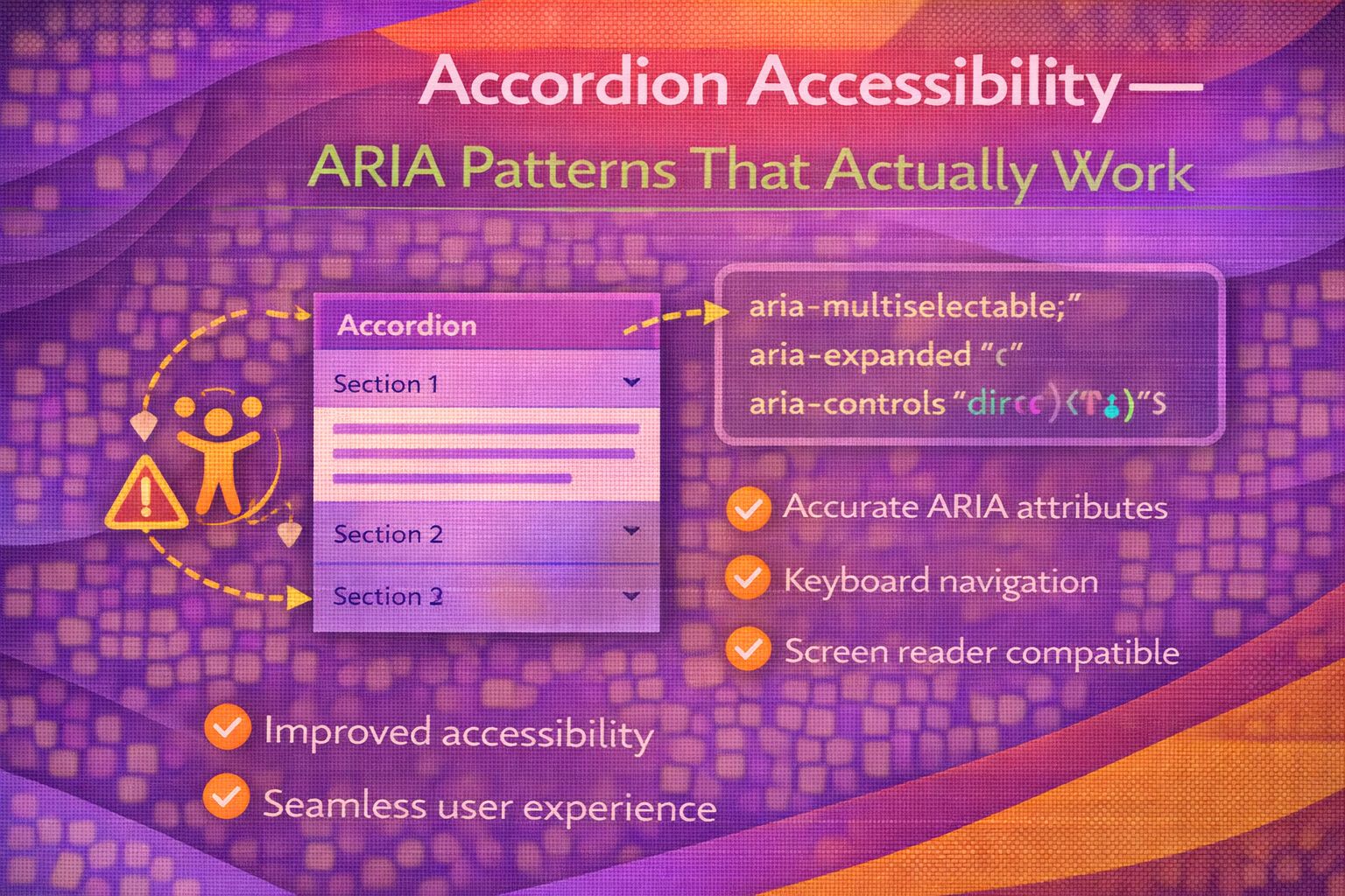
Let's be honest - accordions are everywhere, but most of them are fundamentally broken for screen reader users. We've all seen the div-heavy soup that lacks proper keyboard support, so today I want to show you the pattern I use to ensure every user can actually access your content.
The Semantic Foundation
The biggest mistake I see is using divs for triggers; always use a button nested inside a heading to provide proper document structure.
<!-- The gold standard for accordion markup -->
<h3>
  <button
    id="acc-trigger-1"
    aria-expanded="false"
    aria-controls="acc-panel-1"
    class="accordion-trigger">
    Product Details
    <svg aria-hidden="true" focusable="false" viewBox="0 0 10 10">
      <!-- Icon here -->
    </svg>
  </button>
</h3>

<section
  id="acc-panel-1"
  role="region"
  aria-labelledby="acc-trigger-1"
  hidden>
  <p>Your accessible content goes here.</p>
</section>
Notice how the button controls the visibility of the section via aria-controls, while the heading provides a landmark for navigation.
/* Essential CSS for visibility management */
.accordion-trigger[aria-expanded="true"] svg {
  transform: rotate(180deg);
}

/* Ensure the panel is hidden when the attribute is present */
[hidden] {
  display: none !important;
}
Managing State with JavaScript
Here's the thing: ARIA attributes are just labels unless you use JavaScript to toggle them dynamically when a user interacts with the trigger.
// Simple toggle logic for accessibility
const toggleAccordion = (button) => {
  const isExpanded = button.getAttribute('aria-expanded') === 'true';
  const panelId = button.getAttribute('aria-controls');
  const panel = document.getElementById(panelId);

  // Toggle attributes
  button.setAttribute('aria-expanded', !isExpanded);

  if (isExpanded) {
    panel.setAttribute('hidden', '');
  } else {
    panel.removeAttribute('hidden');
  }
};
I like to add an event listener that handles both clicks and keyboard events, though buttons handle 'Enter' and 'Space' natively.
document.querySelectorAll('.accordion-trigger').forEach(button => {
  button.addEventListener('click', () => toggleAccordion(button));
});
The 'Region' Landmark Trap
What I love about the W3C pattern is the use of role="region", but be careful: if you have more than six panels, it can overwhelm screen reader users with too many landmarks.
<!-- Best practice for 1-5 panels -->
<section role="region" aria-labelledby="header-id">
  <!-- Content -->
</section>

<!-- Pro move: For long lists, omit role="region" to avoid landmark clutter -->
<div id="panel-id" aria-labelledby="header-id" hidden>
  <!-- Content -->
</div>
If you're building a massive FAQ list, sticking to a plain div with aria-labelledby is actually a better experience for your users.
/* Visual focus styles are non-negotiable */
.accordion-trigger:focus-visible {
  outline: 3px solid #2DD4BF;
  outline-offset: 2px;
}
Handling Edge Cases
Sometimes you need an accordion where one item must always remain open; in this case, you should use aria-disabled on the active trigger.
<!-- Pattern for 'Always One Open' accordions -->
<button
  aria-expanded="true"
  aria-controls="panel-1"
  aria-disabled="true">
  Keep me open
</button>
This tells the screen reader that the button is currently non-interactive because the panel cannot be closed while it's the only one active.
Browser Support
The beauty of this ARIA pattern is that it relies on core web technologies that have been stable for over a decade. You can safely use this in production today without worrying about polyfills.
- Modern Browsers (Chrome, Firefox, Safari, Edge): 100% support for aria-expanded and aria-controls.
- Screen Readers (NVDA, JAWS, VoiceOver): Excellent support when using semantic buttons.
- Native and : A great alternative with 95%+ global support if you don't need complex styling.
Wrapping Up
Building accessible components isn't about fancy tricks; it's about following the established patterns that assistive technologies expect. Trust me on this one - your users will thank you.
- Always wrap your triggers in heading tags (h2-h6) for better navigation.
- Use aria-expanded to communicate state and aria-controls to link the trigger to the panel.
- Only use role="region" if you have a small number of accordion items.
If you want to go deeper and learn how to build real, production-ready CSS design systems step by step, check out my full course here: CSS Design Systems Course
If you found this helpful, I'd love to connect! Follow me on Twitter/X or LinkedIn for more CSS and design system tips.