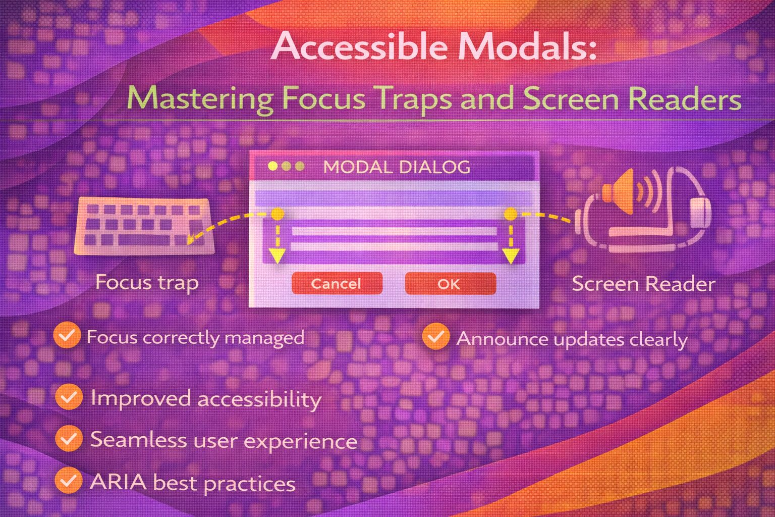
Ever wondered why some modals feel like a total nightmare to navigate with a keyboard? We've all been there—you hit 'Tab' and suddenly your focus is lost somewhere in the footer behind the overlay. It's a classic accessibility fail, but honestly, it's one of the most satisfying things to fix once you know the patterns.
The Modern Way: Native HTML
Right, let's talk about the game changer: the native `` element. It handles the focus trap, the backdrop, and the 'Escape' key logic out of the box, which is honestly a massive win for us.
<!-- Simple, semantic, and accessible by default -->
<dialog id="myModal">
  <form method="dialog">
    <h2>Settings</h2>
    <p>Update your preferences below.</p>
    <button type="submit">Save Changes</button>
    <button type="button" onclick="myModal.close()">Cancel</button>
  </form>
</dialog>
The cool bit? You don't need complex JavaScript to open it—just call the `showModal()` method to ensure it's treated as a top-level modal with a proper focus trap.
/* JavaScript to trigger the native modal */
const modal = document.querySelector('#myModal');
const openBtn = document.querySelector('#openBtn');

openBtn.addEventListener('click', () => {
  modal.showModal(); // This triggers the built-in focus trap!
});
Building a Manual Focus Trap
Sometimes you're stuck with a custom implementation or a legacy codebase where you can't use ``. In those cases, you have to write the focus trap logic yourself to keep the user contained within the modal.
/* The ARIA pattern for a custom modal */
<div role="dialog"
     aria-modal="true"
     aria-labelledby="modal-title"
     id="custom-modal"
     tabindex="-1">
  <h2 id="modal-title">Custom Modal</h2>
  <button class="close-btn">Close</button>
  <input type="text" placeholder="Enter name..." />
  <button>Submit</button>
</div>
Now, here's the heavy lifting. We need to listen for the 'Tab' key and manually cycle the focus between the first and last interactive elements.
// Selecting all focusable elements within the modal
const focusableSelector = 'button, [href], input, select, textarea, [tabindex]:not([tabindex="-1"])';
const modal = document.querySelector('#custom-modal');

modal.addEventListener('keydown', (e) => {
  if (e.key !== 'Tab') return;

  const focusables = modal.querySelectorAll(focusableSelector);
  const first = focusables[0];
  const last = focusables[focusables.length - 1];

  if (e.shiftKey) { /* Shift + Tab */
    if (document.activeElement === first) {
      e.preventDefault();
      last.focus();
    }
  } else { /* Tab */
    if (document.activeElement === last) {
      e.preventDefault();
      first.focus();
    }
  }
});
Handling the Escape Key and Returning Focus
A common mistake I see is forgetting to return focus to the button that opened the modal. If you don't do this, the keyboard user is dumped back at the top of the page, which is incredibly frustrating.
let triggerElement;

function openModal(modalId) {
  triggerElement = document.activeElement; // Save the current focus
  const modal = document.getElementById(modalId);
  modal.classList.add('is-open');
  modal.focus(); // Move focus to the modal
}

function closeModal(modalId) {
  const modal = document.getElementById(modalId);
  modal.classList.remove('is-open');
  if (triggerElement) triggerElement.focus(); // Return focus to the trigger!
}
And don't forget the Escape key! It's a WCAG requirement that users can dismiss non-static content easily.
document.addEventListener('keydown', (e) => {
  if (e.key === 'Escape' && modalIsOpen) {
    closeModal('custom-modal');
  }
});
Screen Reader Considerations
For screen readers, `aria-modal="true"` is your best friend. It tells the assistive technology that the rest of the page is 'inert' and shouldn't be read while the modal is active.
<!-- Use aria-hidden on your main content wrapper when modal is open -->
<body>
  <div id="main-content" aria-hidden="true">
    <!-- All your page content here -->
  </div>

  <div role="dialog" aria-modal="true">
    <!-- Modal content -->
  </div>
</body>
If your modal doesn't have a visible heading, you must still provide a label so the screen reader can announce the purpose of the dialog.
<div role="dialog"
     aria-modal="true"
     aria-label="User Profile Settings">
  <!-- Content without a visible <h2> -->
</div>
Browser Support
The native `` element now has excellent support across all modern browsers (95%+ global). If you're supporting older browsers, the manual JavaScript focus trap remains the gold standard.
- Chrome 37+
- Firefox 52+
- Safari 15.4+
- Edge 79+
Wrapping Up
Building accessible modals doesn't have to be a chore. By leveraging modern HTML or following a few strict JS patterns, you can make your UI inclusive for everyone.
- Use the native element whenever possible for built-in focus management.
- Always return focus to the trigger element when a modal closes.
- Ensure 'Escape' key support and proper ARIA roles for screen reader users.
If you want to go deeper and learn how to build real, production-ready CSS design systems step by step, check out my full course here: CSS Design Systems Course
If you found this helpful, I'd love to connect! Follow me on Twitter/X @alexandersstudi or LinkedIn for more CSS and design system tips.