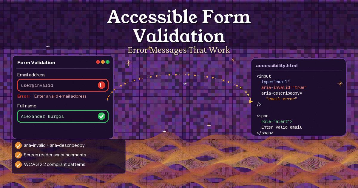
Let's be honest -- most form validation on the web is broken. Not visually broken (it usually looks fine), but broken for the people who need it most: screen reader users, keyboard-only users, and anyone relying on assistive technology.
You know the drill. You fill out a form, hit submit, and... nothing happens. Or a red border appears somewhere but your screen reader doesn't say a word. Or worse, every single field screams at you before you've even started typing.
Here's the thing: accessible form validation isn't hard. It just requires knowing which ARIA attributes to use, when to announce errors, and where to put focus. I've been refining these patterns across real projects, and they make a massive difference.
What WCAG Actually Requires
Before diving into code, let's understand what the guidelines actually ask for. WCAG 2.2 has four key success criteria for form errors:
- SC 3.3.1 Error Identification (Level A) -- If an error is detected, identify it and describe it in text. Not just colour. Not just an icon. Text.
- SC 3.3.2 Labels or Instructions (Level A) -- Every form field needs a proper label. If there's a required format, tell the user upfront.
- SC 3.3.3 Error Suggestion (Level AA) -- Don't just say "invalid". Tell them how to fix it.
- SC 4.1.3 Status Messages (Level AA) -- Error messages that appear dynamically must be announced to screen readers without moving focus.
The golden rule? If a sighted user can see the error, a screen reader user must be able to hear it. Full stop.
The Three ARIA Attributes You Need
You don't need a dozen ARIA attributes to get form validation right. Three will cover 95% of cases.
1. aria-invalid
Add this to any field that fails validation. Screen readers will announce the field as "invalid" when focused. Simple but powerful.
<input
  type="email"
  id="email"
  aria-invalid="true"
>
Important: Don't set aria-invalid="true" on empty required fields before the user has attempted to submit. That's hostile UX. Only mark fields as invalid after submission or after the user has interacted with the field and moved on.
2. aria-describedby
This connects your error message to the input field. When a screen reader user focuses the field, they hear the error message read aloud. It's the bridge between the visual error and the audible one.
<label for="email">Email address</label>
<input
  type="email"
  id="email"
  aria-invalid="true"
  aria-describedby="email-error"
>
<span id="email-error" class="error-message">
  Enter an email in the format name@example.com
</span>
You might have heard of aria-errormessage -- it was designed specifically for this use case. But my honest take? Don't use it in production yet. NVDA doesn't support it, and browser/screen reader support remains inconsistent as of 2026. Stick with aria-describedby. It works everywhere.
3. role="alert"
When an error message appears dynamically (without a page reload), screen reader users won't know about it unless you announce it. role="alert" does exactly that -- it interrupts the screen reader to announce the message immediately.
<span id="email-error" class="error-message" role="alert">
  Enter an email in the format name@example.com
</span>
One gotcha: don't use both role="alert" AND aria-live="assertive" on the same element. They do the same thing, and doubling up can cause duplicate announcements or no announcement at all. Pick one.
When to Validate: The Timing Problem
This is where most developers get it wrong. There are three approaches, and the timing matters hugely for accessibility.
While typing (character-by-character) -- Never do this. It's terrible for screen reader users because every keystroke triggers an announcement. Imagine trying to type your email while your screen reader constantly interrupts with "Invalid! Invalid! Invalid!"
On blur (when the user leaves the field) -- Acceptable for inline validation, but use it carefully. Only validate after the field has been touched.
On submit (recommended) -- Wait until the user clicks submit, then validate everything at once. This is the most predictable and least disruptive approach. The GOV.UK Design System uses this pattern, and it's been tested extensively with real users.
The GOV.UK Pattern: Error Summary + Inline Errors
The best pattern I've seen combines two approaches: an error summary at the top of the form AND inline errors at each field.
<!-- Error summary at top of form -->
<div class="error-summary" role="alert" tabindex="-1">
  <h2>There is a problem</h2>
  <ul>
    <li><a href="#email">Enter a valid email address</a></li>
    <li><a href="#password">Password must be 8 characters or more</a></li>
  </ul>
</div>

<!-- Inline error at each field -->
<div class="form-group">
  <label for="email">Email address</label>
  <span id="email-error" class="error-message">
    <span class="visually-hidden">Error:</span>
    Enter a valid email address
  </span>
  <input type="email" id="email"
    aria-invalid="true"
    aria-describedby="email-error">
</div>
The JavaScript: Putting It All Together
const form = document.querySelector('form');
form.setAttribute('novalidate', '');

function getErrorMessage(field) {
  if (field.validity.valueMissing) {
    return `Enter your ${field.name}`;
  }
  if (field.validity.typeMismatch && field.type === 'email') {
    return 'Enter an email like name@example.com';
  }
  if (field.validity.tooShort) {
    return `Must be ${field.minLength} characters or more`;
  }
  return 'Enter a valid value';
}

form.addEventListener('submit', (e) => {
  e.preventDefault();
  const errors = [];

  // Clear previous errors
  form.querySelectorAll('[aria-invalid]').forEach(f => {
    f.setAttribute('aria-invalid', 'false');
  });
  form.querySelectorAll('.error-message').forEach(el => {
    el.textContent = '';
  });

  // Validate each field
  form.querySelectorAll('input, select, textarea').forEach(field => {
    if (!field.validity.valid) {
      const msg = getErrorMessage(field);
      field.setAttribute('aria-invalid', 'true');
      const errorEl = document.getElementById(field.id + '-error');
      if (errorEl) errorEl.textContent = msg;
      errors.push({ id: field.id, message: msg });
    }
  });

  if (errors.length > 0) {
    showErrorSummary(errors);
  } else {
    form.submit();
  }
});
CSS :user-invalid -- The Game Changer
The :user-invalid CSS pseudo-class only applies after the user has interacted with the field. Unlike :invalid which fires immediately, :user-invalid waits. No more red borders on an empty form.
input:user-invalid {
  border-color: #d4351c;
  border-width: 2px;
}

input:user-valid {
  border-color: #00703c;
}

.error-message:empty {
  display: none;
}

.error-message {
  color: #d4351c;
  font-weight: 700;
  margin-top: 0.25rem;
}
Browser support: Chrome 119+, Firefox 88+, Safari 16.5+. Fully cross-browser in 2026.
Common Mistakes to Avoid
- Using colour alone for errors -- Always combine colour with text and an icon.
- Not associating errors programmatically -- Use aria-describedby to link errors to fields.
- Forgetting aria-invalid -- The field looks wrong but screen readers don't announce it.
- Validating while typing -- Wait for blur or submit.
- Generic error messages -- Be specific about what went wrong and how to fix it.
- Not moving focus after submission errors -- Focus the error summary.
- Relying on native browser validation -- Write your own with proper ARIA support.
The Accessibility Checklist
- Every field has a visible label
- Required fields are indicated in text
- Error messages describe the problem AND how to fix it
- Errors are associated via aria-describedby
- Invalid fields have aria-invalid="true"
- Dynamic errors use role="alert"
- Focus moves to error summary on submission failure
- Colour is never the only error indicator
- The form works entirely with keyboard
- Tested with at least one screen reader (NVDA is free)
The Bottom Line
Accessible form validation boils down to three things: tell users what went wrong (in text), tell them how to fix it, and make sure assistive technology can access all of it. The tools are there -- aria-invalid, aria-describedby, role="alert", and :user-invalid. You just need to use them.
Happy coding!
Resources
- WCAG 2.2 SC 3.3.1 Error Identification
- GOV.UK Error Message Component
- GOV.UK Error Summary Component
- Adrian Roselli -- Exposing Field Errors
- TetraLogical -- Form Validation and Error Messages
- Smashing Magazine -- A Guide to Accessible Form Validation
- MDN -- Client-side Form Validation
- Deque -- The Anatomy of Accessible Forms
If you want to go deeper and learn how to build real, production-ready CSS design systems step by step, check out my full course here: CSS Design Systems Course
If you found this helpful, I'd love to connect! Follow me on Twitter/X @alexandersstudi or LinkedIn for more CSS and design system tips.