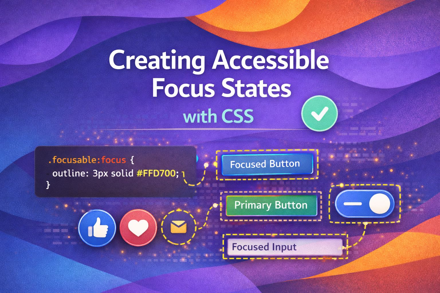
I've always found it a bit frustrating when developers remove the default focus outline without providing a solid alternative. It's a massive accessibility barrier for keyboard users, and frankly, we can do much better than the browser defaults while keeping our designs looking sharp.
The Modern Approach: :focus-visible
I personally love using :focus-visible because it only triggers when the user actually needs it, like during keyboard navigation, rather than on every mouse click.
/* The basic setup I use for most projects */
.button:focus {
  outline: none; /* Hide default only if providing an alternative */
}

.button:focus-visible {
  outline: 3px solid #2DD4BF;
  outline-offset: 2px;
}
This ensures that mouse users don't see the ring, but keyboard users get a clear, high-contrast indicator of where they are on the page.
/* A more robust global reset I often implement */
:focus-visible {
  outline: 3px solid var(--brand-primary, #005aee);
  outline-offset: 4px;
  border-radius: 4px;
}

/* Ensure it works for elements with rounded corners */
.pill-button:focus-visible {
  border-radius: 999px;
}
Creating Custom Rings with Box-Shadow
What I find fascinating is using box-shadow for focus states; it allows for multiple layers and doesn't affect the element's box model size.
/* Creating a 'halo' effect with box-shadow */
.card-link:focus-visible {
  outline: none;
  box-shadow:
    0 0 0 2px #fff,
    0 0 0 5px #6366f1;
  transition: box-shadow 0.2s ease-in-out;
}
The first shadow acts as a 'spacer' to provide breathing room, while the second provides the actual visible focus ring.
/* An inset version for internal elements like inputs */
.input-field:focus-visible {
  box-shadow: inset 0 0 0 2px #0ea5e9;
  border-color: #0ea5e9;
  outline: none;
}
Handling High Contrast and Forced Colors
Here's a trick I use to ensure box-shadow focus states don't disappear for users with 'Forced Colors' or High Contrast mode enabled.
/* Box shadows disappear in High Contrast mode! */
.btn-custom:focus-visible {
  outline: 2px solid transparent; /* Required for HCM visibility */
  box-shadow: 0 0 0 4px #d946ef;
}

@media (forced-colors: active) {
  .btn-custom:focus-visible {
    outline: 2px solid CanvasText; /* Uses system text colour */
  }
}
By adding a transparent outline, we signal to the browser that an outline should be rendered when the user's system overrides custom styling.
/* Using system colours for maximum compatibility */
@media (forced-colors: active) {
  a:focus-visible {
    outline: 3px double Highlight;
    outline-offset: 4px;
  }
}
Focus Within: Styling Parent Containers
I've found that :focus-within is incredibly powerful for complex components like data tables or search bars where you want to highlight the entire container.
/* Highlight a whole form group when an input is active */
.form-group:focus-within {
  background-color: #f8fafc;
  border-left: 4px solid #f59e0b;
}

.form-group input:focus {
  outline: 2px solid #f59e0b;
}
This provides a much broader visual cue, which is excellent for users with low vision or cognitive impairments.
/* Styling a card when its internal link is focused */
.article-card:focus-within {
  transform: translateY(-4px);
  box-shadow: 0 10px 15px -3px rgba(0, 0, 0, 0.1);
  border-color: #10b981;
}
Animating Focus States Safely
Let's look at how to add a bit of polish without causing motion sickness or performance lag.
/* Smooth transition for focus rings */
.nav-link {
  transition: outline-offset 0.15s ease-out;
  outline: 2px solid transparent;
}

.nav-link:focus-visible {
  outline-color: #8b5cf6;
  outline-offset: 4px;
}
It's vital to respect user preferences regarding motion, so I always wrap these transitions in a media query.
@media (prefers-reduced-motion: reduce) {
  .nav-link {
    transition: none !important;
  }
}

/* Alternative: only animate if motion is allowed */
@media (prefers-reduced-motion: no-preference) {
  .smooth-focus:focus-visible {
    animation: pulse 1.5s infinite;
  }
}
Wrapping Up
Building accessible focus states isn't just about compliance; it's about creating a premium experience for every user. Here are the key takeaways from today's deep dive:
- Use :focus-visible to target keyboard users specifically without cluttering the UI for mouse users.
- Combine box-shadow and transparent outlines to ensure visibility across all modes, including High Contrast.
- Leverage :focus-within to provide broader contextual cues for complex components.
- Always respect user motion preferences when animating states.
I encourage you to open your latest project and try navigating it using only your Tab key. You might be surprised by what you find! If you found this helpful, I'd love to connect! Follow me on Twitter/X or LinkedIn for more CSS and design system tips.